
ᐅ General Criticism Regarding Architecture, Layout, and Exterior Appearance
Created on: 29 Nov 2018 13:55
C
Christian K.
House Design
Who designed it: Architect
What we like: Layout, lots of natural light, practical despite design focus, space-saving (more garden area)
What we dislike: Some of the exterior appearance, many stairs
Why does the design look the way it does?
We generally like the Bauhaus style but not monotonous buildings. Since we don’t have enough space for a nice Bauhaus-style house, we preferred a city villa or a modern pitched roof. However, we then saw designs with a setback floor, which we liked.
Advantages of the setback floor: Bedrooms and bathrooms separated (from the children, etc.), nice views, smaller building footprint, easier installation of photovoltaic systems
Disadvantages of the setback floor: Many stairs (especially challenging later in life), no roof space for storage
What do you think are its main strengths and weaknesses?
Strengths: Orientation—for example, stairs located on the north side, bright staircase avoiding a dark space, bathrooms with morning light, corner windows providing more evening light
Weaknesses: Front exterior facade
Our "problem"
The architect incorporated our requirements (number of rooms, storage for existing furniture, etc.), and the original design looked prettier, but—for example—we didn’t want floor-to-ceiling windows in the children’s rooms. The height of the window sills visually isn’t ideal but works better for room use.
Our problem is that we are uncertain about the design because it is quite unusual. Also, considering a possible future sale: While we probably won’t sell, it could happen in an emergency. Then the question is whether the unique design might deter many buyers.
If we had chosen a city villa or pitched roof, we probably wouldn’t have these concerns and might have less garden space but more storage.
Maybe we also hesitate because we only have this one option and feel somewhat pressured to accept it. It could be that if we saw another design with a city villa or pitched roof, we might still choose this design because we would then have alternatives and a better basis for comparison. Do you understand what I mean?
What is the main fundamental question about the floor plan in 130 characters or less?
1. Could there be issues with the architecture if we want to sell the house?
2. Do you have any general comments on the design?
P.S. The facade color will be gray and not the brown tone shown in the drawings.
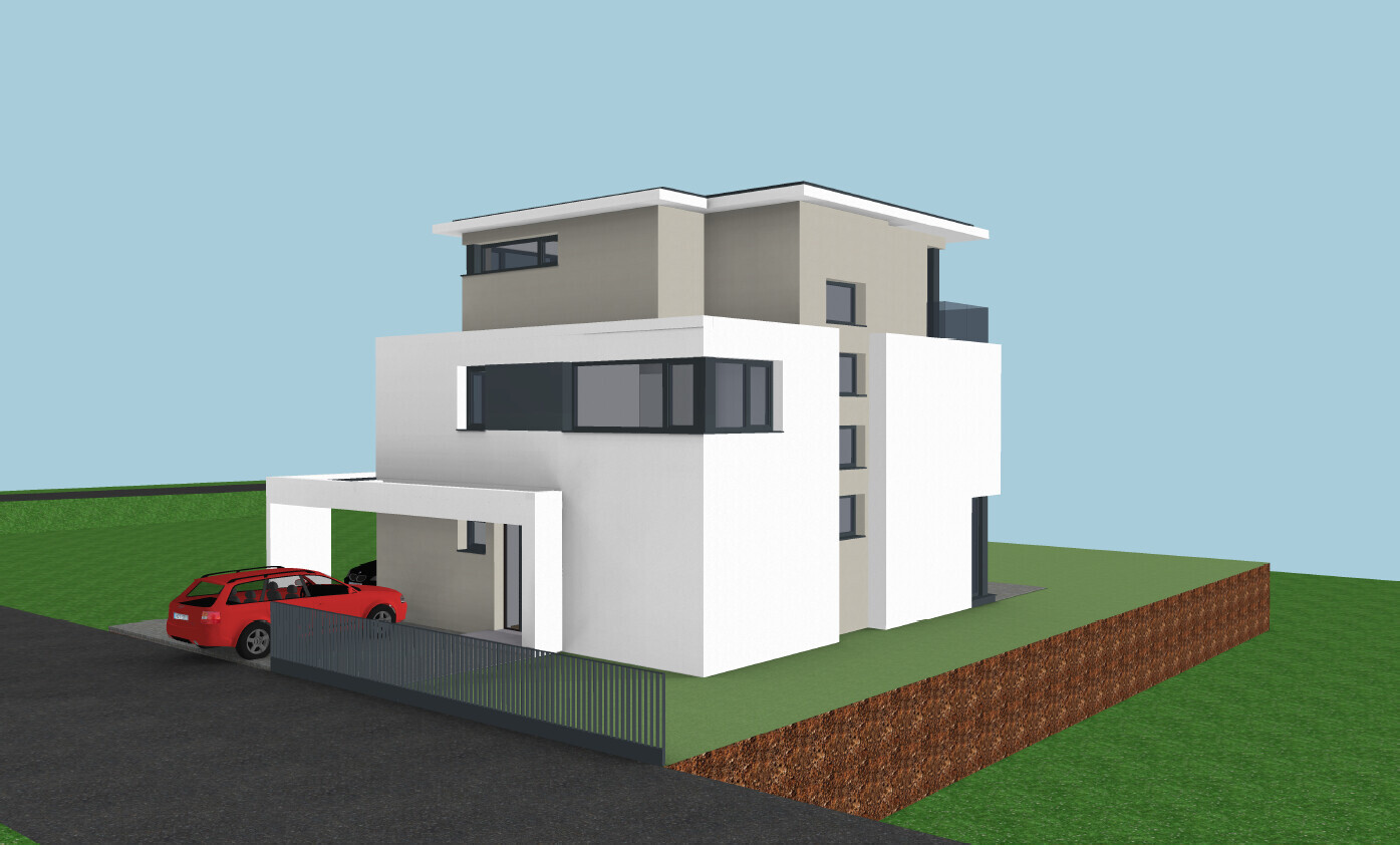
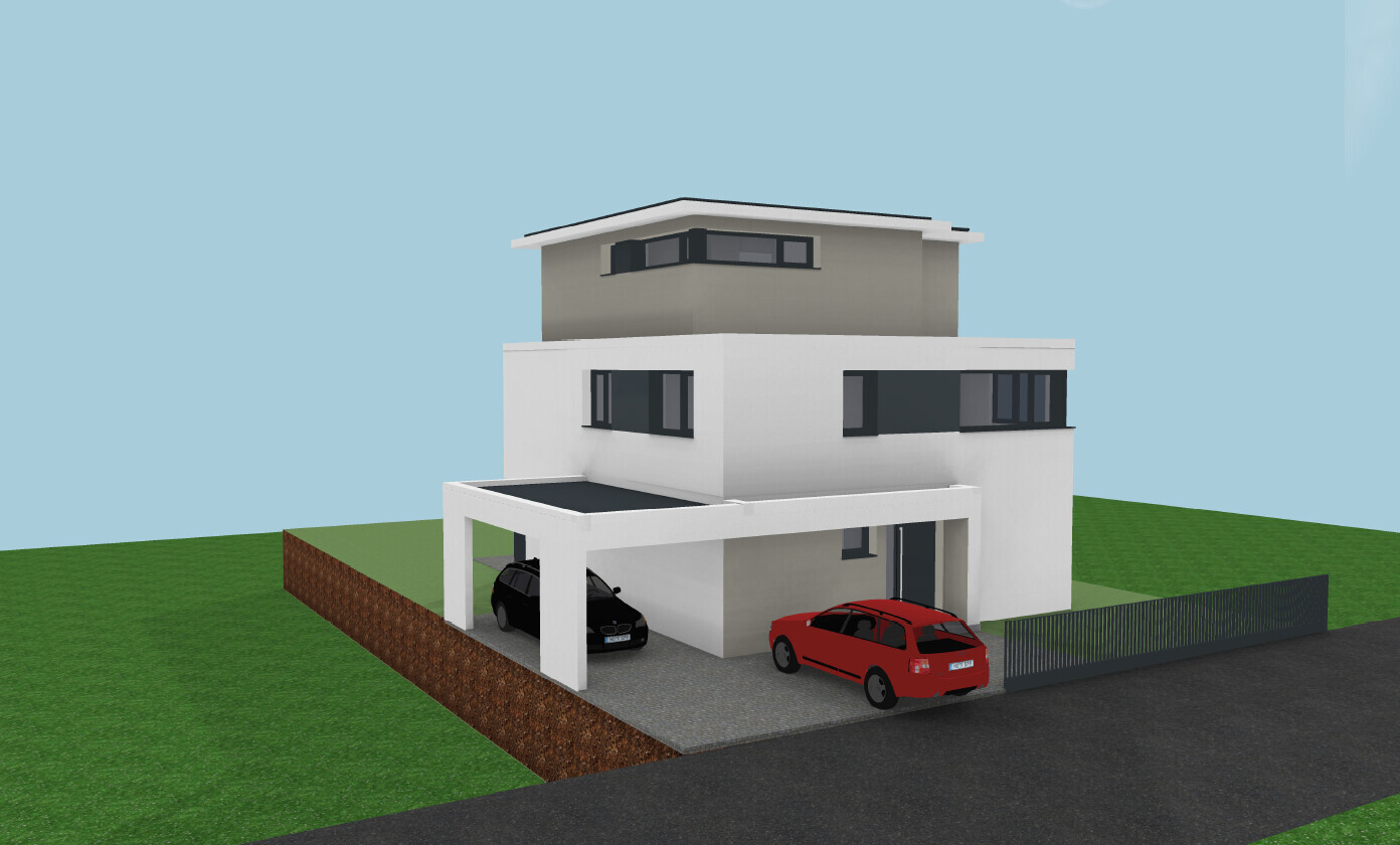
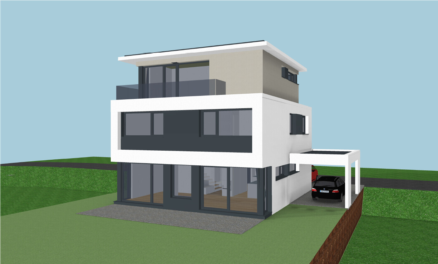
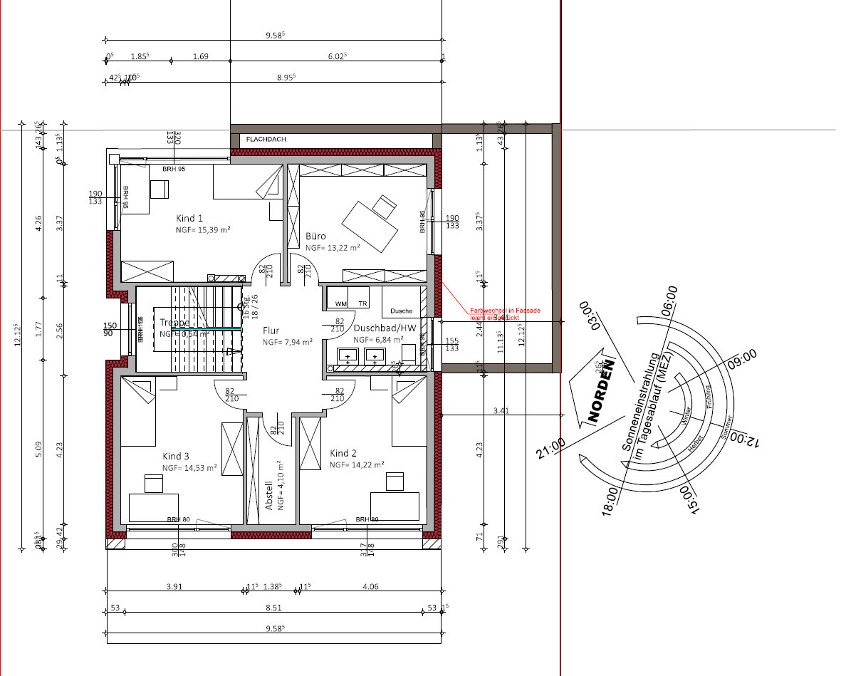
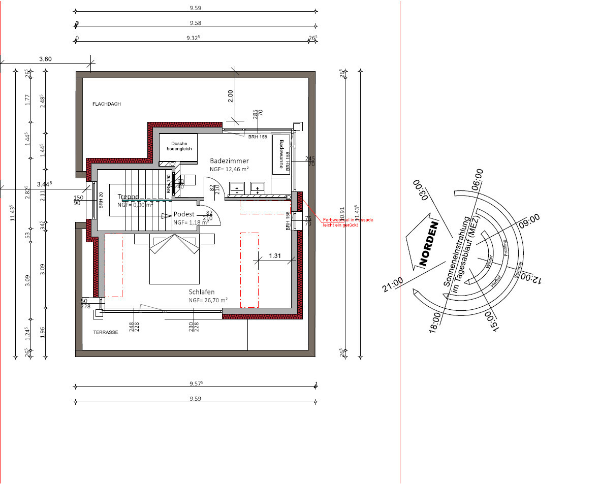
Who designed it: Architect
What we like: Layout, lots of natural light, practical despite design focus, space-saving (more garden area)
What we dislike: Some of the exterior appearance, many stairs
Why does the design look the way it does?
We generally like the Bauhaus style but not monotonous buildings. Since we don’t have enough space for a nice Bauhaus-style house, we preferred a city villa or a modern pitched roof. However, we then saw designs with a setback floor, which we liked.
Advantages of the setback floor: Bedrooms and bathrooms separated (from the children, etc.), nice views, smaller building footprint, easier installation of photovoltaic systems
Disadvantages of the setback floor: Many stairs (especially challenging later in life), no roof space for storage
What do you think are its main strengths and weaknesses?
Strengths: Orientation—for example, stairs located on the north side, bright staircase avoiding a dark space, bathrooms with morning light, corner windows providing more evening light
Weaknesses: Front exterior facade
Our "problem"
The architect incorporated our requirements (number of rooms, storage for existing furniture, etc.), and the original design looked prettier, but—for example—we didn’t want floor-to-ceiling windows in the children’s rooms. The height of the window sills visually isn’t ideal but works better for room use.
Our problem is that we are uncertain about the design because it is quite unusual. Also, considering a possible future sale: While we probably won’t sell, it could happen in an emergency. Then the question is whether the unique design might deter many buyers.
If we had chosen a city villa or pitched roof, we probably wouldn’t have these concerns and might have less garden space but more storage.
Maybe we also hesitate because we only have this one option and feel somewhat pressured to accept it. It could be that if we saw another design with a city villa or pitched roof, we might still choose this design because we would then have alternatives and a better basis for comparison. Do you understand what I mean?
What is the main fundamental question about the floor plan in 130 characters or less?
1. Could there be issues with the architecture if we want to sell the house?
2. Do you have any general comments on the design?
P.S. The facade color will be gray and not the brown tone shown in the drawings.
I clearly prefer the exterior look with floor-to-ceiling windows (who would have thought this from someone who usually dislikes floor-to-ceiling windows ). But then there’s also the functionality to consider—you’ll have to decide which option suits you better. In general, I’m a fan of window seats, especially for children’s rooms. They provide great storage space underneath, and I think such a window looks really nice.
I also like the view from the carport; however, from the other side of the house, the floors look too much like a "lighthouse" to me. The brown area (which looks brown to me as well ) oddly steps back with those small windows, and that’s just not my style.
I find the ground floor layout good, and I would definitely include a sauna on the roof—that’s almost a must-have!
Overall, I would reconsider whether you have enough storage space, but that comes from my general fear of not having enough storage.
In general, I think it’s good to think about potential resale value, but personally, I would rather buy a house like this than a townhouse! There are plenty of people who might not be "bold" enough to build something like this themselves but would gladly buy a finished house like it.
So... I like it.
I also like the view from the carport; however, from the other side of the house, the floors look too much like a "lighthouse" to me. The brown area (which looks brown to me as well ) oddly steps back with those small windows, and that’s just not my style.
I find the ground floor layout good, and I would definitely include a sauna on the roof—that’s almost a must-have!
Overall, I would reconsider whether you have enough storage space, but that comes from my general fear of not having enough storage.
In general, I think it’s good to think about potential resale value, but personally, I would rather buy a house like this than a townhouse! There are plenty of people who might not be "bold" enough to build something like this themselves but would gladly buy a finished house like it.
So... I like it.

I like both designs. However, for me it would also be important to separate the staircase from the living area, especially with three children.
Have you already mentioned the budget for the house? I assume at least a high-end finish. In that case, I would seriously consider planning an elevator for the second floor. If you’re going to do it, might as well go all the way...
Have you already mentioned the budget for the house? I assume at least a high-end finish. In that case, I would seriously consider planning an elevator for the second floor. If you’re going to do it, might as well go all the way...

montessalet schrieb:
The facade design from the first version is clearly better: Wickie schrieb:
I also definitely prefer the exterior view with floor-to-ceiling windows (who would have thought I’d say this as someone who normally dislikes floor-to-ceiling windows ) As far as I, a confessed fan of plain, standard designs, can still appreciate what might be attractive and marketable to people with different tastes than mine, I firmly "vote" for the version from post #1.
Wickie schrieb:
Well… I like it For me, the main appeal is actually just the "missing" double garage, but I find the design overall balanced (or at least close enough that I consider it "covered by personal taste," where the Müllers might do things differently than the Meiers).
Wickie schrieb:
Generally, I’m a fan of window seats in kids’ rooms. Personally, my kids’ rooms would have had too little light at the homework desk if I had to move it away from the wall because of a window seat.
https://www.instagram.com/11antgmxde/
https://www.linkedin.com/company/bauen-jetzt/
C
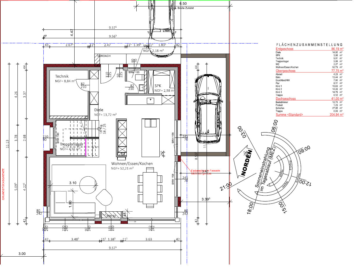
Christian K.30 Nov 2018 20:17So, we have discussed and considered a lot and made some changes based on your input. I’ll briefly present the changes. I redrew the floor plan using Sweet Home 3D, so please don’t complain if something isn’t perfectly accurate. It’s only meant to show what we have in mind. The architect will then finalize the drawings.
Oh, and regarding the door dimensions, the architect will draw the clear opening dimensions for windows and doors. The important thing here is just to see if the doors open properly, etc. The structural engineer/site manager will adjust everything neatly in the 1:50 scale plans afterward.

So, what do we see here... We extended the wall behind the TV so that you can’t see the front door from the sofa and vice versa. Although the small section opens up the space, we take seriously that this spot is not quite as comfortable to sit in. To avoid making it a narrow corridor, we slightly pushed the “[-wall” in the kitchen inward so that there is now space to place something like an aquarium. Previously, only pictures on the wall were possible.
I had completely forgotten, but we also planned to install a sliding wall behind the TV. This can be pulled out as needed to separate the living room from the staircase.
By moving the wall, space became tight for the kitchen island, so we removed it and added a small breakfast bar instead.
The frequently mentioned cabinet in the living room is now placed under the window on the right. The table is no longer centered and everything feels a bit cramped. This will also be the exit to the terrace, so we will hold off on the highboard for now. If necessary, something can still be added later. There will also be furniture below the TV, and something can be placed along the wall.
Since we also redesigned the kitchen cabinets, I thought of a small but nice detail I always wanted. Although it will be a wall to the bathroom, still…

Can you see it? From the countertop, you can see the aquarium. OK, at first it will just be an empty space, since we’ll probably need funds for other things first, but I like the idea.
For the exterior view, the architect made the first draft of the S-shape. We also lowered the parapet height to 75cm (30 inches) so that a desk fits flush with the window. This means we have to install a safety bar at the window, but oh well...
The architect had another idea, which I quickly visualized with Photoshop:
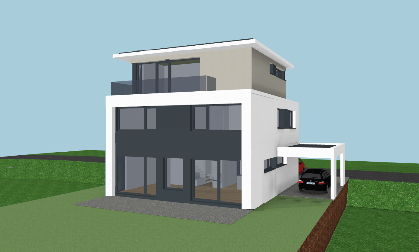
But I think we will go with the S-shape. We haven’t decided yet.
Thanks for your input; as you can see, we have incorporated or at least tried to consider most of it.
An alternative to the TV wall would be to swap the sofa and the TV. This way you have a view of the garden from the sofa. However, you would then have to place the TV in front of the window or build a half-height wall. You could then lower the roller blinds when watching something. In the evenings, it’s usually dark anyway.
P.S. An elevator is definitely not in the budget. The current cost estimate is about 530,000. Features include, for example, roller blinds, photovoltaic system, parquet flooring, and smart home (self-installed).
Oh, and regarding the door dimensions, the architect will draw the clear opening dimensions for windows and doors. The important thing here is just to see if the doors open properly, etc. The structural engineer/site manager will adjust everything neatly in the 1:50 scale plans afterward.
So, what do we see here... We extended the wall behind the TV so that you can’t see the front door from the sofa and vice versa. Although the small section opens up the space, we take seriously that this spot is not quite as comfortable to sit in. To avoid making it a narrow corridor, we slightly pushed the “[-wall” in the kitchen inward so that there is now space to place something like an aquarium. Previously, only pictures on the wall were possible.
I had completely forgotten, but we also planned to install a sliding wall behind the TV. This can be pulled out as needed to separate the living room from the staircase.
By moving the wall, space became tight for the kitchen island, so we removed it and added a small breakfast bar instead.
The frequently mentioned cabinet in the living room is now placed under the window on the right. The table is no longer centered and everything feels a bit cramped. This will also be the exit to the terrace, so we will hold off on the highboard for now. If necessary, something can still be added later. There will also be furniture below the TV, and something can be placed along the wall.
Since we also redesigned the kitchen cabinets, I thought of a small but nice detail I always wanted. Although it will be a wall to the bathroom, still…
Can you see it? From the countertop, you can see the aquarium. OK, at first it will just be an empty space, since we’ll probably need funds for other things first, but I like the idea.
For the exterior view, the architect made the first draft of the S-shape. We also lowered the parapet height to 75cm (30 inches) so that a desk fits flush with the window. This means we have to install a safety bar at the window, but oh well...
The architect had another idea, which I quickly visualized with Photoshop:
But I think we will go with the S-shape. We haven’t decided yet.
Thanks for your input; as you can see, we have incorporated or at least tried to consider most of it.
An alternative to the TV wall would be to swap the sofa and the TV. This way you have a view of the garden from the sofa. However, you would then have to place the TV in front of the window or build a half-height wall. You could then lower the roller blinds when watching something. In the evenings, it’s usually dark anyway.
P.S. An elevator is definitely not in the budget. The current cost estimate is about 530,000. Features include, for example, roller blinds, photovoltaic system, parquet flooring, and smart home (self-installed).
 montessalet30 Nov 2018 20:35
The S-shape simply feels lighter and less overwhelming. However, the one above is better than the one in the first post (which I referred to as a "block").
M
Mottenhausen30 Nov 2018 21:53My first thought when looking at it: "I think it’s cool."
When the first two comments started the same way, I had to laugh out loud. Thanks for the nice moment!
Honestly, if we had the money, our house would look exactly like this (the version with the floor-to-ceiling windows in the children's rooms and the "S"-shaped layout). Okay, our local building permit / planning permission doesn’t allow three levels and so on, but as I said, if you have the money, please, please don’t waste it on a needlessly oversized townhouse or something similar. Build it like this. The small issues mentioned earlier should be solvable without major changes to the design.
When the first two comments started the same way, I had to laugh out loud. Thanks for the nice moment!
Honestly, if we had the money, our house would look exactly like this (the version with the floor-to-ceiling windows in the children's rooms and the "S"-shaped layout). Okay, our local building permit / planning permission doesn’t allow three levels and so on, but as I said, if you have the money, please, please don’t waste it on a needlessly oversized townhouse or something similar. Build it like this. The small issues mentioned earlier should be solvable without major changes to the design.
Similar topics