
ᐅ General Criticism Regarding Architecture, Layout, and Exterior Appearance
Created on: 29 Nov 2018 13:55
C
Christian K.
House Design
Who designed it: Architect
What we like: Layout, lots of natural light, practical despite design focus, space-saving (more garden area)
What we dislike: Some of the exterior appearance, many stairs
Why does the design look the way it does?
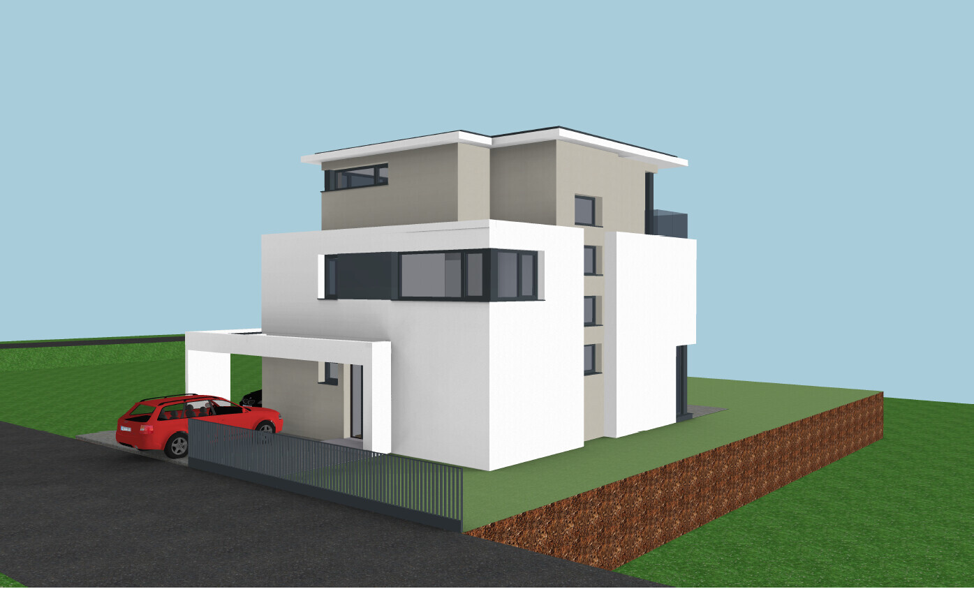
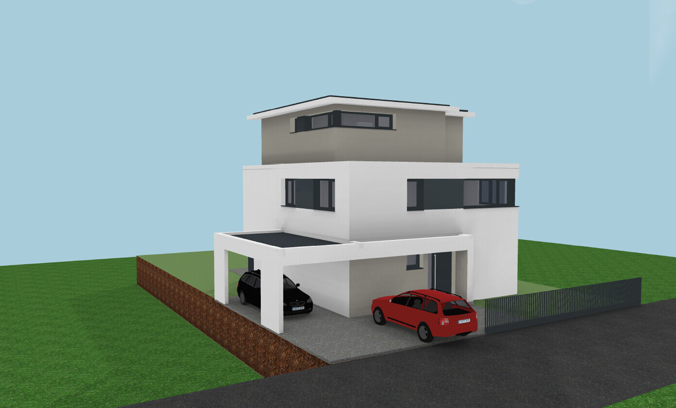
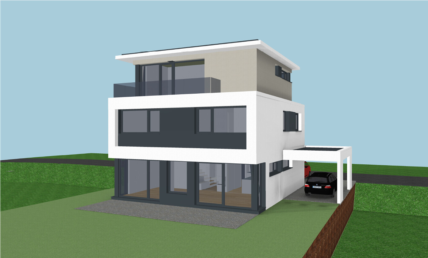
We generally like the Bauhaus style but not monotonous buildings. Since we don’t have enough space for a nice Bauhaus-style house, we preferred a city villa or a modern pitched roof. However, we then saw designs with a setback floor, which we liked.
Advantages of the setback floor: Bedrooms and bathrooms separated (from the children, etc.), nice views, smaller building footprint, easier installation of photovoltaic systems
Disadvantages of the setback floor: Many stairs (especially challenging later in life), no roof space for storage
What do you think are its main strengths and weaknesses?
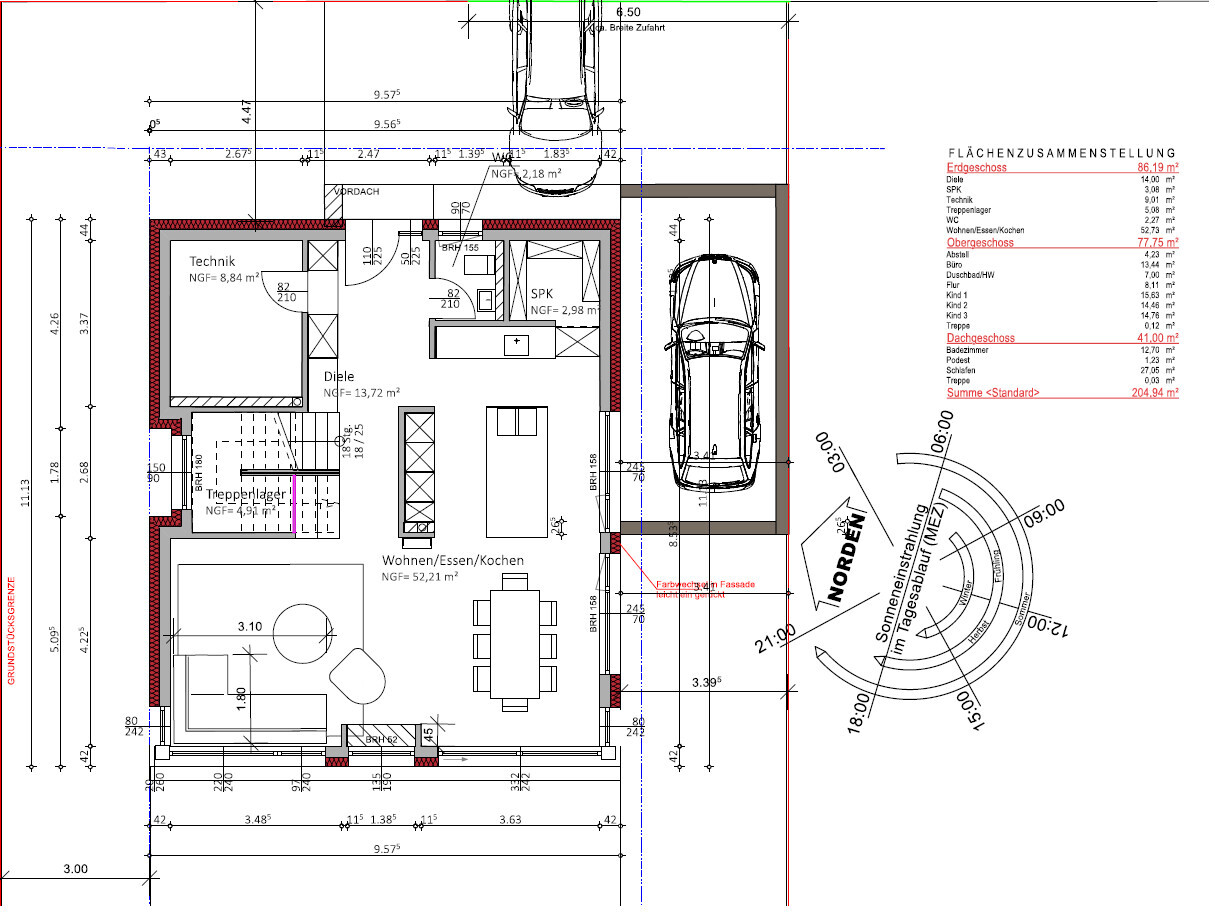
Strengths: Orientation—for example, stairs located on the north side, bright staircase avoiding a dark space, bathrooms with morning light, corner windows providing more evening light
Weaknesses: Front exterior facade
Our "problem"
The architect incorporated our requirements (number of rooms, storage for existing furniture, etc.), and the original design looked prettier, but—for example—we didn’t want floor-to-ceiling windows in the children’s rooms. The height of the window sills visually isn’t ideal but works better for room use.
Our problem is that we are uncertain about the design because it is quite unusual. Also, considering a possible future sale: While we probably won’t sell, it could happen in an emergency. Then the question is whether the unique design might deter many buyers.
If we had chosen a city villa or pitched roof, we probably wouldn’t have these concerns and might have less garden space but more storage.
Maybe we also hesitate because we only have this one option and feel somewhat pressured to accept it. It could be that if we saw another design with a city villa or pitched roof, we might still choose this design because we would then have alternatives and a better basis for comparison. Do you understand what I mean?
What is the main fundamental question about the floor plan in 130 characters or less?
1. Could there be issues with the architecture if we want to sell the house?
2. Do you have any general comments on the design?
P.S. The facade color will be gray and not the brown tone shown in the drawings.
Who designed it: Architect
What we like: Layout, lots of natural light, practical despite design focus, space-saving (more garden area)
What we dislike: Some of the exterior appearance, many stairs
Why does the design look the way it does?
We generally like the Bauhaus style but not monotonous buildings. Since we don’t have enough space for a nice Bauhaus-style house, we preferred a city villa or a modern pitched roof. However, we then saw designs with a setback floor, which we liked.
Advantages of the setback floor: Bedrooms and bathrooms separated (from the children, etc.), nice views, smaller building footprint, easier installation of photovoltaic systems
Disadvantages of the setback floor: Many stairs (especially challenging later in life), no roof space for storage
What do you think are its main strengths and weaknesses?
Strengths: Orientation—for example, stairs located on the north side, bright staircase avoiding a dark space, bathrooms with morning light, corner windows providing more evening light
Weaknesses: Front exterior facade
Our "problem"
The architect incorporated our requirements (number of rooms, storage for existing furniture, etc.), and the original design looked prettier, but—for example—we didn’t want floor-to-ceiling windows in the children’s rooms. The height of the window sills visually isn’t ideal but works better for room use.
Our problem is that we are uncertain about the design because it is quite unusual. Also, considering a possible future sale: While we probably won’t sell, it could happen in an emergency. Then the question is whether the unique design might deter many buyers.
If we had chosen a city villa or pitched roof, we probably wouldn’t have these concerns and might have less garden space but more storage.
Maybe we also hesitate because we only have this one option and feel somewhat pressured to accept it. It could be that if we saw another design with a city villa or pitched roof, we might still choose this design because we would then have alternatives and a better basis for comparison. Do you understand what I mean?
What is the main fundamental question about the floor plan in 130 characters or less?
1. Could there be issues with the architecture if we want to sell the house?
2. Do you have any general comments on the design?
P.S. The facade color will be gray and not the brown tone shown in the drawings.
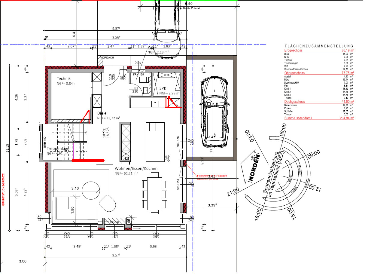
Kitchen area, transition to dining, and access to the terrace have clearly diminished in the latest ground floor version. The kitchen space is too wide for an almost double-row layout with a small peninsula. The passages toward the terrace are inconvenient when navigating around the table.
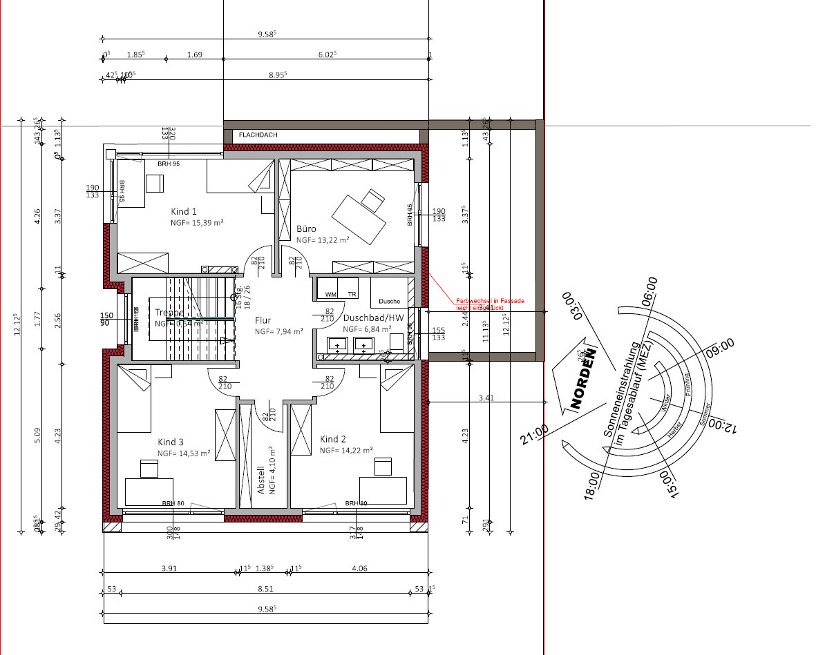
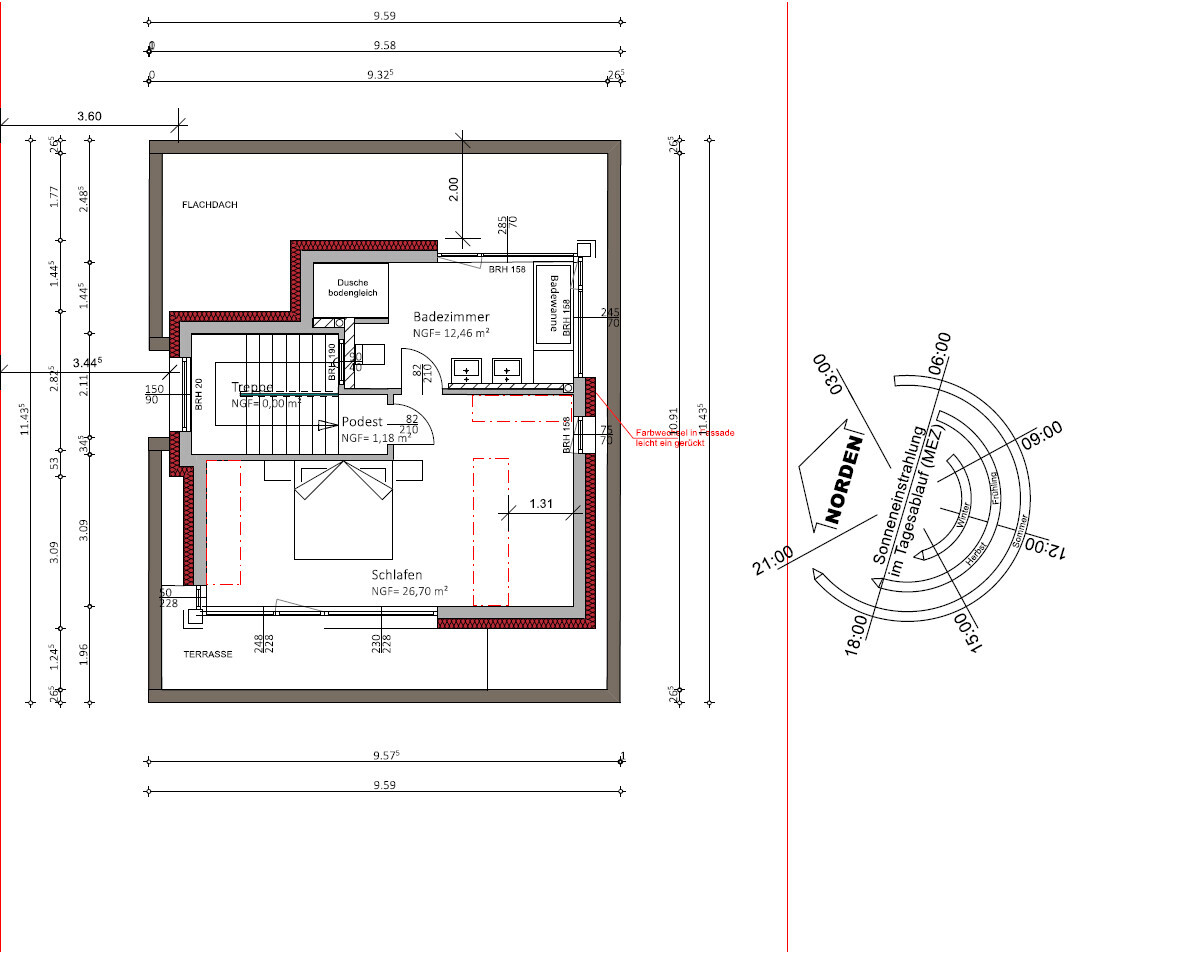
Regarding the master bedroom area... The wardrobe space drawn on the left side of the plan does not look good due to the corner window. In general, I find the proposed wardrobe spaces a bit like creating a maze, and the open area to the right at head height from the bed is also not well designed.
I fully understand your wife’s preference for floor-to-ceiling windows. Lowering them to 75 cm (30 inches) is also worth reconsidering. The distance between the windows and the planned wardrobe wall in children’s rooms 2 and 3 is also unfortunate. I also find the bathroom layout on the kids’ floor problematic... the shower is less than 90 cm (35 inches) wide in the shell stage. The shower exit directly facing the washing machine? Washer and dryer stacked without any laundry folding space is also not ideal.
Okay, enough complaints now . By the way, I really like the spacious staircase. Basically, I would try to bring a bit more southern natural light into the living area, especially in the kitchen/dining zone.
Where will items like bicycles, lawn mower, garden furniture, etc. be stored?
I would also be interested in seeing a site plan with the proposed house positioning and any building boundaries. It definitely seems to be completely flat.
Regarding the master bedroom area... The wardrobe space drawn on the left side of the plan does not look good due to the corner window. In general, I find the proposed wardrobe spaces a bit like creating a maze, and the open area to the right at head height from the bed is also not well designed.
I fully understand your wife’s preference for floor-to-ceiling windows. Lowering them to 75 cm (30 inches) is also worth reconsidering. The distance between the windows and the planned wardrobe wall in children’s rooms 2 and 3 is also unfortunate. I also find the bathroom layout on the kids’ floor problematic... the shower is less than 90 cm (35 inches) wide in the shell stage. The shower exit directly facing the washing machine? Washer and dryer stacked without any laundry folding space is also not ideal.
Okay, enough complaints now . By the way, I really like the spacious staircase. Basically, I would try to bring a bit more southern natural light into the living area, especially in the kitchen/dining zone.
Where will items like bicycles, lawn mower, garden furniture, etc. be stored?
I would also be interested in seeing a site plan with the proposed house positioning and any building boundaries. It definitely seems to be completely flat.

Christian K. schrieb:
I think it will be the S-shape after all. We haven’t decided yet. Such details are often rearranged again when the plan reaches the structural engineer stage.
Christian K. schrieb:
We also lowered the parapet height to 75cm (30 inches) so that the desk aligns flush with the window. Because of this, we have to install a safety bar on the window, but oh well... You don’t necessarily need windows that open fully; a fixed section at about the height of a potted plant is also an option.
kbt09 schrieb:
I’d also be interested in a site plan showing the proposed house positioning and possibly the building limits. It certainly seems completely level. I’d be interested in that as well.
https://www.instagram.com/11antgmxde/
https://www.linkedin.com/company/bauen-jetzt/
montessalet schrieb:
The S-shape simply feels lighter and less overwhelming. But the one above is better than the first design (which I called a "block"). I feel the same way. This new version would be a deterioration of the S-shape but still better than the first...
kbt09 schrieb:
The kitchen area, transition to dining, and access to the terrace have clearly worsened compared to the last ground floor version. The kitchen space is far too wide for what is basically a two-row layout with a short peninsula. The walkways towards the terrace are inconvenient when moving around the table. I agree – the proportions just don’t feel right anymore. Plan the kitchen through properly; the gap between the cabinets is simply too large, which makes working there impractical.
kbt09 schrieb:
Lowering it to 75cm (30 inches) is also worth reconsidering. Agreed!
Wickie schrieb:
Plan the kitchen thoroughly, Yes, I agree: in terms of readiness for the "structural engineer" phase (and supply and disposal planning) — which is the last step before the building permit/planning permission — I see the design is essentially only one step away from finalizing the kitchen layout.
The "[" wall is relevant to the structural engineering in its position, whether or not it includes the aquarium viewing window, but therefore it remains equally important for the kitchen planning.
So, start the kitchen planning to move on to the semifinals.
https://www.instagram.com/11antgmxde/
https://www.linkedin.com/company/bauen-jetzt/

Sorry, I find all the proposed changes disadvantageous. I would roll them back completely. The access to the utility room (HAR) under the stairs probably won’t work anyway. I like aquariums, but you can’t really enjoy one there. I think the picture on the wall makes more sense in that spot, and the kitchen island should be added back in.
The narrow hallway in front of the stairs also bothers me a bit. Therefore, I would consider moving the stairs back instead of forward. That would affect all floors and, of course, incur costs. But then the door to the utility room would work. However, I still don’t see an aquarium there. I believe it fits best in the upstairs office.
The bathroom upstairs still bothers me. Besides the direct access from the bedroom, I’m also disturbed by the fact that the door hits the user right at knee height. Ouch!
The narrow hallway in front of the stairs also bothers me a bit. Therefore, I would consider moving the stairs back instead of forward. That would affect all floors and, of course, incur costs. But then the door to the utility room would work. However, I still don’t see an aquarium there. I believe it fits best in the upstairs office.
The bathroom upstairs still bothers me. Besides the direct access from the bedroom, I’m also disturbed by the fact that the door hits the user right at knee height. Ouch!
Similar topics