
Hello everyone,
I would appreciate your feedback on the floor plans.
Development Plan / Restrictions:
· Plot size: 1,200 m² (18 m (59 inches) wide)
· Slope: south-facing hill, street to the north
· Site coverage ratio: 0.3
· Floor area ratio: 0.6
· Building envelope, building line, and boundary: see "enlarged building envelope" 12 x 14 m (39 x 46 feet)
· Edge development: garages
· Number of parking spaces: 3 required according to building authority
· Construction type: open building layout
· Building setback: 3 m (10 feet)
· Roof type: pitched roofs 15-30°, hipped roofs to be avoided, see regulations
· Orientation: ridge direction of the buildings parallel to each other
· Exterior design: see section 6 of the regulations
Homeowners’ Requirements
Preliminary: The homeowners (born 1982 male, 1988 female, and two children born 2014 female, 2016 male) want to live on two floors (basement and ground floor). A third children’s bedroom should also be included. The third floor (attic) should be accessible barrier-free.
· Style: Bauhaus (optionally exposed concrete)
· Roof design: large south-facing side (for solar panels, photovoltaics)
· Building type: two-family house
· Basement and floors: basement, ground floor, attic
· Number of occupants and ages as above: (2 + 3 in basement and ground floor, 2 + 1 in attic)
o Space requirements attic: 2 bedrooms, 1 flexible floor plan bathroom, open living/dining/kitchen area, utility room
o Space requirements ground floor: 1 master bedroom, walk-in closet, master bathroom, large open living/dining/kitchen area, wardrobe, storage room
o Space requirements basement: 3 children’s bedrooms, children’s bathroom, optional play corridor, boiler room, cellar, utility room
· Open or closed architecture: open
· Conservative or modern construction: modern
· Kitchen: open kitchen with island (at least on ground floor)
· Balcony, roof terrace: likely sensible on all three floors considering exposed concrete
· Parking spaces: carports if possible, which can later be converted into garages (initial cost saving)
· Heating/thermal technology: air-to-water heat pump (underfloor heating), optional photovoltaics
· Windows: large window areas on the south side, optionally wide, low windows above the kitchen worktop on the ground floor
· Energy efficiency: KfW 55 standard
· High sound insulation (especially for the ceiling of the attic, separate residential unit)
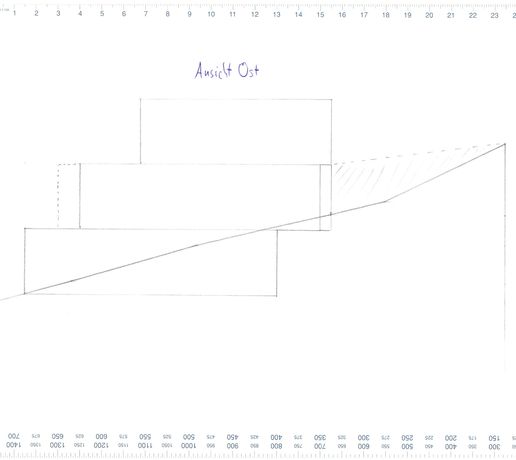
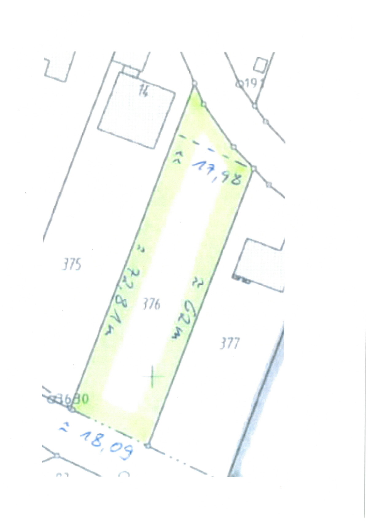
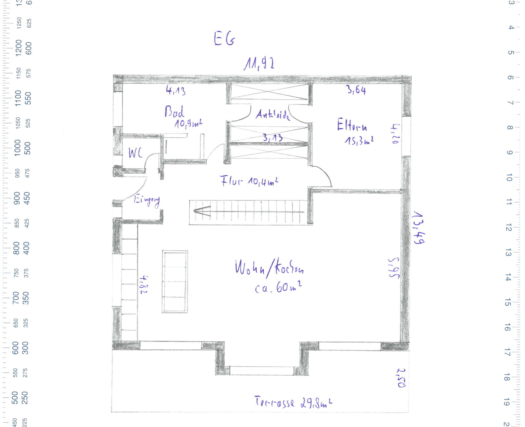
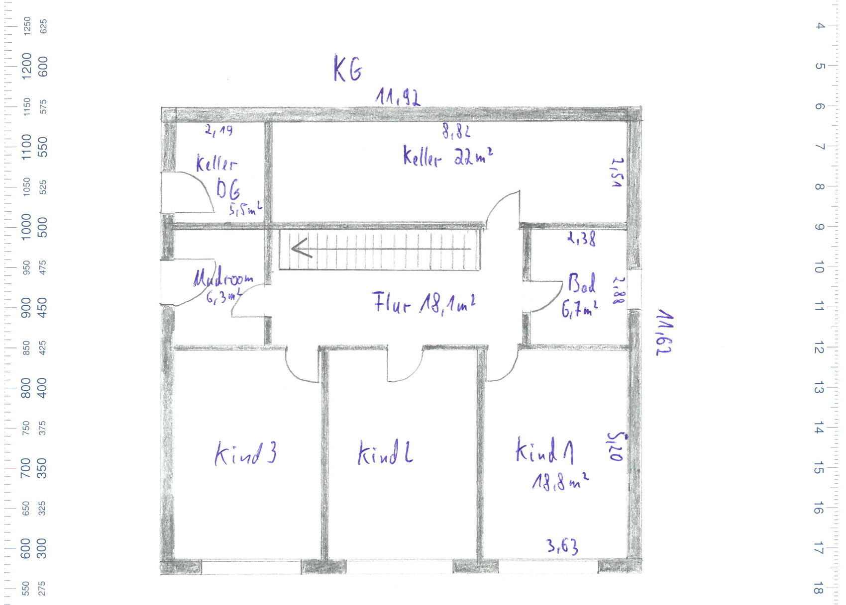
I would appreciate your feedback on the floor plans.
Development Plan / Restrictions:
· Plot size: 1,200 m² (18 m (59 inches) wide)
· Slope: south-facing hill, street to the north
· Site coverage ratio: 0.3
· Floor area ratio: 0.6
· Building envelope, building line, and boundary: see "enlarged building envelope" 12 x 14 m (39 x 46 feet)
· Edge development: garages
· Number of parking spaces: 3 required according to building authority
· Construction type: open building layout
· Building setback: 3 m (10 feet)
· Roof type: pitched roofs 15-30°, hipped roofs to be avoided, see regulations
· Orientation: ridge direction of the buildings parallel to each other
· Exterior design: see section 6 of the regulations
Homeowners’ Requirements
Preliminary: The homeowners (born 1982 male, 1988 female, and two children born 2014 female, 2016 male) want to live on two floors (basement and ground floor). A third children’s bedroom should also be included. The third floor (attic) should be accessible barrier-free.
· Style: Bauhaus (optionally exposed concrete)
· Roof design: large south-facing side (for solar panels, photovoltaics)
· Building type: two-family house
· Basement and floors: basement, ground floor, attic
· Number of occupants and ages as above: (2 + 3 in basement and ground floor, 2 + 1 in attic)
o Space requirements attic: 2 bedrooms, 1 flexible floor plan bathroom, open living/dining/kitchen area, utility room
o Space requirements ground floor: 1 master bedroom, walk-in closet, master bathroom, large open living/dining/kitchen area, wardrobe, storage room
o Space requirements basement: 3 children’s bedrooms, children’s bathroom, optional play corridor, boiler room, cellar, utility room
· Open or closed architecture: open
· Conservative or modern construction: modern
· Kitchen: open kitchen with island (at least on ground floor)
· Balcony, roof terrace: likely sensible on all three floors considering exposed concrete
· Parking spaces: carports if possible, which can later be converted into garages (initial cost saving)
· Heating/thermal technology: air-to-water heat pump (underfloor heating), optional photovoltaics
· Windows: large window areas on the south side, optionally wide, low windows above the kitchen worktop on the ground floor
· Energy efficiency: KfW 55 standard
· High sound insulation (especially for the ceiling of the attic, separate residential unit)

I’m not very excited about the design; it works, but it’s not very creative. Especially the front view is a no-go for me. I’d rather see large window areas instead of always having the same double patio door. Or did you get some great deal ordering the same door eight times?
Under NO circumstances should you remove the wall between the bedroom and the walk-in closet. Maybe consider removing the wall between the bathroom and the walk-in closet instead (if there is a controlled mechanical ventilation system).
The bay window is gone, thank goodness, so the piano will be gone too.
Overall, there is very little storage space for a family of four and possibly five, if I understand correctly. It might make sense to reduce the size of the three children’s rooms downstairs in favor of more storage.
Personally, I would also prefer to have the kitchen/living room with garden access. Are you planning to grow your own vegetables? Herbs? And what if you need some parsley quickly—just running down to the garden? At least I would plan a staircase from the terrace to the garden.
A basement for the in-laws in the basement level, accessible only from outside? So if they need something from the basement, they have to go through the garden? What do you plan to store there? Probably not drink crates, right?
Visually, it doesn’t have anything to do with Bauhaus anymore. I find the exterior plain and boring. There is more potential. But in the end, it has to suit your taste. The floor plan does work.
Under NO circumstances should you remove the wall between the bedroom and the walk-in closet. Maybe consider removing the wall between the bathroom and the walk-in closet instead (if there is a controlled mechanical ventilation system).
The bay window is gone, thank goodness, so the piano will be gone too.
Overall, there is very little storage space for a family of four and possibly five, if I understand correctly. It might make sense to reduce the size of the three children’s rooms downstairs in favor of more storage.
Personally, I would also prefer to have the kitchen/living room with garden access. Are you planning to grow your own vegetables? Herbs? And what if you need some parsley quickly—just running down to the garden? At least I would plan a staircase from the terrace to the garden.
A basement for the in-laws in the basement level, accessible only from outside? So if they need something from the basement, they have to go through the garden? What do you plan to store there? Probably not drink crates, right?
Visually, it doesn’t have anything to do with Bauhaus anymore. I find the exterior plain and boring. There is more potential. But in the end, it has to suit your taste. The floor plan does work.
S
sichtbeton8212 Sep 2017 09:33We also came up with the idea of a sliding door just yesterday. Your reasoning matches ours exactly! Thanks!
What do you mean by "Better to have large window areas than always the same double patio doors"? Do you mean, for example, that the entire south side on the ground floor should be made of glass? That would certainly be a highlight! However, it would mainly be very complex structurally. Or do you mean occasionally replacing the patio door, about 2.5m by 2.5m (8 ft 2 in by 8 ft 2 in), where not necessary, with a window instead? That would only make sense for one or at most two doors/windows on the ground floor.
We discussed the option of having the living area downstairs and the children’s rooms upstairs for a long time and ultimately decided on living space upstairs. But I can understand your preference. The staircase option is still open. Some friends of ours made the same change later on. If necessary, you might find a spot on the terrace for a small herb garden.
The basement (top floor) is only accessible from the outside. Yes, the access can only be through the side stairs. The “garden” actually starts further down. Storage should be limited to items that are not needed frequently, like summer/winter tires, a trampoline that is taken down during the cold season, etc. There should also be a small accessible attic space for the upper floor. It’s also possible that if the property is rented out, we might use the basement (top floor) as a tool shed. Later on, a garden shed will also be built for additional storage space.
Yes, unfortunately we have moved away from the Bauhaus style. It started with the fact that a flat roof is not approved, and ends, for example, with more complex structural engineering and therefore higher costs for 12m (39 ft) of window areas. Our highlight remains the terrace/stepped shape of the house.
What do you mean by "Better to have large window areas than always the same double patio doors"? Do you mean, for example, that the entire south side on the ground floor should be made of glass? That would certainly be a highlight! However, it would mainly be very complex structurally. Or do you mean occasionally replacing the patio door, about 2.5m by 2.5m (8 ft 2 in by 8 ft 2 in), where not necessary, with a window instead? That would only make sense for one or at most two doors/windows on the ground floor.
We discussed the option of having the living area downstairs and the children’s rooms upstairs for a long time and ultimately decided on living space upstairs. But I can understand your preference. The staircase option is still open. Some friends of ours made the same change later on. If necessary, you might find a spot on the terrace for a small herb garden.
The basement (top floor) is only accessible from the outside. Yes, the access can only be through the side stairs. The “garden” actually starts further down. Storage should be limited to items that are not needed frequently, like summer/winter tires, a trampoline that is taken down during the cold season, etc. There should also be a small accessible attic space for the upper floor. It’s also possible that if the property is rented out, we might use the basement (top floor) as a tool shed. Later on, a garden shed will also be built for additional storage space.
Yes, unfortunately we have moved away from the Bauhaus style. It started with the fact that a flat roof is not approved, and ends, for example, with more complex structural engineering and therefore higher costs for 12m (39 ft) of window areas. Our highlight remains the terrace/stepped shape of the house.
I find the front view rather boring. It looks a bit like a hotel, with the same windows repeated. There could be more variation. The bay window is gone, and for example, on the ground floor, you don’t necessarily need that three-part division anymore. Think about how you want to arrange the rooms and adjust the windows accordingly. For instance, a large window area with a sliding or folding door in the center, maybe a horizontal strip window placed a bit higher in the living area, the kitchen designed differently, and so on. I don’t know how you live or what’s important to you (if the TV needs to be placed in a specific spot, this will affect where it’s better to avoid windows; or if you have an old cupboard that you definitely want to place somewhere—where would that fit?). This can impact the window arrangement. What makes sense in the kitchen? Would it be better to have a long strip window on the side, with only one door facing forward, allowing for more space for tall cabinets? There are many options, but having the same double patio door three times and the same arrangement below feels too dull to me.
Regarding the roof shape: okay, a flat roof isn’t allowed, but what’s on top now isn’t great either. Perhaps a staggered gable roof? That would give the in-law unit a nice skylight!
You’ve organized everything well (although I want to emphasize storage again!), but right now the house feels to me like everything was just put together, and this is what came out. I’m still missing a bit of a clear guiding concept, the “aha!” moment. It won’t be a bad house, but it’s boring in my opinion.
Regarding the roof shape: okay, a flat roof isn’t allowed, but what’s on top now isn’t great either. Perhaps a staggered gable roof? That would give the in-law unit a nice skylight!
You’ve organized everything well (although I want to emphasize storage again!), but right now the house feels to me like everything was just put together, and this is what came out. I’m still missing a bit of a clear guiding concept, the “aha!” moment. It won’t be a bad house, but it’s boring in my opinion.

To begin with, a confession: delivering a brilliant design on this nightmare plot is not easy.
Overall, I find the exterior design exceptionally unfortunate. The floor plans are okay, maybe a bit dated around the 1970/80s transition. Outside, I resist finding anything even remotely attractive. The top floor, viewed from street level, is essentially a basement level. This alone makes the building look like it slipped two meters (about 6.5 feet) down the slope. The upper apartment gives the overall impression of a holiday flat. The steeper roof on the hillside side reinforces the awkward proportions seen from the street and—with its asymmetry—it shows no connection to the building or the terrain on the side. The roof just lies crookedly with no discernible reason. From the sides, the building looks as if everything projecting in front of the top floor is an extension. The horizontal window adds to the confusion, as it overlaps on both sides of this apparent extension boundary. But the real highlight is the terrain depression in front of the bathroom window. After this rollercoaster of proportions, a cultural shock hits when you turn around the house to see the strict valley-facing facade.
This combination of proportional chaos from three sides and lack of inspiration from the fourth side is probably unique, but unfortunately not successful.
Against the background of the floor plans, this need not be a contradiction; it could just as well be a causal connection.
But it doesn’t matter: we are still at the very beginning here. With R. Hotzenplotz, the turnaround started around post #400.
https://www.instagram.com/11antgmxde/
https://www.linkedin.com/company/bauen-jetzt/
Climbee schrieb:I agree. The valley-facing facade looks like a “spot the difference” puzzle: the usual double patio door in the usual format is here a single door in the center at the top. It really looks like the brother-in-law only needed two of these patio doors, and the rest came from the leftover pack. Creativity here really scores a failing grade. The facade is structured like a concrete frame building. At this point, the association is with a hotel block—without the stepped floors and hillside location, this is how office buildings would be designed. This strictness is further enhanced by the complete lack of concept on the two side facades: excluding doors to the mudroom/basement, you see four and five elements in four and five different formats, and the horizontal windows look oddly lowered. On the hillside facade, despite only two elements, nothing matches: the front door with side panel does not fit with the otherwise sparse windows, and the transom window looks strange, since from street level it is more like a basement window.
I don’t find the design very exciting; it works, but creativity is something else. Especially the front view would be a no-go for me. Better to have large window areas than always the same double patio door.
Climbee schrieb:... is a very constructive suggestion, especially the note,
Always the same windows. There could be some variation. The bay window is gone, so you don't need the triple division in the ground floor anymore.
Climbee schrieb:... developing the exterior variation from the interior.
Think about how you want to furnish and adjust the windows accordingly. For example, a large window area with a sliding or folding door in the center, maybe a horizontal window band placed a bit higher in the living area, the kitchen arranged differently, etc.
Overall, I find the exterior design exceptionally unfortunate. The floor plans are okay, maybe a bit dated around the 1970/80s transition. Outside, I resist finding anything even remotely attractive. The top floor, viewed from street level, is essentially a basement level. This alone makes the building look like it slipped two meters (about 6.5 feet) down the slope. The upper apartment gives the overall impression of a holiday flat. The steeper roof on the hillside side reinforces the awkward proportions seen from the street and—with its asymmetry—it shows no connection to the building or the terrain on the side. The roof just lies crookedly with no discernible reason. From the sides, the building looks as if everything projecting in front of the top floor is an extension. The horizontal window adds to the confusion, as it overlaps on both sides of this apparent extension boundary. But the real highlight is the terrain depression in front of the bathroom window. After this rollercoaster of proportions, a cultural shock hits when you turn around the house to see the strict valley-facing facade.
This combination of proportional chaos from three sides and lack of inspiration from the fourth side is probably unique, but unfortunately not successful.
Against the background of the floor plans, this need not be a contradiction; it could just as well be a causal connection.
But it doesn’t matter: we are still at the very beginning here. With R. Hotzenplotz, the turnaround started around post #400.
Climbee schrieb:... is another constructive suggestion I can support.
Offset gable roof? Would give the in-law unit a nice skylight!
https://www.instagram.com/11antgmxde/
https://www.linkedin.com/company/bauen-jetzt/
Hmm, from the south side, this will look like a huge block, and if it’s just stepped down plainly like that, it becomes boring and uninspired.
A sloped plot is a challenge, but with clever ideas, you can create some really cool possibilities. I recommend checking out the media library of Bayerischer Rundfunk and watching the "Dream Houses" series. They often build on slopes there, so you can definitely get some useful ideas.
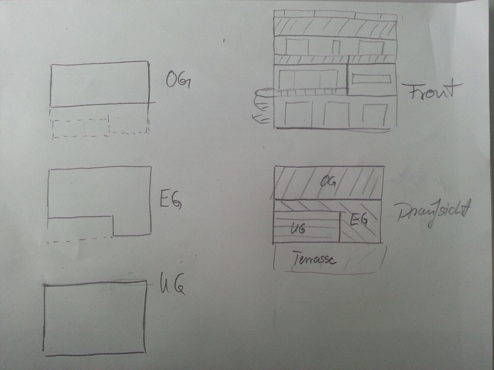
I’m not an architect, but off the top of my head, I would suggest breaking up the front view a bit:
Place the kitchens on the ground floor and first floor aligned vertically; kitchens are often placed on the east side, but it’s not a must. Then it would make more sense for the ground floor entrance to be oriented from west to east. So, mirror the ground floor layout.
Pull the kitchen forward. To put it bluntly: move the bay window from the center to the side. This would also create a nicer terrace for the garden apartment. Right now, it’s a narrow, barely usable strip of space. So, extend the ground floor to the south on the east side for the kitchen. That would change the window arrangement completely: for the kitchen, you could add a door on the west side leading to the terrace and enjoy a nice southern view with a strip of windows (and, for example, plan a large work surface there, which makes working really enjoyable!). An island facing the terrace/west, and with the door to the terrace, you basically bring the kitchen outdoors during summer, having a terrace protected from the east with sun from the south and west.
This also breaks up the façade towards the front, and upstairs you get a terrace where you could place outdoor furniture (you might consider adding a privacy wall on the east side, which would make the terrace cozy and less exposed, hardly visible from the street). The ground floor terrace is basically an extension of the kitchen, which I find great for the summer.
I’ve attached one of my quickly sketched, dreaded hand drawings (as always, completely out of scale, just to give ideas). The scribble on the left side is meant to represent stairs to the garden; for the front, I assumed a south-facing, offset gable roof:
A sloped plot is a challenge, but with clever ideas, you can create some really cool possibilities. I recommend checking out the media library of Bayerischer Rundfunk and watching the "Dream Houses" series. They often build on slopes there, so you can definitely get some useful ideas.
I’m not an architect, but off the top of my head, I would suggest breaking up the front view a bit:
Place the kitchens on the ground floor and first floor aligned vertically; kitchens are often placed on the east side, but it’s not a must. Then it would make more sense for the ground floor entrance to be oriented from west to east. So, mirror the ground floor layout.
Pull the kitchen forward. To put it bluntly: move the bay window from the center to the side. This would also create a nicer terrace for the garden apartment. Right now, it’s a narrow, barely usable strip of space. So, extend the ground floor to the south on the east side for the kitchen. That would change the window arrangement completely: for the kitchen, you could add a door on the west side leading to the terrace and enjoy a nice southern view with a strip of windows (and, for example, plan a large work surface there, which makes working really enjoyable!). An island facing the terrace/west, and with the door to the terrace, you basically bring the kitchen outdoors during summer, having a terrace protected from the east with sun from the south and west.
This also breaks up the façade towards the front, and upstairs you get a terrace where you could place outdoor furniture (you might consider adding a privacy wall on the east side, which would make the terrace cozy and less exposed, hardly visible from the street). The ground floor terrace is basically an extension of the kitchen, which I find great for the summer.
I’ve attached one of my quickly sketched, dreaded hand drawings (as always, completely out of scale, just to give ideas). The scribble on the left side is meant to represent stairs to the garden; for the front, I assumed a south-facing, offset gable roof:
Similar topics