
ᐅ Preliminary floor plan design for a 220 m² single-family house
Created on: 20 Jun 2017 22:41
R
R.Hotzenplotz
Hello!
We have already gone through several plans with our architect and I think we are almost there, about to start the detailed planning phase. Before that, I’m looking forward to getting feedback from other users.
Development plan/restrictions: §34 – two full stories
Plot size: 1,085m² (1,1679 yd²)
Basement, floors – 2 full stories plus partial basement
Number of people, ages – 3 people (37, 34, 1, second child planned)
Space requirements on ground floor and upper floor – the requirement was that bedrooms and the study should be about 17m² (183 ft²) each; the entire house should be approximately 220m² (2,368 ft²)
Office: family use
Guests per year: 1
Open or closed architecture: closed
Traditional or modern design: modern
Open kitchen, kitchen island – no open kitchen, but yes to a kitchen island
Number of dining seats – 6
Fireplace – yes
Music/stereo wall – TV wall
Balcony, roof terrace – balcony
Garage, carport – large garage
Additional wishes/special features/daily routines, preferably with reasons why certain things should or should not be included – everyone should be able to sleep as undisturbed as possible in their bedrooms, even if other family members are awake. The husband is sometimes up as early as 4 a.m. Otherwise, watching TV in the evening should be possible without disturbing those sleeping upstairs.
House design
Who created the design:
- Architect (freelancer for a general contractor)
What do you like most? Why?
The upper floor with well-sized rooms and the location of the rooms exactly where they should be (only the washroom area we would still like to move to the outer right corner so that you don’t have to pass it every time you use the toilet). On the ground floor, the access through an airlock, the kitchen, and the dining area with the study next to it are especially liked.
Also appreciated is that after adjustments, the study now faces the garden instead of the street.
What don’t you like? Why?
We originally wanted the distance from wall to wall where the sofa and TV stand is to be about 6.40m (21 ft) (large screen & surround system), but so far only 5.69m (19 ft) has been realized.
Laundry room as described.
Kitchen larger in square meters than needed; the approx. 3m² (32 ft²) could theoretically be used well in the living area.
Price estimate according to architect/planner:
720,000 euros (including construction incidentals)
Personal price limit for the house, including equipment:
800,000 euros
Preferred heating technology:
Gas
If you have to give up on something, which details/features can you do without?
- Can do without:
Technical systems like controlled residential ventilation
- Cannot do without:
Space (except for the kitchen)
Why is the design the way it is now? For example:
Is this a standard design from the planner?
The architect has largely implemented our wishes; the only issue is the living room situation.
What makes it particularly good or bad in your opinion?
Patient, quick to implement, has already gotten to know us well.
No negative points.
Do you notice any other points that might not fit or that we should consider, which we might have overlooked?
In the basement, the room currently labeled as home cinema might possibly be used as one medium- to long-term. For the foreseeable future, it will be a storage room.
We have already gone through several plans with our architect and I think we are almost there, about to start the detailed planning phase. Before that, I’m looking forward to getting feedback from other users.
Development plan/restrictions: §34 – two full stories
Plot size: 1,085m² (1,1679 yd²)
Basement, floors – 2 full stories plus partial basement
Number of people, ages – 3 people (37, 34, 1, second child planned)
Space requirements on ground floor and upper floor – the requirement was that bedrooms and the study should be about 17m² (183 ft²) each; the entire house should be approximately 220m² (2,368 ft²)
Office: family use
Guests per year: 1
Open or closed architecture: closed
Traditional or modern design: modern
Open kitchen, kitchen island – no open kitchen, but yes to a kitchen island
Number of dining seats – 6
Fireplace – yes
Music/stereo wall – TV wall
Balcony, roof terrace – balcony
Garage, carport – large garage
Additional wishes/special features/daily routines, preferably with reasons why certain things should or should not be included – everyone should be able to sleep as undisturbed as possible in their bedrooms, even if other family members are awake. The husband is sometimes up as early as 4 a.m. Otherwise, watching TV in the evening should be possible without disturbing those sleeping upstairs.
House design
Who created the design:
- Architect (freelancer for a general contractor)
What do you like most? Why?
The upper floor with well-sized rooms and the location of the rooms exactly where they should be (only the washroom area we would still like to move to the outer right corner so that you don’t have to pass it every time you use the toilet). On the ground floor, the access through an airlock, the kitchen, and the dining area with the study next to it are especially liked.
Also appreciated is that after adjustments, the study now faces the garden instead of the street.
What don’t you like? Why?
We originally wanted the distance from wall to wall where the sofa and TV stand is to be about 6.40m (21 ft) (large screen & surround system), but so far only 5.69m (19 ft) has been realized.
Laundry room as described.
Kitchen larger in square meters than needed; the approx. 3m² (32 ft²) could theoretically be used well in the living area.
Price estimate according to architect/planner:
720,000 euros (including construction incidentals)
Personal price limit for the house, including equipment:
800,000 euros
Preferred heating technology:
Gas
If you have to give up on something, which details/features can you do without?
- Can do without:
Technical systems like controlled residential ventilation
- Cannot do without:
Space (except for the kitchen)
Why is the design the way it is now? For example:
Is this a standard design from the planner?
The architect has largely implemented our wishes; the only issue is the living room situation.
What makes it particularly good or bad in your opinion?
Patient, quick to implement, has already gotten to know us well.
No negative points.
Do you notice any other points that might not fit or that we should consider, which we might have overlooked?
In the basement, the room currently labeled as home cinema might possibly be used as one medium- to long-term. For the foreseeable future, it will be a storage room.

Wow! Over 280 responses to the initial question. The project is ambitious and backed by a sufficient budget. Two architects have been or are already involved. The comments are becoming surreal. What could be wrong here?
In my experience with design approaches that are revised again and again with increasingly microscopic changes, these concepts are fundamentally flawed. The core idea is not right, or certain details are insisted upon that don’t actually fit together in the specific context. It might be time for a “tabula rasa.”
In my experience with design approaches that are revised again and again with increasingly microscopic changes, these concepts are fundamentally flawed. The core idea is not right, or certain details are insisted upon that don’t actually fit together in the specific context. It might be time for a “tabula rasa.”
R
R.Hotzenplotz29 Jul 2017 19:12wpic schrieb:
Maybe it’s time for a "clean slate".What exactly does that mean?
At least we agree that we like the recently posted room layout. The terrace, balcony, etc. would need to be adjusted to the new "dining corner," and the exterior design still needs to be finalized. If the bay window is to be removed, a rough redesign will be necessary, but I think the room arrangement can still be used. Even if the floor area increases somewhat, I can imagine it wouldn’t necessarily be more expensive, since various corners and offsets would be removed. Above all, I could be told right from the start what to pay attention to in order to design the structure without support beams. A kind of break-even point could be calculated, showing the maximum span in the living area allowed in a particular design to avoid the need for support beams.

R.Hotzenplotz schrieb:
Even if the floor area might increase a bit as a result, I could imagine that it still wouldn’t be more expensive, since various corners and offsets would be eliminated. Exactly. Your offsets contain a lot of potential, as their costs (in the form of numerous complex wall connections, complicated wall-to-ceiling joints, increased insulation and waterproofing effort due to exposed edges of walls and ceilings caused by the offsets, structural engineering challenges due to uneven load alignments, and so on) amount to as much as an additional basement (or put differently, as much as the house without these offsets but with 300 sqm (3,230 sq ft) of floor area).
R.Hotzenplotz schrieb:
And above all, I can be told in advance what to pay attention to, so that beams can be avoided in the planning. In the meantime, I briefly visited my hobby workshop and prepared something. Mainly just for analysis before I start tinkering, but also as if I had anticipated that you would ask about this here now:
I took one of the more recent designs from the family tree as an example and overlaid the outlines of the upper floor onto the ground floor plan.
This blue line represents the exterior edge of the outer wall of the respective upper floor — in the other versions, the misalignment between the two floors was no better at all.
You can see that on the left and right as well as on both sides of the bay window facing the street, only the outside edges of the upper floor’s exterior walls lie over the inside edges of the ground floor walls. On both corners of the main entrance, there are the only two areas—together just one quarter of a square meter (roughly 2.7 sq ft)—where the upper floor exterior wall “classically” stands structurally aligned directly above the ground floor exterior wall.
Each corner (per dimension) is a critical point. This not only means the structural engineer can take two vacations per year (no Birgen Air, no Egypt), but also that a family of building damage restorers could secure their livelihood for multiple generations. This represents the maximum level of complexity you can build.
https://www.instagram.com/11antgmxde/
https://www.linkedin.com/company/bauen-jetzt/
Here I am again, with a quick update from the workshop:
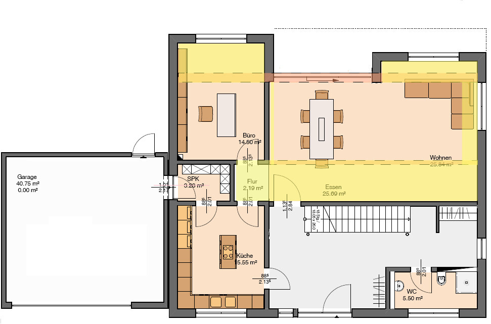
I’ve radically straightened the ground floor of the 213 sqm (2295 sq ft) version (the one with the partition wall) – don’t worry, it will still have character. The dashed line on the garden side shows how far the office used to protrude (about 10cm (4 inches) less), but the shift toward the frontmost old facade line has increased significantly. I have located or created bearing points for the beams. Next to (and at the edges, also between) the beams, there is a suspended ceiling (drywall) for spotlights, and it’s also suitable for partially or fully concealing a projector; the beams themselves will be completely hidden, and the hallway to the kitchen will transition smoothly with a stepped down ceiling. The beams are shown in red/dashed lines, and the adjacent/suspended areas are highlighted in yellow.
I haven’t changed the width yet for this demonstration, but I would probably add at least half a meter (about 1.5 feet) later (more details will emerge when adapting the upper floor). The garage has only been slightly set back for now and hasn’t been further altered.
That’s just to show that with some determination and experience, a design like this can be rescued.
This is roughly how it can look when you start with the structure and do the finishing touches last – not the other way around. First the framework, then the styling.
https://www.instagram.com/11antgmxde/
https://www.linkedin.com/company/bauen-jetzt/
I’ve radically straightened the ground floor of the 213 sqm (2295 sq ft) version (the one with the partition wall) – don’t worry, it will still have character. The dashed line on the garden side shows how far the office used to protrude (about 10cm (4 inches) less), but the shift toward the frontmost old facade line has increased significantly. I have located or created bearing points for the beams. Next to (and at the edges, also between) the beams, there is a suspended ceiling (drywall) for spotlights, and it’s also suitable for partially or fully concealing a projector; the beams themselves will be completely hidden, and the hallway to the kitchen will transition smoothly with a stepped down ceiling. The beams are shown in red/dashed lines, and the adjacent/suspended areas are highlighted in yellow.
I haven’t changed the width yet for this demonstration, but I would probably add at least half a meter (about 1.5 feet) later (more details will emerge when adapting the upper floor). The garage has only been slightly set back for now and hasn’t been further altered.
That’s just to show that with some determination and experience, a design like this can be rescued.
This is roughly how it can look when you start with the structure and do the finishing touches last – not the other way around. First the framework, then the styling.
https://www.instagram.com/11antgmxde/
https://www.linkedin.com/company/bauen-jetzt/
R
R.Hotzenplotz30 Jul 2017 08:06It really gets interesting with the upper floor and whether it’s possible to omit the bay window there.
If that works out, the hip roof will be back in strong contention.
If that works out, the hip roof will be back in strong contention.
R.Hotzenplotz schrieb:
It will get really interesting with the upper floor and whether it’s possible to omit the bay window there. Let’s see when I can manage to implement that. The existing upper floor would fit in (as you can see yourself from the blue line; the outlines are actually smaller). The bay window is removed; in #248 I moved all facades forward to the bay window line.
R.Hotzenplotz schrieb:
If that works out, the hip roof will be a strong contender again. I’m actually leaning towards a flat roof (with a touch of hip roof, haha). Why do you keep talking about a hip roof? — I had the impression you wanted it to be as Bauhaus as possible? — is the hip roof now your favorite? That would be more like Frank Lloyd Wright, so we’ve been on the wrong track so far.
https://www.instagram.com/11antgmxde/
https://www.linkedin.com/company/bauen-jetzt/
Similar topics