
ᐅ Floor plan of a single-family house, approximately 190 sqm, with a basement, drawn on graph paper to scale
Created on: 22 Dec 2021 10:49
H
Hausprojekt35
Hello everyone,
below you will find our design that we feel comfortable with. We took your advice and drew everything on graph paper to the millimeter, without using any “toy furniture” models.
Development Plan / Restrictions
Plot size: 850 sqm (9150 sq ft)
Slope: No
Site coverage ratio: max. 180 sqm (1938 sq ft)
Building envelope, building line and boundary: see sketch
Edge development: see sketch
Number of parking spaces: 2
Number of floors: 2
Roof type: Gable roof
Style: contemporary and timeless
Orientation: west
Maximum heights / limits: Ridge height: 11.50 m (38 ft), Eaves height: 7.50 m (25 ft)
Other requirements: Driveway max. 5 meters (16 feet) wide
Client Requirements
Basement, floors: Yes
Number of occupants, ages: 4 (38, 37, 7, 5)
Office: family use or home office?: Both
Guest overnight stays per year: 6–10 times
Open or closed architecture: “semi-open”
Number of dining seats: 10
Fireplace: No
Music/sound system wall: No
Balcony, roof terrace: No
Garage, carport: Yes
Additional wishes / special features / daily routine, including reasons why something should or should not be:
The dining terrace as well as the kitchen and “outdoor kitchen” are deliberately located on the north side. A forest borders the north, where we can cook and eat outside undisturbed, unobserved, and without direct sunlight. This is important to us and simply feels best; we cook a lot and extensively. Brightness is provided through large sliding windows. The pool shown on the plan already exists on the property. We want to keep it and renovate it later.
House Design
Who designed it: DIY
What do you like most? Why?: All our wishes have been included.
What do you dislike? Why?: Possibly the staircase is too close to the entrance door and the “reception area” feels too cramped?
Personal budget for the house, including fittings: 600,000–650,000
If you had to give up certain details / expansions:
- could you give up: symmetry + southern orientation*
- could not give up: kitchen, dining and living in one line + large kitchen with terrace access + decent cloakroom + spacious living room
*Note: to the south there is a street and a relatively tall neighbouring house. A south-facing garden is not an option for us.
Why is the design as it is now? For example:
We tried many things, did a lot... this orientation and the resulting layout feel right to us according to local conditions. From our point of view, we are using the plot optimally: nice west garden, north side for undisturbed leisure time (privacy from neighbors).
What is the most important / fundamental question about the floor plan in 130 characters?
Do you see any bottlenecks or do the proportions look okay?
P.S.: I forgot to draw the window in the guest WC. The basement access inside the house is located beside the stairs, off the hallway. The assumed stair dimensions are 4.15 m (13 ft 7 in) long and 1.10 m (3 ft 7 in) wide.
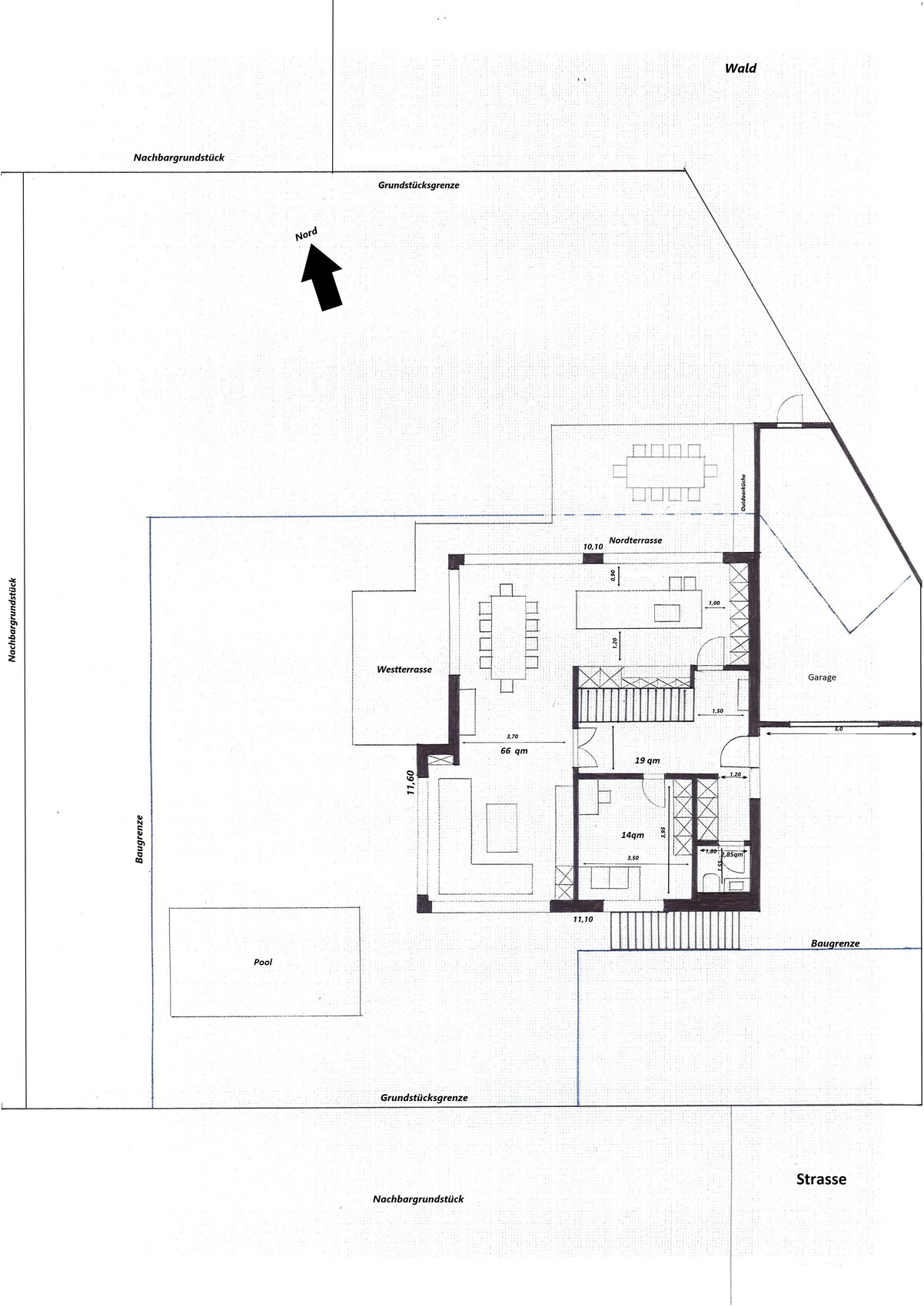
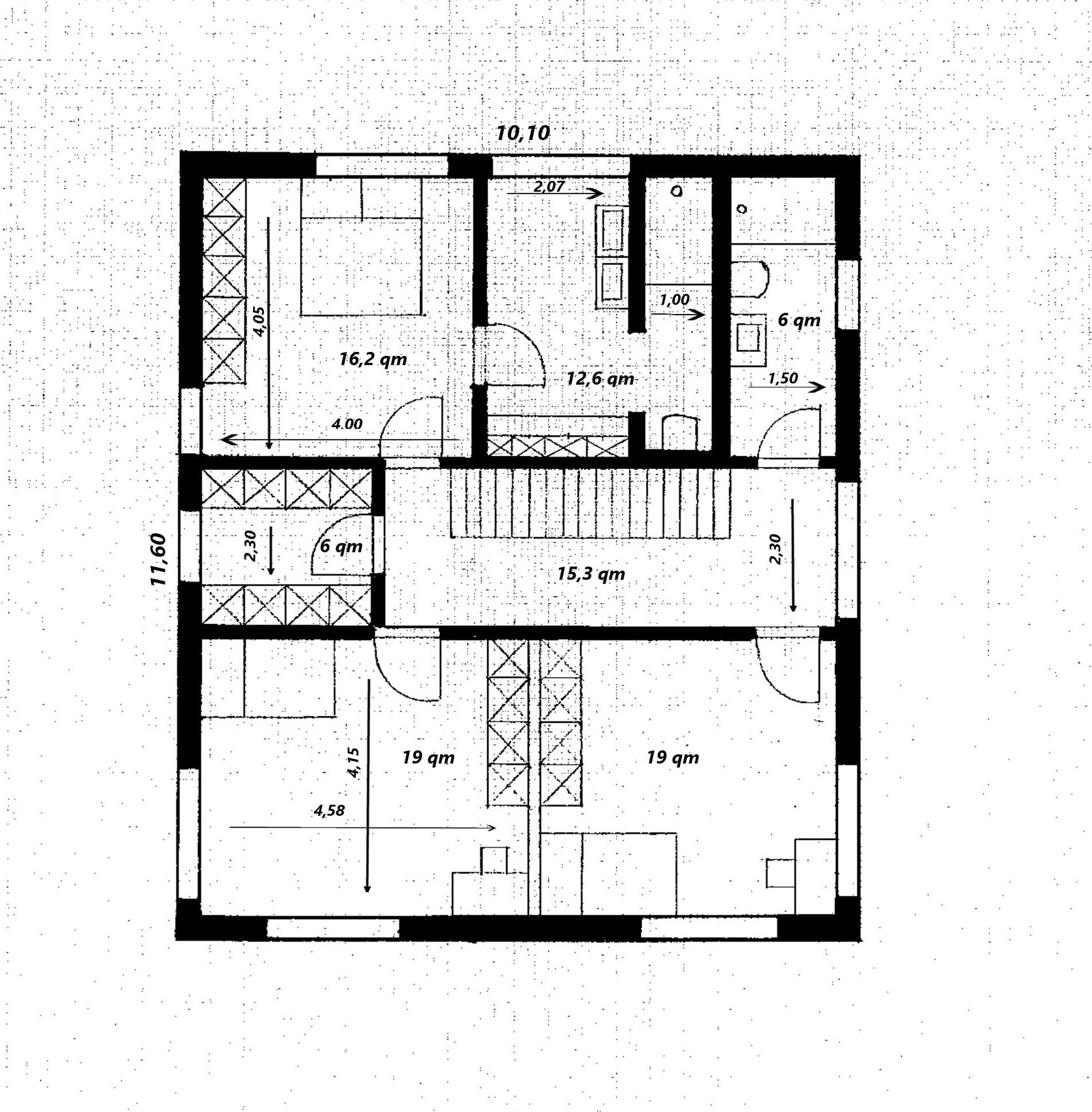
below you will find our design that we feel comfortable with. We took your advice and drew everything on graph paper to the millimeter, without using any “toy furniture” models.
Development Plan / Restrictions
Plot size: 850 sqm (9150 sq ft)
Slope: No
Site coverage ratio: max. 180 sqm (1938 sq ft)
Building envelope, building line and boundary: see sketch
Edge development: see sketch
Number of parking spaces: 2
Number of floors: 2
Roof type: Gable roof
Style: contemporary and timeless
Orientation: west
Maximum heights / limits: Ridge height: 11.50 m (38 ft), Eaves height: 7.50 m (25 ft)
Other requirements: Driveway max. 5 meters (16 feet) wide
Client Requirements
Basement, floors: Yes
Number of occupants, ages: 4 (38, 37, 7, 5)
Office: family use or home office?: Both
Guest overnight stays per year: 6–10 times
Open or closed architecture: “semi-open”
Number of dining seats: 10
Fireplace: No
Music/sound system wall: No
Balcony, roof terrace: No
Garage, carport: Yes
Additional wishes / special features / daily routine, including reasons why something should or should not be:
The dining terrace as well as the kitchen and “outdoor kitchen” are deliberately located on the north side. A forest borders the north, where we can cook and eat outside undisturbed, unobserved, and without direct sunlight. This is important to us and simply feels best; we cook a lot and extensively. Brightness is provided through large sliding windows. The pool shown on the plan already exists on the property. We want to keep it and renovate it later.
House Design
Who designed it: DIY
What do you like most? Why?: All our wishes have been included.
What do you dislike? Why?: Possibly the staircase is too close to the entrance door and the “reception area” feels too cramped?
Personal budget for the house, including fittings: 600,000–650,000
If you had to give up certain details / expansions:
- could you give up: symmetry + southern orientation*
- could not give up: kitchen, dining and living in one line + large kitchen with terrace access + decent cloakroom + spacious living room
*Note: to the south there is a street and a relatively tall neighbouring house. A south-facing garden is not an option for us.
Why is the design as it is now? For example:
We tried many things, did a lot... this orientation and the resulting layout feel right to us according to local conditions. From our point of view, we are using the plot optimally: nice west garden, north side for undisturbed leisure time (privacy from neighbors).
What is the most important / fundamental question about the floor plan in 130 characters?
Do you see any bottlenecks or do the proportions look okay?
P.S.: I forgot to draw the window in the guest WC. The basement access inside the house is located beside the stairs, off the hallway. The assumed stair dimensions are 4.15 m (13 ft 7 in) long and 1.10 m (3 ft 7 in) wide.

Hausprojekt35 schrieb:
If you look down from above onto the gallery, you would see the top panel of the wardrobe without the recessed shower corner. That’s why the bathroom wall was moved further to the left on the plan. Please imagine the view from the staircase above (gallery) towards the window. Do you have the 3D view? Then just stand next to the staircase at the top and look straight ahead. In my opinion, that would look quite awkward. In contrast, the top of the cabinets would bother me less.
Hausprojekt35 schrieb:
The question is whether the drainage on the kitchen tall cabinet side would be so disturbing? Well, everyone has to decide that for themselves. It would bother me if I heard splashing while eating, especially knowing what’s splashing… but okay, better in the kitchen than in the living room. Maybe the architect has another idea for that.
Hausprojekt35 schrieb:
The hallway on the upper floor is as wide as the hallway on the ground floor. We kept them the same width upstairs and downstairs as non-professionals, for statistical reasons. The hallway downstairs is also very wide—actually. It only became (on paper) narrower because you redirected the staircase. I suspect the wall only goes up to the stringer. Visually, the hallway is still quite wide, and you notice that when entering the space. That’s not bad, just unnecessarily expensive.
H
Hausprojekt356 Feb 2022 22:39K a t j a schrieb:
Please imagine the view from the staircase upstairs (gallery) toward the window. Do you have the 3D view? Try standing next to the staircase at the top and look straight ahead. In my opinion, that would look quite unbalanced. In contrast, the top of the cabinets would bother me less. You raise a good point. We’ve already had discussions about this at home… My wife is bothered by the dust surface and appearance above the cabinets. Here are how both options look:
K a t j a schrieb:
The hallway downstairs is also very wide — at least in theory. It was only narrowed on paper because you “wrapped” the staircase. I assume the wall only goes up to the stair stringer. Visually, the hallway remains quite wide, and you feel that when entering the space. That’s not bad, just unnecessarily expensive. You’re right, the hallway could definitely be made narrower. We adopted the “wrapped staircase” idea from the suggestion by @Würfel* in post #29.
One option on the upper floor could be to do without the gallery and place the kids’ bathroom there, as @Würfel* also suggested. The children’s bedrooms would then each be about 3sqm (32 sq ft) larger.

Hausprojekt35 schrieb:
Here are both options:I’m for option 3 (don’t need it, get rid of it) – or are you expecting Philipp Scheidemann or the Pope to give this balcony a place in history?https://www.instagram.com/11antgmxde/
https://www.linkedin.com/company/bauen-jetzt/
H
Hausprojekt357 Feb 2022 23:3111ant schrieb:
I prefer option 3 (no need to break it, get rid of it) – or are you expecting Philipp Scheidemann or the Pope to give this balcony a place in history? We would use the bay window and the roof over the north terrace as a balcony. So, the floor area is not lost. And yes: we would actually use it to hang laundry. Besides that, you can quickly look down into the garden to see what the kids are up to while you’re cleaning, ironing, etc. upstairs. But I agree with you to some extent: whether we will use it as a "chill balcony" in the late evening hours remains to be seen 😉
11ant schrieb:
The hall doesn’t have to create that impression on its own, as it gets plenty of support. I don’t see any substantial improvements, but many changes, practically a constantly new design. Even an infinite monkey can be ridden to death, but you don’t have to ;-) (I’m starting to sound like @driver55, but that’s because of the design). What kind of changes do you think would enhance the floor plan? By the way, it’s not a constantly new design, but ongoing adjustments based on feedback here. Thanks to the help in this forum, we feel we’ve made a significant step forward (see #1).
Hausprojekt35 schrieb:
We would actually use it to hang laundry. I wasn’t referring to the "chill balcony," but to the "gallery," the indoor balcony from which you can shout down to the entrance hall and ask what the mayor of Wesel’s name is. But the Freudian interpreter was quite right, since I also wouldn’t answer the "chill balcony" with "that’s art" in the sense of the Krüger question ;-)
Hausprojekt35 schrieb:
Thanks to the help here, we feel like we’ve made significant progress. Well, that’s really the main thing, at least in a feeling way. If money isn’t an issue, it really doesn’t matter whether, in my opinion, the construction costs per square meter are distributed excellently or awkwardly.
Hausprojekt35 schrieb:
What kind of changes do you think would improve the floor plan? Hmm – maybe removing all homages to Pinterest gimmicks (including those that people try to repackage as features)?
Make a table with all rooms and zones, and enter their areas. Then convert these areas into percentages of the total area, and hypothetically assume that the total area uses 100% of the budget. This way, each room and zone has a cost. If a space’s cost isn’t matched by its value, it gets removed (not just repainted). I wish you good judgment 🙂
https://www.instagram.com/11antgmxde/
https://www.linkedin.com/company/bauen-jetzt/
Similar topics