
ᐅ Floor Plan Design Yard 3 Children’s Rooms, Feeling Frustrated...
Created on: 20 Feb 2026 21:01
B
BarimaGood evening,
I’m having trouble progressing with my/our floor plan.
I want to create a mudroom off the garage where the kids and dog can leave their dirty clothes. At the same time, I would like a separate utility room, pantry, and mechanical room.
The northwest is true north, meaning the yard is located at the top of the floor plan. Currently, with the old house, you drive along the right side of the house to reach the yard at the back. This is where everything happens.
To the left of the house, there is an old building that has been renovated into a holiday home.
Where and how should we plan the back entrance, the mudroom, and efficient routes to the kitchen for groceries?
My husband really wants a gallery in the entrance area.
Do you have any suggestions?
Best regards

I’m having trouble progressing with my/our floor plan.
I want to create a mudroom off the garage where the kids and dog can leave their dirty clothes. At the same time, I would like a separate utility room, pantry, and mechanical room.
The northwest is true north, meaning the yard is located at the top of the floor plan. Currently, with the old house, you drive along the right side of the house to reach the yard at the back. This is where everything happens.
To the left of the house, there is an old building that has been renovated into a holiday home.
Where and how should we plan the back entrance, the mudroom, and efficient routes to the kitchen for groceries?
My husband really wants a gallery in the entrance area.
Do you have any suggestions?
Best regards
Barima schrieb:
I’m stuck with my/our floor plan planning. I can understand that! It’s surprisingly poor because everything is too awkwardly arranged. Please fill out the questionnaire!H
hanghaus202321 Feb 2026 11:55A site plan showing the property and surrounding area. Pictures speak louder than words.

ypg schrieb:
I can understand that! It’s alarmingly bad, because everything is too convoluted. At first glance, I thought this was the current state of an existing building to be renovated—this labyrinth looks that terrifying. From the wall thicknesses, I infer that there is already a specific “prefabricated house” manufacturer involved, one you are negotiating with (or, worst case, already committed to?). Besides my usual advice to “start at the beginning” (see above), I would also recommend getting familiar with their construction grid: be politely dismissive of claims like “we will build your dream floor plan exactly measured to the centimeter.” In timber frame panel construction, the standard stud spacing (usually 625mm (about 25 inches), less often 833mm (about 33 inches), or sometimes different) practically replaces the octameter grid used in masonry construction. Strictly speaking, you would have already started off on the wrong foot if you are fixed on a particular building method this early.
Barima schrieb:
My husband really wants a gallery in the entrance area. … to deliver the blessing “Urbi et Orbi,” present the championship trophy, or declare the republic?
By the way: “meinem” (the nominative case is apparently deadly to the other cases or something).
https://www.instagram.com/11antgmxde/
https://www.linkedin.com/company/bauen-jetzt/

@Barima: Please fill out the questionnaire.
My opinion on the ground floor:
- Garage: What kind of small cars are those shown in the plan? With three children, wouldn’t you usually drive something larger? If there’s no space in the garage, the direct access to the house isn’t very convenient either, since you can’t fully open the door and have to squeeze past bikes, trash bins, etc.
- Pantry: What is supposed to go in there? Two shelves of 30cm (12 inches) each? Or also a freezer? Are the 1.50m (5 feet) referring to the window height or the sill height? I guess it’s the latter, but the windows in the plan are dimensioned inconsistently.
- Hallway: Such a huge entrance area (which I really like, especially in such a large house), but then this dark, small hallway? I’m not too fond of that.
- Doors: Are the doors rather narrow, or is that just an optical illusion?
- Mudroom: I would consider combining this room with another space; otherwise, it will become more compartmentalized. Maybe the utility/heating room would be a better option? Then muddy pants can dry more quickly, and the laundry/housekeeping room stays clean.
- Kitchen: I would reconsider the distance between the kitchen counter and the island. It seems quite large.
Upper floor:
- Could you show some exterior views? I don’t understand all these small windows. Also, I’m unclear about the height/sill height.
My opinion on the ground floor:
- Garage: What kind of small cars are those shown in the plan? With three children, wouldn’t you usually drive something larger? If there’s no space in the garage, the direct access to the house isn’t very convenient either, since you can’t fully open the door and have to squeeze past bikes, trash bins, etc.
- Pantry: What is supposed to go in there? Two shelves of 30cm (12 inches) each? Or also a freezer? Are the 1.50m (5 feet) referring to the window height or the sill height? I guess it’s the latter, but the windows in the plan are dimensioned inconsistently.
- Hallway: Such a huge entrance area (which I really like, especially in such a large house), but then this dark, small hallway? I’m not too fond of that.
- Doors: Are the doors rather narrow, or is that just an optical illusion?
- Mudroom: I would consider combining this room with another space; otherwise, it will become more compartmentalized. Maybe the utility/heating room would be a better option? Then muddy pants can dry more quickly, and the laundry/housekeeping room stays clean.
- Kitchen: I would reconsider the distance between the kitchen counter and the island. It seems quite large.
Upper floor:
- Could you show some exterior views? I don’t understand all these small windows. Also, I’m unclear about the height/sill height.
I have highlighted the biggest mistakes.
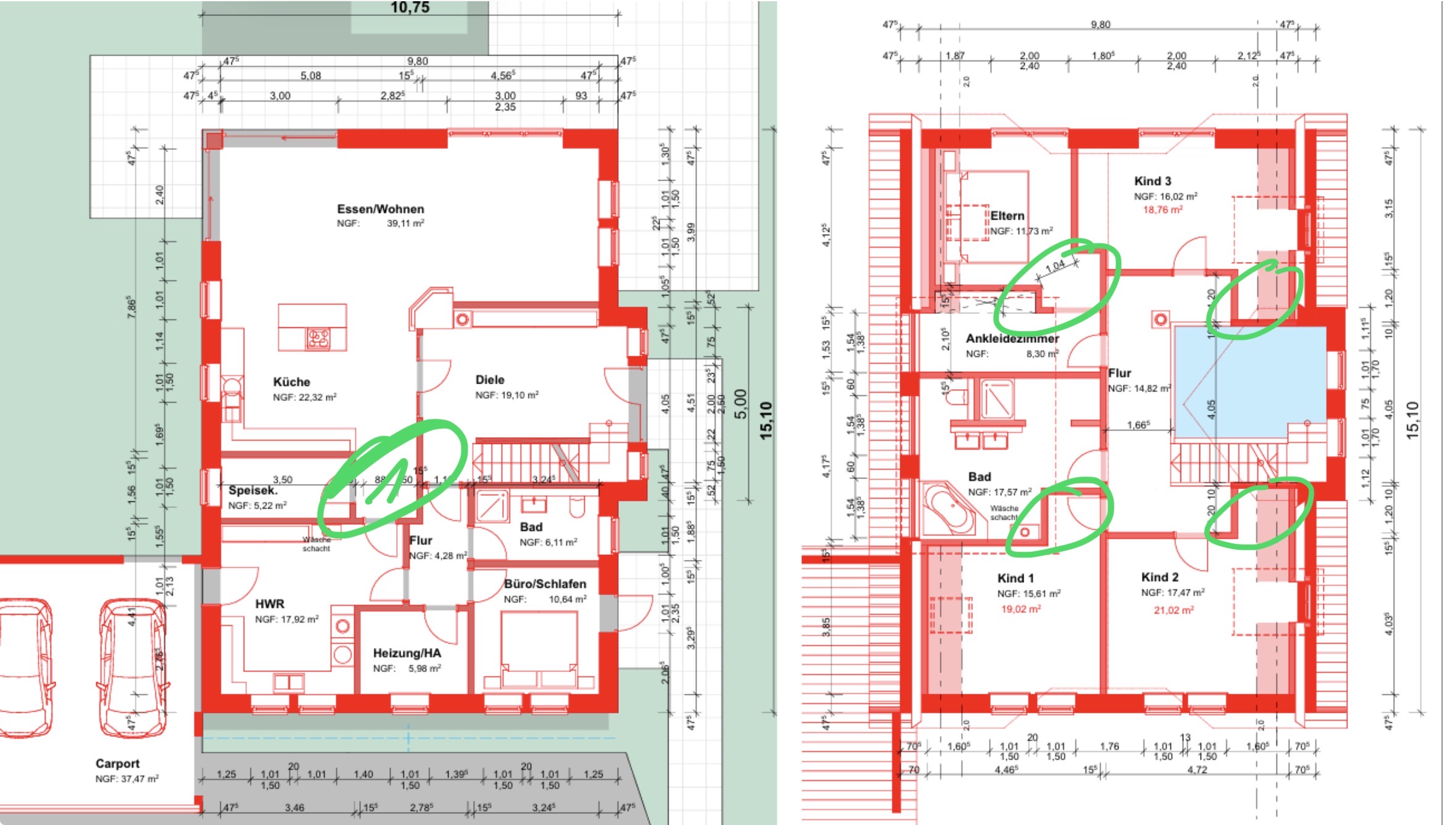
This kind of thing should of course be avoided. These are tight spots, awkward corners, or simply unnecessary.
The third hallway on the ground floor, meaning the space in front of the pantry and utility room, is completely unnecessary and also not attractive at all. It creates a dark dead space in the room, the hallway requires additional lighting, and it reduces the size of the kitchen. If you enlarge the pantry toward the hallway, you get a straight, more practical layout. I really don’t understand how anyone comes up with something like this.
The same applies to the bedroom: who wants to bump into or catch themselves on wall corners when getting up at night in the dark? You also won’t be able to move the bed easily through this narrow passage without it getting stuck.
Furthermore, the room of child 3 suffers. Planning errors can be sugarcoated by saying niches and corners are practical. In reality, the room ends up missing a corner or even has two dirty corners in the children’s rooms, which might be “practical” for hiding stuff but spoil the space. These niches won’t work as built-in wardrobes either.
The entrance to child 2’s room, which first confronts you with a wall, doesn’t improve the space either. Here again, placing furniture becomes a real challenge.
I get the feeling that perfectly symmetrical windows were placed within the building shell first, and then the rooms and entrances were awkwardly squeezed in afterward. Proper spatial planning based on functional living principles simply wasn’t done.
If you planned according to Feng Shui (it’s always a good idea to have the Bagua in mind or print it out if necessary), none of this would happen. For example, child 3’s room has a deficiency in the knowledge area but a surplus in the good friends section, where it is very likely that stuff is stored, which is counterproductive for the room’s purpose.
This kind of thing should of course be avoided. These are tight spots, awkward corners, or simply unnecessary.
The third hallway on the ground floor, meaning the space in front of the pantry and utility room, is completely unnecessary and also not attractive at all. It creates a dark dead space in the room, the hallway requires additional lighting, and it reduces the size of the kitchen. If you enlarge the pantry toward the hallway, you get a straight, more practical layout. I really don’t understand how anyone comes up with something like this.
The same applies to the bedroom: who wants to bump into or catch themselves on wall corners when getting up at night in the dark? You also won’t be able to move the bed easily through this narrow passage without it getting stuck.
Furthermore, the room of child 3 suffers. Planning errors can be sugarcoated by saying niches and corners are practical. In reality, the room ends up missing a corner or even has two dirty corners in the children’s rooms, which might be “practical” for hiding stuff but spoil the space. These niches won’t work as built-in wardrobes either.
The entrance to child 2’s room, which first confronts you with a wall, doesn’t improve the space either. Here again, placing furniture becomes a real challenge.
I get the feeling that perfectly symmetrical windows were placed within the building shell first, and then the rooms and entrances were awkwardly squeezed in afterward. Proper spatial planning based on functional living principles simply wasn’t done.
If you planned according to Feng Shui (it’s always a good idea to have the Bagua in mind or print it out if necessary), none of this would happen. For example, child 3’s room has a deficiency in the knowledge area but a surplus in the good friends section, where it is very likely that stuff is stored, which is counterproductive for the room’s purpose.
Similar topics