
ᐅ Single-family home facade design, feedback and ideas, broom finish plaster
Created on: 28 Jun 2020 15:04
M
mini_g!
Happy Sunday everyone!
We’re starting the implementation of our project next week. The excavation for the foundation pit will begin. Here is the discussion about it: https://www.hausbau-forum.de/threads/neubau-efh-ca-174-m-grundriss-architekt.32936/
Soon we will have to make decisions about the exterior design—such as color, texture, and window color. I’d like to ask for your opinion again.
Since it’s difficult to summarize everything, I’ll try to describe it more “emotionally.” We want the house to be a bit different. Inside, some special features are planned. On the ground floor, there is only one door—to the guest toilet. All other openings are full height, reaching the ceiling. One wall will be made of exposed concrete, and we want to keep the ceiling concrete as well.
On the upper floor, the roof is open. Instead of drywall with sprayed plaster, we are considering using Heraklith/Heradesign panels on the ceiling.
For the exterior, we also want the house to stand out from the common styles found in both new developments and older neighborhoods in our area. In new residential areas, the standard is gray or black bricks, a rather fine white plaster façade, and windows in anthracite gray / RAL 7016. Occasionally there is a bay window in dark tones and some wooden elements. Deviations from this are already unusual.
In older neighborhoods, you usually find red bricks with white façades and windows.
Currently, our ideas are as follows:
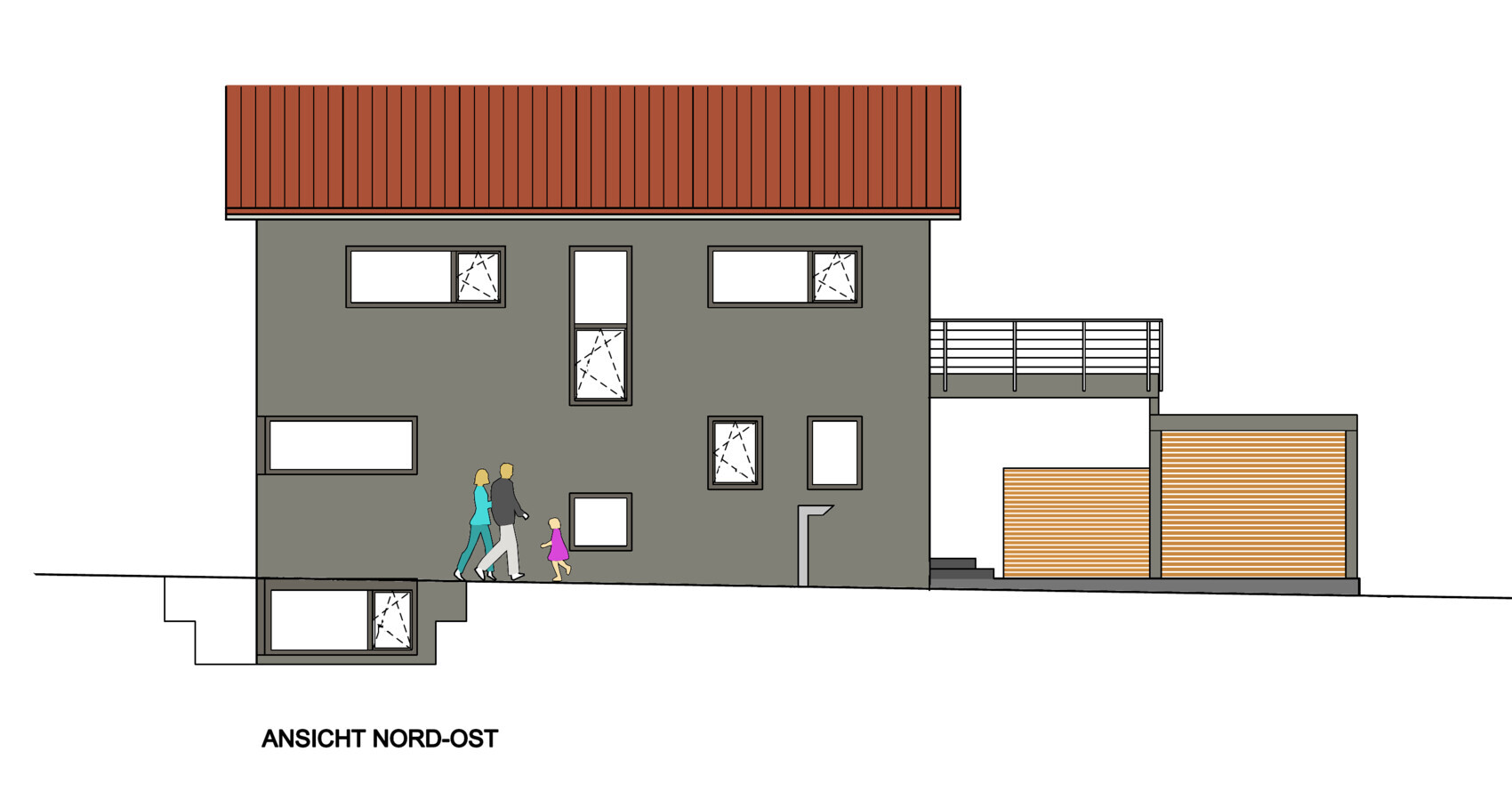
I’ve tried to visualize this as attached. What does the community think?
Are there any concepts for how to ideally put together an exterior design? Do you have alternative suggestions, especially for façade color? Are you aware of other examples of broom-finish façades?
Best regards! mini_g!
P.S. No one with a white façade and gray bricks should feel offended. It’s very possible we will fall back on that—it is a beautiful combination!
We’re starting the implementation of our project next week. The excavation for the foundation pit will begin. Here is the discussion about it: https://www.hausbau-forum.de/threads/neubau-efh-ca-174-m-grundriss-architekt.32936/
Soon we will have to make decisions about the exterior design—such as color, texture, and window color. I’d like to ask for your opinion again.
Since it’s difficult to summarize everything, I’ll try to describe it more “emotionally.” We want the house to be a bit different. Inside, some special features are planned. On the ground floor, there is only one door—to the guest toilet. All other openings are full height, reaching the ceiling. One wall will be made of exposed concrete, and we want to keep the ceiling concrete as well.
On the upper floor, the roof is open. Instead of drywall with sprayed plaster, we are considering using Heraklith/Heradesign panels on the ceiling.
For the exterior, we also want the house to stand out from the common styles found in both new developments and older neighborhoods in our area. In new residential areas, the standard is gray or black bricks, a rather fine white plaster façade, and windows in anthracite gray / RAL 7016. Occasionally there is a bay window in dark tones and some wooden elements. Deviations from this are already unusual.
In older neighborhoods, you usually find red bricks with white façades and windows.
Currently, our ideas are as follows:
- Creaton Magnum bricks in copper red engobed finish
- Eaves underside in light gray HPL, with no visible rafters or purlins
- For example, Fundermax 0741NT (Birch Grey)
- Façade with broom-finish plaster in a gray shade with a slightly earthy tone
- Example of broom finish: Google search “weberFassade besenstrich essen”
- Window reveals smoothly plastered, same color as façade
- Base plaster either matching the rest of the façade or offset, smooth and slightly darker
- Windows in gray, for example RAL 7039
- Carport still unclear, possibly matching the color of the eaves underside
- Cladding with rhombus-profile boards
I’ve tried to visualize this as attached. What does the community think?
Are there any concepts for how to ideally put together an exterior design? Do you have alternative suggestions, especially for façade color? Are you aware of other examples of broom-finish façades?
Best regards! mini_g!
P.S. No one with a white façade and gray bricks should feel offended. It’s very possible we will fall back on that—it is a beautiful combination!
tomtom79 schrieb:
Before you start thinking about colors, you should first be clear about the size and arrangement of your windows. Could you explain that? The architect took care of the overall harmony, which I think turned out quite well. However, there are rooms behind the windows with different uses. Symmetry might have to be compromised there, but I don’t find that problematic. What would you change?
Bertram100 schrieb:
If you dare: bold colors, a nice, true yellow or a grass green. Or paint parts of the house. Or use colored tiles. That’s quite common here in the city and looks really good. I don’t see it as bold color. We prefer subdued tones. The question is how to find a harmonious combination of roof, facade, and windows. Are there basic guidelines?
Best regards! mini
P
pagoni202029 Jun 2020 12:35I would be careful not to try and do things differently "by force." Nowadays, a classic, straightforward design is often what stands out. What used to be just an ugly bay window (oh dear, of course, I had one too) or uniquely shaped roof tiles is now simply something different.
For the roof, I would prefer a classic or simple shape and color (which might also be more affordable). For the plaster, I would go bold with color (whether gray, green, or red...) but with intensity, and maybe add a contrasting splash of color on the front door and the carport or diamond-shaped siding in strong colors. So, I would favor color more on the carport than on the roof. A striking, large plant in front of the house would be interesting as well.
Back then, we tried all sorts of things and (unfortunately) even went as far as a green bathtub with particularly rounded sinks and bright red faucets... unthinkable today, coming straight from the building fair into our house. I found it mostly charmingly crazy, but in reality, it was just crazy and expensive.
Like many front yards, you often get the feeling of walking through a big-box hardware store display. Here too, I prefer individuality without strict guidelines.
A concrete ceiling or wall can certainly look nice, but having it plastered later as a backup option would not be an option for me.
Maybe you could have everything plastered first and then experiment on your own with paint or design in some areas, which can be easier to adjust if needed. Nowadays, there are wall finishes that mimic concrete, natural stone, wood, or even large wall murals, and so on.
For me, the motto would be "less is more," but where I do add accents, they should be bold and confidently visible.
For the roof, I would prefer a classic or simple shape and color (which might also be more affordable). For the plaster, I would go bold with color (whether gray, green, or red...) but with intensity, and maybe add a contrasting splash of color on the front door and the carport or diamond-shaped siding in strong colors. So, I would favor color more on the carport than on the roof. A striking, large plant in front of the house would be interesting as well.
Back then, we tried all sorts of things and (unfortunately) even went as far as a green bathtub with particularly rounded sinks and bright red faucets... unthinkable today, coming straight from the building fair into our house. I found it mostly charmingly crazy, but in reality, it was just crazy and expensive.
Like many front yards, you often get the feeling of walking through a big-box hardware store display. Here too, I prefer individuality without strict guidelines.
A concrete ceiling or wall can certainly look nice, but having it plastered later as a backup option would not be an option for me.
Maybe you could have everything plastered first and then experiment on your own with paint or design in some areas, which can be easier to adjust if needed. Nowadays, there are wall finishes that mimic concrete, natural stone, wood, or even large wall murals, and so on.
For me, the motto would be "less is more," but where I do add accents, they should be bold and confidently visible.

mini_g! schrieb:
We want the house to be a bit different.Oh :-( you should have said that earlier. With this simple and understated design, that would have been the last thing I thought of, and if you had mentioned it sooner, we could have guided you toward achieving that goal. Punk expressed through muted colors at best becomes gothic punk, but not original, elegant, or anything that would help it stand out positively – thank you for traveling with Geisterbahn. What a shame.https://www.instagram.com/11antgmxde/
https://www.linkedin.com/company/bauen-jetzt/
11ant schrieb:
Oh :-( you should have mentioned that earlier. With such a simple and subtle design, that would have been the last thing I expected, and if you had said it earlier, you could have been guided to achieve that goal. Punk, at best, becomes goth punk through muted colors, but not original or elegant or anything that would help it stand out positively – thank you for traveling with the ghost train. What a pity. As I said, it remains just an ordinary single-family house like many others. Just as a golf car doesn’t become unique with a body kit.
Maybe I’m softening my stance and suggesting it should have a color other than white and no textured plaster. Is that better?
After all, your own children are always something special, right?
Best regards! mini
P
pagoni202029 Jun 2020 13:56mini_g! schrieb:
As I said, it’s just a plain single-family house like many others. Just as a Golf car doesn’t become unique with a body kit.
Maybe I’m softening my stance and saying it should be a different color than white and no textured plaster. Is that better?
After all, your own children are always something special, right?
Best regards! mini Your single-family house isn’t necessarily a “plain” house; it only becomes that way if you make it so. Especially inside, it can be something special, unless you try to enforce a sort of forced revolution.
Not too many small, playful details—instead, something generous and strong, whatever you do or what you like.
Children are only “special” to their own parents; to other parents, they are just some children—there really isn’t a difference.
Maybe try the opposite: a calm roof and a strong house color, and then see what you LIKE.

mini_g! schrieb:
Can you explain that? The architect took care of the harmonization, and I think it turned out quite well.Are there other opinions?Somehow, I find the side looks wild, not aligned. The windows should line up better.
Similar topics