ᐅ What does the color "sto 16024, HB 81, C1" mean? Correction of a wrong decision.
Created on: 3 Apr 2022 12:01
P
Pinkiponk
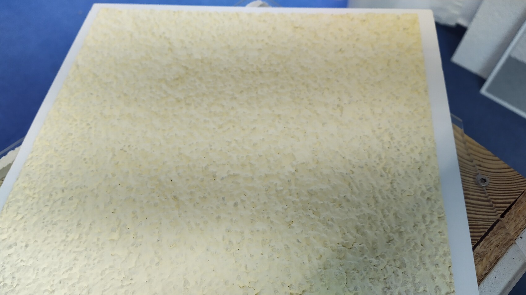
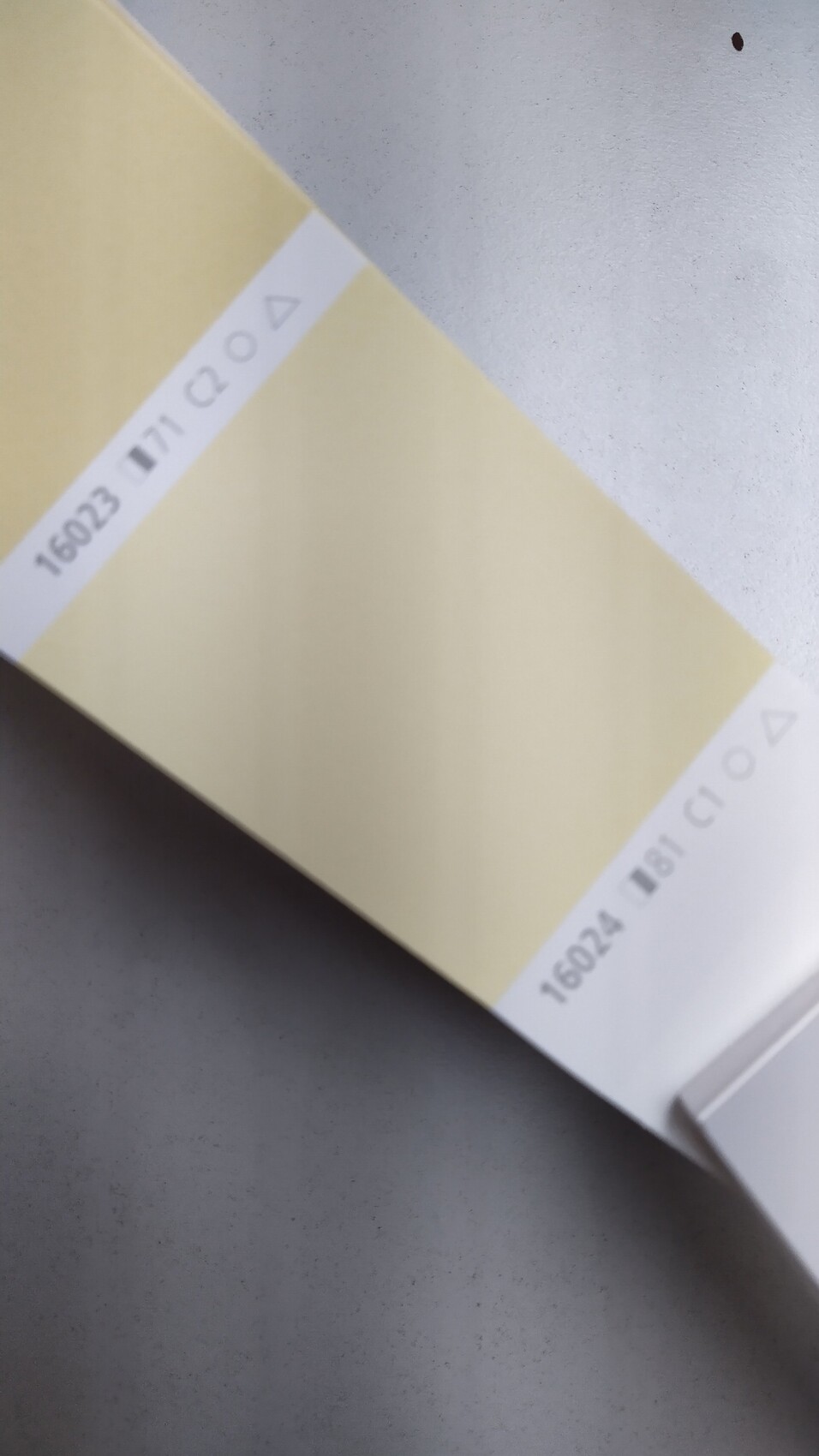
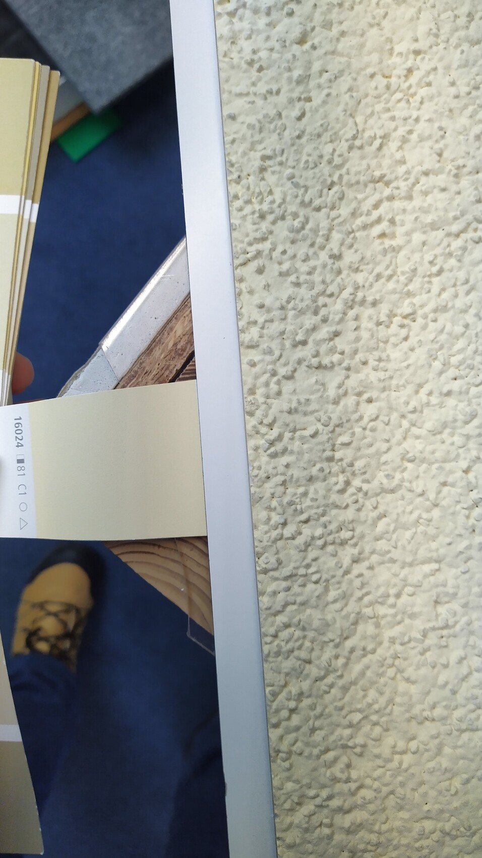
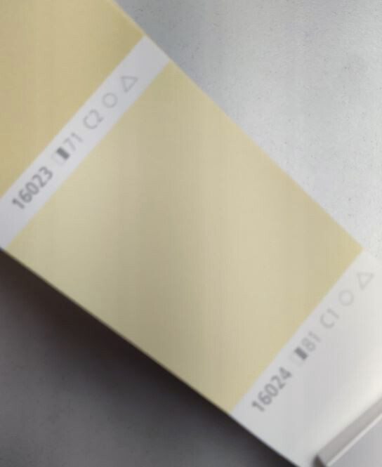
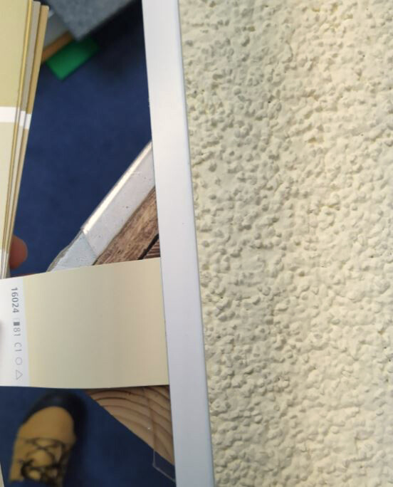
As mentioned in another thread, during the sample selection we chose the exterior facade color (including the base) "sto 16024, HB 81, C1," described as "silicone resin, diffusely open," "scratch render K3." On the small sample card, the color appeared very warm and light, which is exactly what we wanted. However, when I searched online for this color, I only found a sample for "sto 16024" (see photo), which looks much too dark to me.
Does anyone know what the additional labels "HB 81, C1" mean and whether they indicate that the color overall is lighter than "sto 16024"? Your feedback is very important to me, as we still have the option to change the color choice at the moment. Thank you in advance. :-)
Does anyone know what the additional labels "HB 81, C1" mean and whether they indicate that the color overall is lighter than "sto 16024"? Your feedback is very important to me, as we still have the option to change the color choice at the moment. Thank you in advance. :-)
P
Pinkiponk5 Apr 2022 11:41One more question:
Is it true that colors appear darker on larger surfaces compared to lighter areas?
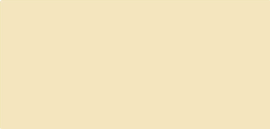
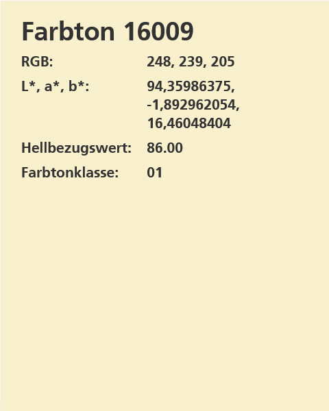
I have now chosen the color sto 16009, which seems to have the highest light reflectance value of 86 in the "yellow" color group. It appears that sto does not offer a lighter yellow, unless I have overlooked something.
Will the difference in light reflectance values from 81 to 86 be noticeable to the human eye when standing in front of the facade? Thanks. 🙂
Is it true that colors appear darker on larger surfaces compared to lighter areas?
I have now chosen the color sto 16009, which seems to have the highest light reflectance value of 86 in the "yellow" color group. It appears that sto does not offer a lighter yellow, unless I have overlooked something.
Will the difference in light reflectance values from 81 to 86 be noticeable to the human eye when standing in front of the facade? Thanks. 🙂

Let me tell you that colors can only be defined by numbers in theory.
- Everyone perceives colors differently
- Colors look different on every surface
- Colors appear differently depending on the lighting
- Contrasts can either intensify or weaken the effect
This already led to some funny situations in our new housing development. One person chose a shade that is actually a very light brown. When it’s cloudy, it looks like it has a slight purple tint.
Another person had a bay window painted in a brown tone—a rather strong shade between beige and brown—while the rest of the facade was painted three levels lighter within the same color range, so a lighter tone from the same scheme. I can tell you, in most weather conditions, you would say the house is white. But place something white next to it, and you’ll be surprised how big the difference actually is.
I’ll repeat my advice: have three samples made and hold them up on different sides of your house under various lighting conditions. And yes, large surfaces can still look different.
Or once the plaster is applied, have three test patches painted on the wall in one spot.
Edit: Can you tell the difference between 81 and 86? No idea. But 81 and 86 are both very, very light tones.

Pinkiponk schrieb:
that strange beige, which is far from a warm yellow. I would say it is similar to "vanilla," like what is called "chamois" in the stationery trade, so quite far from "lemon sorbet." Both 16024 and 16009 I would clearly assign to the sand color spectrum rather than the yellow spectrum.
https://www.instagram.com/11antgmxde/
https://www.linkedin.com/company/bauen-jetzt/
P
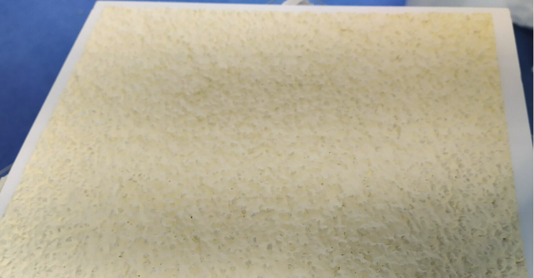
Pinkiponk6 Apr 2022 09:39I recently received photos from our material consultant that exactly match what we believe we have chosen and desire. Attached are three photos. On-site, we were able to see larger plaster samples and are confident that we will like this color on our house. 🙂 A light, cheerful color, in my opinion. It doesn’t look as nice when shadows fall on it, but we would have to accept that with any color.
P
Pinkiponk6 Apr 2022 09:50ypg schrieb:
I bet it’s the standard yellow commonly used to paint many plastered houses! 😎Just out of curiosity. Is it the standard yellow? I’m really interested in your opinion. There are at least three other yellow houses on our street, so we can compare sometime. 🙂 So… in my job, I use grey wedges or a grey card in photography when it comes to color. My screen—whether it’s a phone, iPad, PC, or Mac—displays different colors. To trained eyes; laypeople don’t need to notice the difference.
But if there are only supposed to be three shades of yellow, then I probably know two in the facade area: a dull one and a bright one. Yours, in my opinion, is the more pleasant yellow, leaning more towards cream, and the standard yellow I know.
Here are your photos with the color cast removed 😉
A bit friendlier now, right?
Similar topics