ᐅ Semi-detached house: approximately 145 sqm with a pitched roof – potential for improvement in the bathroom?
Created on: 26 Aug 2019 10:46
S
Strahleman
Hello everyone,
I hesitated for a long time about whether to share our building project here. Mainly for one simple reason: many of you are brutally honest, and of course, you don’t want your floor plan, which you’ve grown so attached to, to be torn apart. But it doesn’t help if, after a few years, you realize the house was built blindly. So I’ve decided to ask for your (partly professional) opinions on our project.
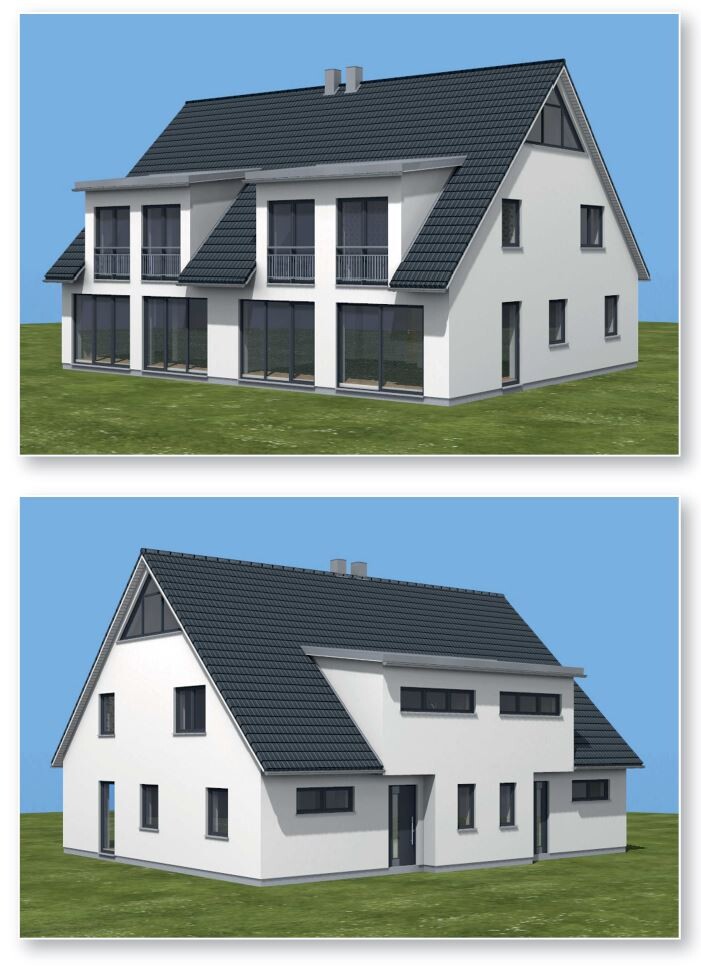
To give you some context: it’s a semi-detached house with about 145 sqm (1,560 sq ft) in a quiet residential area. The development plan is fairly recent (from 2013) and is designed flexibly enough that basically all our wishes and requirements for the house can be realized.
About the project:
Development Plan / Restrictions
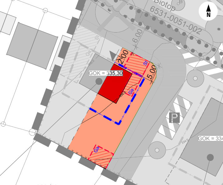
Plot size: approx. 415 sqm (4,465 sq ft)
Slope: none, just slightly inclined (max. 0.5 m (1.6 ft) over 33 m (108 ft))
Site coverage ratio: 0.4
Floor area ratio: 1.0
Building area, building line, and boundaries: see development plan (building area large enough for the project, approx. 10 x 15 m (33 x 49 ft))
Number of parking spaces: 2
Number of floors: max. 2
Roof type: gable roof
Orientation: southwest
Maximum height restrictions: max. 9.60 m (31.5 ft) (9 m (29.5 ft) house + 0.6 m (2 ft) foundation slab above ground level)
Homeowners’ Requirements
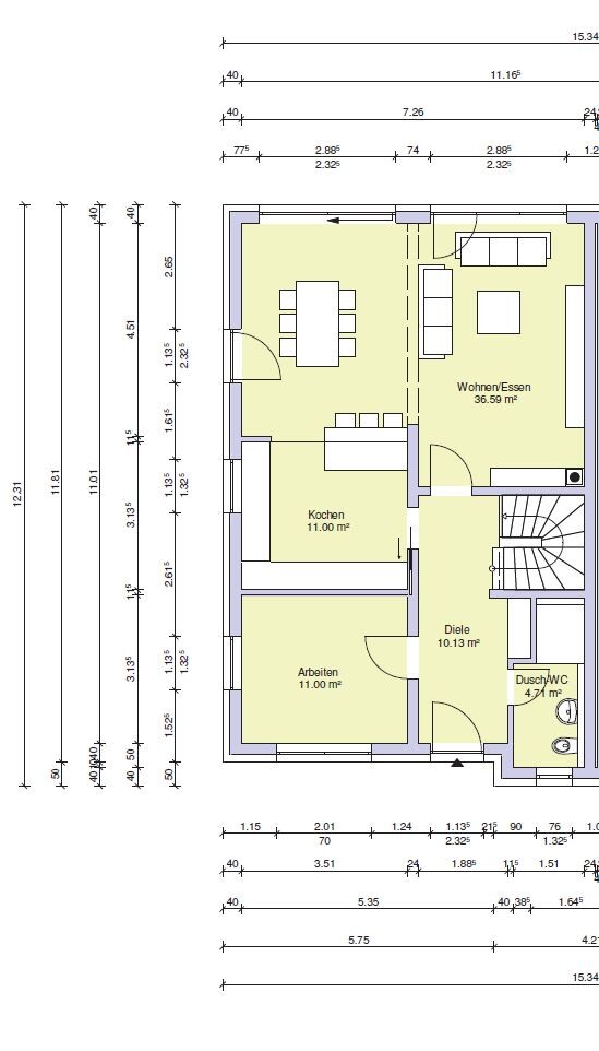
Style, roof shape, building type: a mix of gable roof and Bauhaus style, bright living room and children’s rooms with large windows on the south side
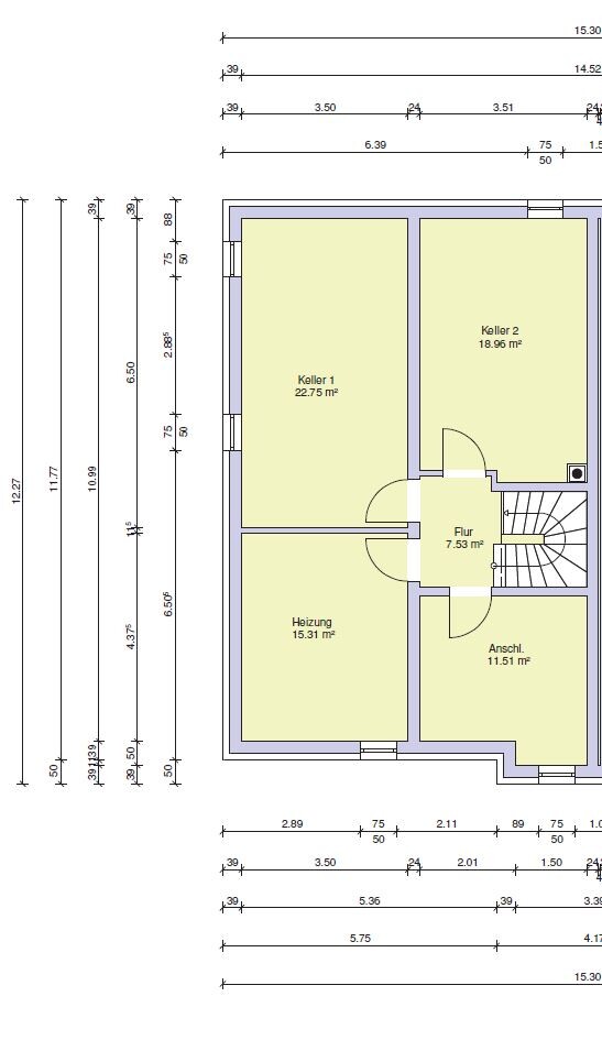
Basement, floors: yes to basement (full height living space), ground floor, upper floor
Number of occupants, ages: currently 2 (33, 30 years old), planning for 1-2 children
Space requirements on ground and upper floors:
Office: study room for my wife (teacher)
Overnight guests per year: very rare, max. 1-2 times a year
Open or closed layout: ground floor open layout (kitchen-dining-living area)
Conservative or modern construction style: mixed (?!?)
Open kitchen, cooking island: open kitchen, separated cooking area against a wall, but no freestanding island
Number of dining seats: 4-6
Fireplace: optional, initially not planned (chimney will be installed)
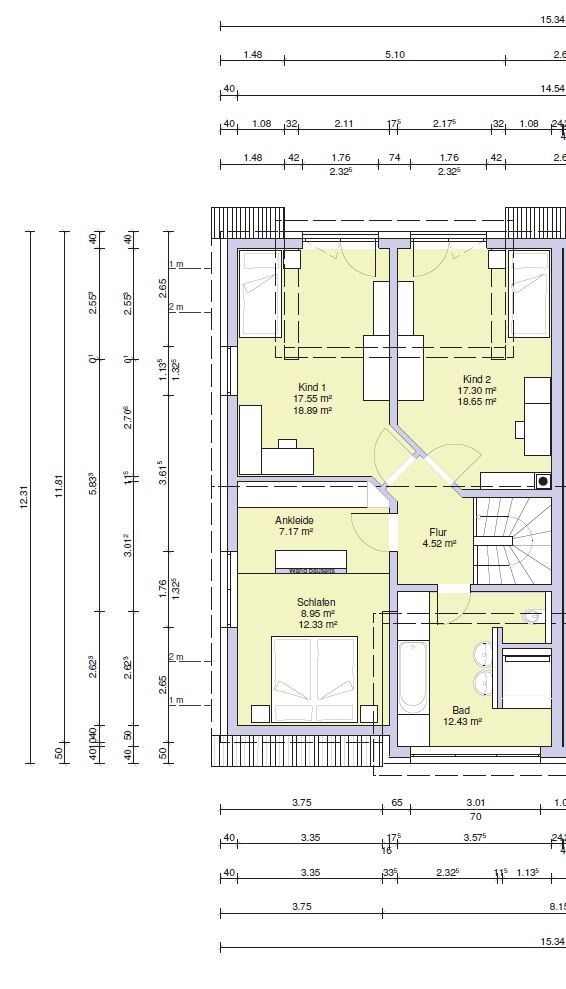
Balcony, roof terrace: no, French balconies on the upper floor
Garage, carport: double carport planned
House Design
Who designed it: planner from a building company
What do you particularly like? Why?
Good room layout (children’s rooms not too small, fairly evenly distributed), despite the gable roof, there is a large share of full ceiling height rooms on the upper floor
What do you not like? Why?
Preferred heating system: ground source heat pump with horizontal trench collector, underfloor heating (+ heating circuit adjustment)
If you had to give up something, what details or features could you let go of?
Could probably give up: finishing the basement for living purposes, comfort features like heating circuit adjustment, or walk-in showers
Cannot give up: the office on the ground floor
Why did the design turn out this way?
The design is based on a standard layout from the planner, which we modified with our own ideas and wishes such as the office on the ground floor and the T-shaped bathroom. From our perspective, the floor plan is internally consistent, and it reflects our daily life needs. For example, it was important to my wife to have an office on the ground floor so she can immediately put away work things after coming home instead of having them scattered around before moving them upstairs. The open kitchen-dining-living area with large windows offers space and feels very homely without large empty areas. Additionally, there is enough storage space in the kitchen, so you don’t have to run to the basement for every can of food. The separate hallway with stairs to the upper floor is also very nice for us, as the living room does not become a thoroughfare.
We are unsure about the sofa as a divider in the living-dining area. There is about 1.3 m (4.3 ft) between the dining table and sofa, so it shouldn’t be a tight spot, right?
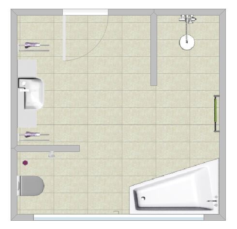
The upper floor is also balanced in size, with a small dressing room visually separated by a low wall. A wardrobe directly opposite the bed was a no-go for us. Possible improvements might be needed in the bathroom. The T-shaped bathroom was initially a wish of ours, but it now feels somewhat unorganized. We have already considered an alternative that makes the room appear larger while still visually separating the toilet and shower from the rest of the bathroom. The shower in the alternative layout would be 1.1 x 1.3 m (3.6 x 4.3 ft), similar to the T-shaped bathroom, and the toilet would be separated from the rest by a half-height wall to allow more light inside. The toilet area would also be 1.1 x 1.1 m (3.6 x 3.6 ft), as in the T-shaped bathroom.
By the way, the roof is initially not planned to be finished as living space, but it is prepared so that this can be added later if needed.
What is the most important/fundamental question about the floor plan in 130 characters?
Are there any points, layouts, or rooms that could be improved? We like the plan, but here are many experts with the right eye for details.
Note on the designs: The window on the east side in the office is floor-to-ceiling, allowing direct garden access from the office. In the master bedroom, a roof window above the bed brings in more light. Neither is shown on the plan yet.
Looking forward to your opinions!
I hesitated for a long time about whether to share our building project here. Mainly for one simple reason: many of you are brutally honest, and of course, you don’t want your floor plan, which you’ve grown so attached to, to be torn apart. But it doesn’t help if, after a few years, you realize the house was built blindly. So I’ve decided to ask for your (partly professional) opinions on our project.
To give you some context: it’s a semi-detached house with about 145 sqm (1,560 sq ft) in a quiet residential area. The development plan is fairly recent (from 2013) and is designed flexibly enough that basically all our wishes and requirements for the house can be realized.
About the project:
Development Plan / Restrictions
Plot size: approx. 415 sqm (4,465 sq ft)
Slope: none, just slightly inclined (max. 0.5 m (1.6 ft) over 33 m (108 ft))
Site coverage ratio: 0.4
Floor area ratio: 1.0
Building area, building line, and boundaries: see development plan (building area large enough for the project, approx. 10 x 15 m (33 x 49 ft))
Number of parking spaces: 2
Number of floors: max. 2
Roof type: gable roof
Orientation: southwest
Maximum height restrictions: max. 9.60 m (31.5 ft) (9 m (29.5 ft) house + 0.6 m (2 ft) foundation slab above ground level)
Homeowners’ Requirements
Style, roof shape, building type: a mix of gable roof and Bauhaus style, bright living room and children’s rooms with large windows on the south side
Basement, floors: yes to basement (full height living space), ground floor, upper floor
Number of occupants, ages: currently 2 (33, 30 years old), planning for 1-2 children
Space requirements on ground and upper floors:
Office: study room for my wife (teacher)
Overnight guests per year: very rare, max. 1-2 times a year
Open or closed layout: ground floor open layout (kitchen-dining-living area)
Conservative or modern construction style: mixed (?!?)
Open kitchen, cooking island: open kitchen, separated cooking area against a wall, but no freestanding island
Number of dining seats: 4-6
Fireplace: optional, initially not planned (chimney will be installed)
Balcony, roof terrace: no, French balconies on the upper floor
Garage, carport: double carport planned
House Design
Who designed it: planner from a building company
What do you particularly like? Why?
Good room layout (children’s rooms not too small, fairly evenly distributed), despite the gable roof, there is a large share of full ceiling height rooms on the upper floor
What do you not like? Why?
Preferred heating system: ground source heat pump with horizontal trench collector, underfloor heating (+ heating circuit adjustment)
If you had to give up something, what details or features could you let go of?
Could probably give up: finishing the basement for living purposes, comfort features like heating circuit adjustment, or walk-in showers
Cannot give up: the office on the ground floor
Why did the design turn out this way?
The design is based on a standard layout from the planner, which we modified with our own ideas and wishes such as the office on the ground floor and the T-shaped bathroom. From our perspective, the floor plan is internally consistent, and it reflects our daily life needs. For example, it was important to my wife to have an office on the ground floor so she can immediately put away work things after coming home instead of having them scattered around before moving them upstairs. The open kitchen-dining-living area with large windows offers space and feels very homely without large empty areas. Additionally, there is enough storage space in the kitchen, so you don’t have to run to the basement for every can of food. The separate hallway with stairs to the upper floor is also very nice for us, as the living room does not become a thoroughfare.
We are unsure about the sofa as a divider in the living-dining area. There is about 1.3 m (4.3 ft) between the dining table and sofa, so it shouldn’t be a tight spot, right?
The upper floor is also balanced in size, with a small dressing room visually separated by a low wall. A wardrobe directly opposite the bed was a no-go for us. Possible improvements might be needed in the bathroom. The T-shaped bathroom was initially a wish of ours, but it now feels somewhat unorganized. We have already considered an alternative that makes the room appear larger while still visually separating the toilet and shower from the rest of the bathroom. The shower in the alternative layout would be 1.1 x 1.3 m (3.6 x 4.3 ft), similar to the T-shaped bathroom, and the toilet would be separated from the rest by a half-height wall to allow more light inside. The toilet area would also be 1.1 x 1.1 m (3.6 x 3.6 ft), as in the T-shaped bathroom.
By the way, the roof is initially not planned to be finished as living space, but it is prepared so that this can be added later if needed.
What is the most important/fundamental question about the floor plan in 130 characters?
Are there any points, layouts, or rooms that could be improved? We like the plan, but here are many experts with the right eye for details.
Note on the designs: The window on the east side in the office is floor-to-ceiling, allowing direct garden access from the office. In the master bedroom, a roof window above the bed brings in more light. Neither is shown on the plan yet.
Looking forward to your opinions!
kbt09 schrieb:
What I also noticed is that, since it seems to be a zero knee wall, the 2m (6 ft 7 in) line in the bedroom is too far away from the wall at the bottom of the plan. First, the bed's headboard can’t be very tall, and it would feel quite cramped lying there. Also, when getting up, you could easily hit your head. A width of 335 cm (11 ft) is also quite narrow for the master bedroom.Yes, that is quite extreme. You could check this during the shell construction phase... (considering the screed) and possibly lower part of the ceiling to allow the bed to be positioned further forward.
Müllerin schrieb:
We have 3.40 m (11 ft) in the master bedroom, which works well. However, the 2 m (6.5 ft) clearance is at 2.30 m (7.5 ft) from the headboard, and there is a lintel of about 90 cm (35 inches). It’s definitely workable, but you have to be aware that there is only about 60–65 cm (24–26 inches) of space between the wall and the bed on each side. You should definitely take a look at the knee wall height in a cross-section.
S
Strahleman26 Aug 2019 13:45Thanks for your feedback so far! I’ll try to address all points as best as I can.
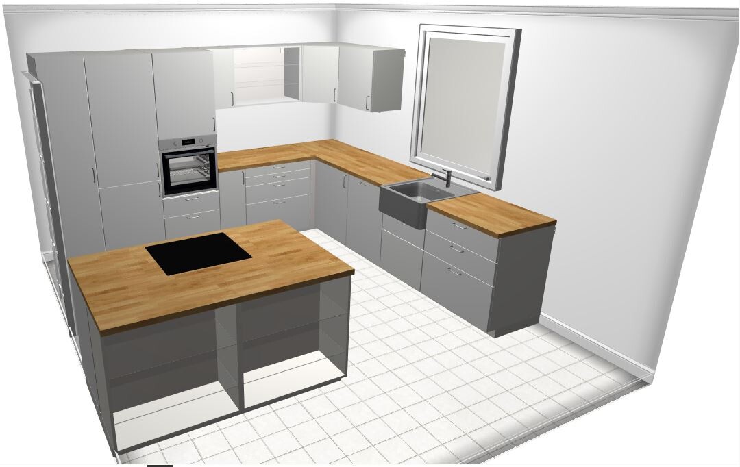
We have actually made some initial progress with the kitchen planning (see screenshot. Floor and kitchen appliances, especially the sink and cooktop, are still not finalized and were only used for better visualization).
You mean the distance between the kitchen island and the main kitchen run, right? We intentionally chose that spacing in the plan to see how far back we could position the island without causing someone entering the kitchen through the sliding door to bump into a person cooking. The plan is to make the island a bit deeper (countertop size about 105cm (41 inches) instead of 90cm (35 inches)) and then adjust it so the kitchen run and island align flush at the front. They should move about 20–30cm (8–12 inches) closer together. Also, since we enjoy cooking together, we wanted to leave more space to work comfortably.
We think exactly the same about the T-shaped bathroom: you stand directly in front of the sink after entering. We’re also concerned that the shower might be too dark (we would swap it with the toilet, as ypg suggested) and that the passage between sink and bathtub might turn into a bottleneck if we install a slightly wider bathtub. That is why the second option is also under consideration.
The venetian blinds will only be installed on the large south-facing windows, precisely for the reasons you mentioned.
I already mentioned swapping the shower and toilet above. If we choose the T-shaped bathroom, it will be swapped. At the moment, we prefer option 2 because it seems more open in our minds and likely offers a bit more storage space.
The point about the living room door is a good one—we hadn’t considered that yet! Thanks for the tip.
That’s right, we will have a zero knee wall. Depending on the actual ceiling height (measured on site after shell construction), we had planned to build a small shelf behind the bed. This means the bed would be set slightly further into the room, and there would be a small shelf directly behind it for glasses, books, phone, etc. Small cabinets with drawers could also fit underneath. The width is actually a bit larger (3.51m (11.5 ft)). The floor plan measurement stopped at the bathroom roof (3.35m (11 ft)), but there are an additional 16cm (6 inches) beyond that, which is not immediately obvious. With this, there should still be about 80cm (31 inches) of space on each side of a 1.8m (71 inches) wide bed. It’s not huge but sufficient for us.
Funny, and good to know the layout works! Is there anything you would have done differently now, after gaining experience living in the house?
kaho674 schrieb:
I would already start with the kitchen planning. I think the distance to the kitchen island is too large – but that’s minor.
We have actually made some initial progress with the kitchen planning (see screenshot. Floor and kitchen appliances, especially the sink and cooktop, are still not finalized and were only used for better visualization).
You mean the distance between the kitchen island and the main kitchen run, right? We intentionally chose that spacing in the plan to see how far back we could position the island without causing someone entering the kitchen through the sliding door to bump into a person cooking. The plan is to make the island a bit deeper (countertop size about 105cm (41 inches) instead of 90cm (35 inches)) and then adjust it so the kitchen run and island align flush at the front. They should move about 20–30cm (8–12 inches) closer together. Also, since we enjoy cooking together, we wanted to leave more space to work comfortably.
Müllerin schrieb:
I don’t really like the T-shaped bathroom because when you open the door you stand right in front of the sink.
I prefer the second option. Our shower is recessed because we have a slightly different stair shape.
Overall: everything great.
Personal note:
I don’t know where you plan shutters or blinds, but I would definitely go for external venetian blinds (Raffstores) in the children’s rooms.
Those rooms face full sun, and if you leave the shutters (roller shutters) closed all the time, as you might in this kind of weather, it can be unpleasant for the kids to play.
With venetian blinds, of course, it’s much better: you get sunlight but still keep the room bright.
We think exactly the same about the T-shaped bathroom: you stand directly in front of the sink after entering. We’re also concerned that the shower might be too dark (we would swap it with the toilet, as ypg suggested) and that the passage between sink and bathtub might turn into a bottleneck if we install a slightly wider bathtub. That is why the second option is also under consideration.
The venetian blinds will only be installed on the large south-facing windows, precisely for the reasons you mentioned.
ypg schrieb:
Swap shower and toilet!
Slide the living room door so there is space behind it for something else.
I already mentioned swapping the shower and toilet above. If we choose the T-shaped bathroom, it will be swapped. At the moment, we prefer option 2 because it seems more open in our minds and likely offers a bit more storage space.
The point about the living room door is a good one—we hadn’t considered that yet! Thanks for the tip.
kbt09 schrieb:
What I also noticed is because you apparently have a zero knee wall, the 2m (6.5 ft) line in the bedroom is too far from the bottom wall. First, the bed’s headboard can’t be very tall, it can also feel quite oppressive to lie there, and when getting up, you might quickly hit your head. 335cm (11 ft) width is also quite narrow for a master bedroom.
That’s right, we will have a zero knee wall. Depending on the actual ceiling height (measured on site after shell construction), we had planned to build a small shelf behind the bed. This means the bed would be set slightly further into the room, and there would be a small shelf directly behind it for glasses, books, phone, etc. Small cabinets with drawers could also fit underneath. The width is actually a bit larger (3.51m (11.5 ft)). The floor plan measurement stopped at the bathroom roof (3.35m (11 ft)), but there are an additional 16cm (6 inches) beyond that, which is not immediately obvious. With this, there should still be about 80cm (31 inches) of space on each side of a 1.8m (71 inches) wide bed. It’s not huge but sufficient for us.
ivenh0 schrieb:
Funny, the room layout on the ground and upper floors is identical to our house. And I can say: it works!
Funny, and good to know the layout works! Is there anything you would have done differently now, after gaining experience living in the house?
Strahleman schrieb:
At the moment, we prefer option 2 because it feels more open—at least in our minds—and seems to offer a bit more storage space. Oh dear... it seems more open because the walls above are basically invisible. Also, you have planned an ultra-compact bathtub there, and that without any shelves or ledges.
If anything, I would suggest a traditional layout with the shower as in option 2, but rotated, and next to it a straight bathtub enclosed within a frame.
The toilet should have only a half-height privacy screen, if any at all.
Similar topics