ᐅ Here is our floor plan. We are looking forward to your feedback.
Created on: 22 Jan 2013 21:34
S
stefan2511S
stefan251122 Jan 2013 21:34Hello,
here is our floor plan. What else can be improved or optimized?
here is our floor plan. What else can be improved or optimized?
Hello,
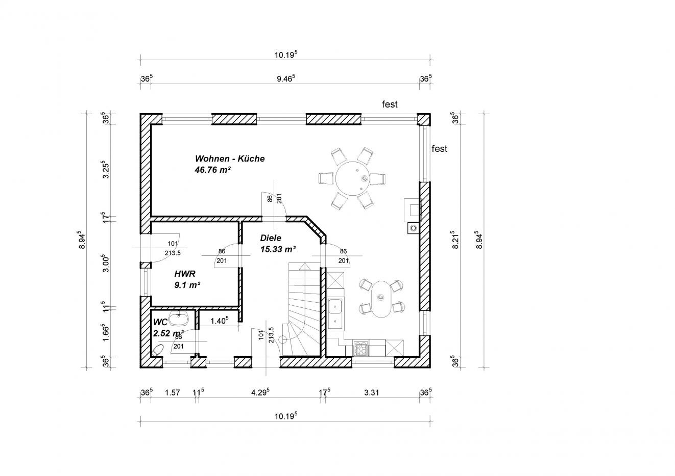
I don’t find the living room width quite ideal. At 4 meters (13 feet) wide, you already have difficulties arranging the living room furniture, especially if there are floor-to-ceiling terrace windows and you want to go outside... but the door could be placed in the middle. Friends have a similar living room with a 4 m (13 ft) width, and it would be better if they had an extra 50 cm (20 inches). A wider living room offers more options for arranging the furniture.
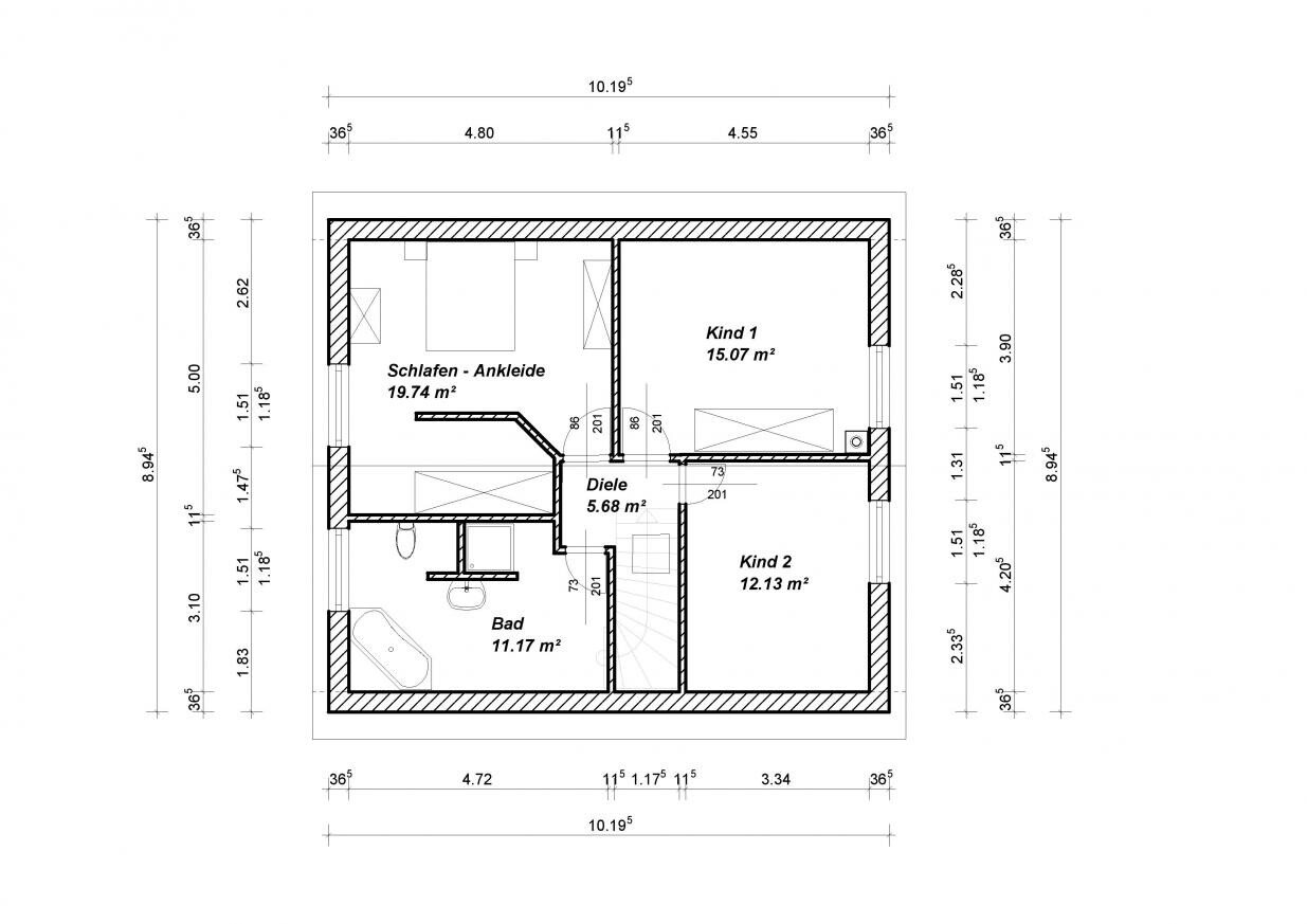
The toilet located by the bathroom window could be a bit inconvenient... (but it doesn’t have to be).
In the utility room, I would avoid large windows and doors as much as possible. You lose valuable wall space that you will really need later!
I would position the window in Child’s Room 1 a bit more centrally, so it doesn’t get hidden behind the wardrobe when entering the room — this creates more space for furniture.
I don’t find the living room width quite ideal. At 4 meters (13 feet) wide, you already have difficulties arranging the living room furniture, especially if there are floor-to-ceiling terrace windows and you want to go outside... but the door could be placed in the middle. Friends have a similar living room with a 4 m (13 ft) width, and it would be better if they had an extra 50 cm (20 inches). A wider living room offers more options for arranging the furniture.
The toilet located by the bathroom window could be a bit inconvenient... (but it doesn’t have to be).
In the utility room, I would avoid large windows and doors as much as possible. You lose valuable wall space that you will really need later!
I would position the window in Child’s Room 1 a bit more centrally, so it doesn’t get hidden behind the wardrobe when entering the room — this creates more space for furniture.
If you are planning for 2 children, the layout between Child 1 and Child 2 does not seem fair. Your bedroom is 20 square meters (215 square feet), but it only has a small window, which is also partly blocked by the walk-in closet wall (casting a shadow). It will probably be quite dark in there.
I would try to move the staircase to the other side of the hallway. This way, Child 1 and Child 2’s rooms would be larger, and the bathroom and bedroom smaller. Why have you not included any windows on the north/south side on the first floor? Only one window per room seems too little for such large rooms.
I would try to move the staircase to the other side of the hallway. This way, Child 1 and Child 2’s rooms would be larger, and the bathroom and bedroom smaller. Why have you not included any windows on the north/south side on the first floor? Only one window per room seems too little for such large rooms.
Similar topics