ᐅ How on earth do you choose the right color combination for the exterior?
Created on: 2 Jan 2020 10:54
B
Bauherr am L
Good day again, fellow home builders!
We are currently having a hard time deciding on the colors (mainly for the exterior). It has been decided that our house will essentially rely on two base colors/materials:
1. Plaster (shade still to be determined, but lighter than the panels for point 2) for the house
2. Metal coating: panels used as cladding for the garage as well as accents on some parts of the house, including window frames, preferably in a fine-texture paint (probably by Tiger).
We especially need to decide soon on the window frame color (and therefore the panels as well). The finalists are DB703, Marone 02 Metallic, Iron Glimmer Effect P7, Grey Classic 02 Metallic. All TIGER Drylac.
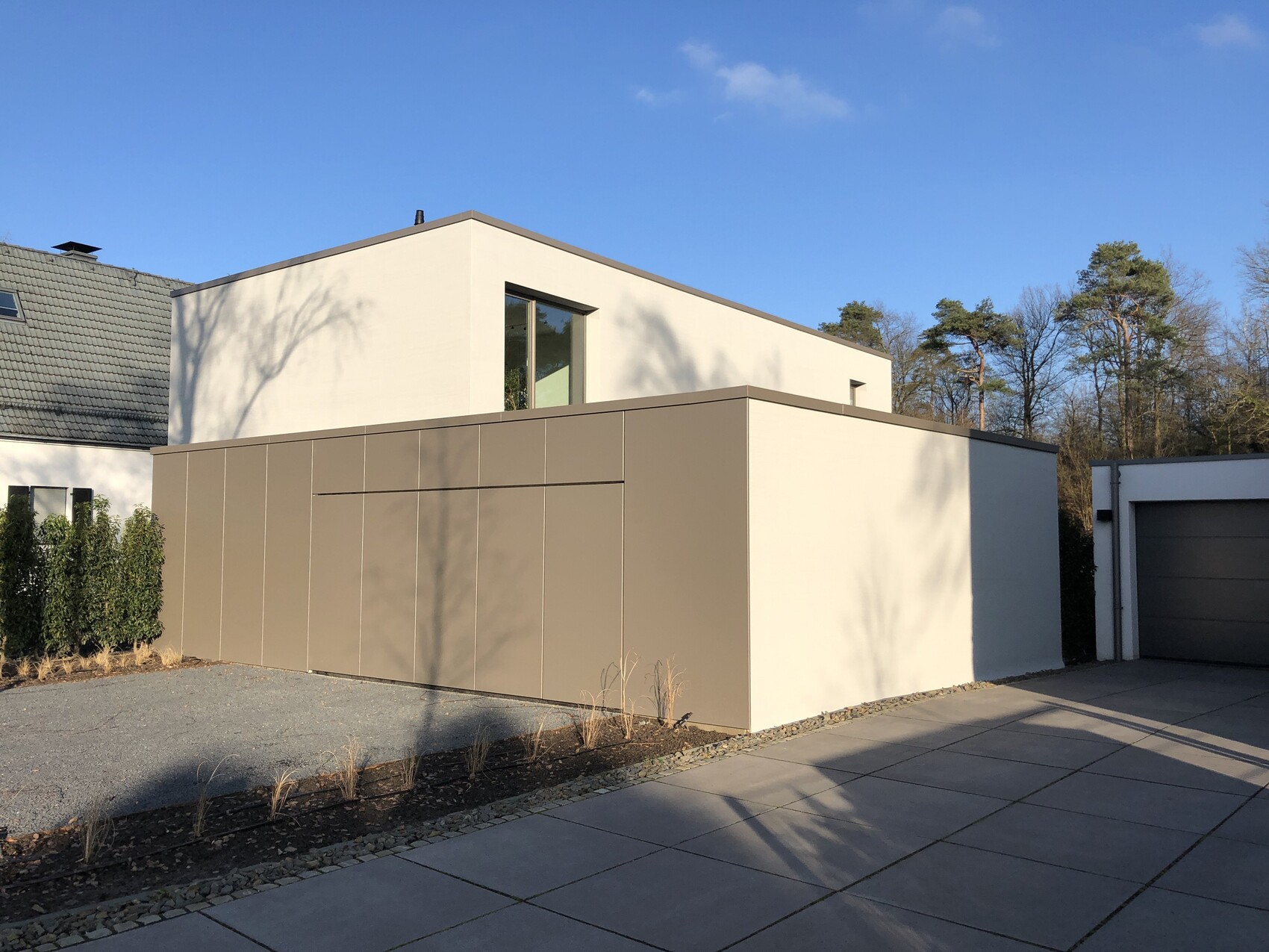
The plaster color (the largest surface overall) should contrast with the window frames and panel areas and be lighter.
The following picture is an example of a successful combination. However, the panels are too olive-toned for our taste.
Do you have any tips on how to make such a decision? We are currently struggling a lot.
For the sake of completeness: inside, we want white-oiled oak parquet. This matters because the window frame color will need to work together with it.
P.S.: Do you know any companies in North Rhine-Westphalia (NRW) that manufacture and install such (aluminum?) panels as shown in the picture?
Thank you!
We are currently having a hard time deciding on the colors (mainly for the exterior). It has been decided that our house will essentially rely on two base colors/materials:
1. Plaster (shade still to be determined, but lighter than the panels for point 2) for the house
2. Metal coating: panels used as cladding for the garage as well as accents on some parts of the house, including window frames, preferably in a fine-texture paint (probably by Tiger).
We especially need to decide soon on the window frame color (and therefore the panels as well). The finalists are DB703, Marone 02 Metallic, Iron Glimmer Effect P7, Grey Classic 02 Metallic. All TIGER Drylac.
The plaster color (the largest surface overall) should contrast with the window frames and panel areas and be lighter.
The following picture is an example of a successful combination. However, the panels are too olive-toned for our taste.
Do you have any tips on how to make such a decision? We are currently struggling a lot.
For the sake of completeness: inside, we want white-oiled oak parquet. This matters because the window frame color will need to work together with it.
P.S.: Do you know any companies in North Rhine-Westphalia (NRW) that manufacture and install such (aluminum?) panels as shown in the picture?
Thank you!
Here is the experience we had with choosing paint colors, which was not always positive:
Start deciding on the color as early as possible. In our case, the base coat was already applied when we changed our minds about painting the facade white and decided instead on a beige tone. But which beige? The search began, and in the end, we had six different color samples on the wall, none of which looked good on the white background. Either they were too faint or too intense. Each paint sample cost us days (!) because we had to reorder and apply the paint again. Our house would probably have looked patchy by now if we hadn’t received the advice to apply the color on a large area between two windows. Only then were we able to immediately choose a darker shade.
For a rough idea of the direction you want to take, it really helps to bring color samples to facades you like. However, as described above, the color samples ALWAYS differ from how they look on the actual facade.
B
Bauherr am L5 Jan 2020 15:11Thank you for the tips. Especially visiting houses and asking questions if you like them seems to be a good approach. We have now looked at several options again. For the metal coatings (especially window frames), we were able to see some examples in person that could be suitable. It looks like it will come down to DB703. This also has the advantage that the color is practically considered a standard.
Similar topics