ßÉģ Hillside House in the Southwest Palatinate ŌĆō Our Home Construction 2.0
Created on: 9 Sep 2022 18:13
K
kati1337
Good evening everyone
IŌĆÖm starting a small collection thread here for photos and progress updates on our second building project.
WeŌĆÖve already moved to the Palatinate region to be closer to the construction site. Now weŌĆÖre watching eagerly and happily as our (hopefully final) dream home takes shape near family.
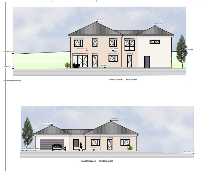
One big challenge still ahead of us is the facade design. I really love the Nordic style with brickwork and mullioned windows. That wonŌĆÖt be possible here for two reasons: firstly, no one here can do bricklaying, and secondly, it would stand out too much. We will be going with a rendered facade. How to design the colors of the facade and windows to still create some country house / cottage charm is currently still a work in progress mentally.
Otherwise, IŌĆÖm sharing our plans here and how it will eventually be built.
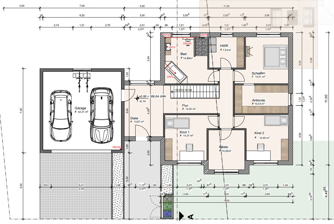
The support pillar marked near the kitchen island could be removed for a small extra cost, so that will be gone.
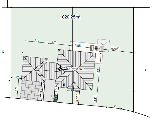
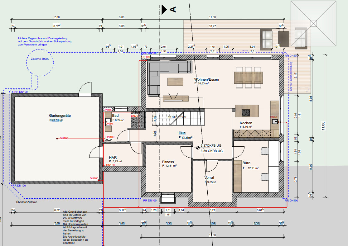
The room for ŌĆ£garden equipmentŌĆØ under the garage will get a partition wall for structural reasons.
It wonŌĆÖt be fully finished living space like in the house, but underfloor heating will be installed, along with a lockable door and a window. ItŌĆÖs meant to store garden tools but also some of the building services equipment, since the utility room (HAR) is quite small, and maybe be used as a party room.
We had three construction companies in the final selection. In the end, we chose the ŌĆ£doerŌĆØ ŌĆō a builder recommended to us here by friends and family. No website, no smartphone, but he is on site every day himself working in overalls. He has a very good reputation in this area and now rarely builds single-family homes. We were a bit lucky through personal connections and a very friendly initial phone call to get our foot in the door. So far we are very satisfied with this choice.
IŌĆÖm starting a small collection thread here for photos and progress updates on our second building project.
WeŌĆÖve already moved to the Palatinate region to be closer to the construction site. Now weŌĆÖre watching eagerly and happily as our (hopefully final) dream home takes shape near family.
One big challenge still ahead of us is the facade design. I really love the Nordic style with brickwork and mullioned windows. That wonŌĆÖt be possible here for two reasons: firstly, no one here can do bricklaying, and secondly, it would stand out too much. We will be going with a rendered facade. How to design the colors of the facade and windows to still create some country house / cottage charm is currently still a work in progress mentally.
Otherwise, IŌĆÖm sharing our plans here and how it will eventually be built.
The support pillar marked near the kitchen island could be removed for a small extra cost, so that will be gone.
The room for ŌĆ£garden equipmentŌĆØ under the garage will get a partition wall for structural reasons.
It wonŌĆÖt be fully finished living space like in the house, but underfloor heating will be installed, along with a lockable door and a window. ItŌĆÖs meant to store garden tools but also some of the building services equipment, since the utility room (HAR) is quite small, and maybe be used as a party room.
We had three construction companies in the final selection. In the end, we chose the ŌĆ£doerŌĆØ ŌĆō a builder recommended to us here by friends and family. No website, no smartphone, but he is on site every day himself working in overalls. He has a very good reputation in this area and now rarely builds single-family homes. We were a bit lucky through personal connections and a very friendly initial phone call to get our foot in the door. So far we are very satisfied with this choice.
The current plan only includes a built-in dishwasher at an elevated position.
I donŌĆÖt find the dishwasherŌĆÖs location very practical in relation to the sink and trash bin.
Also, I have to admit, IŌĆÖm not really happy with the room layout featuring a country-style kitchen, but I donŌĆÖt have a better suggestion at the moment. It might also be because I find it less ergonomic when the island and sink are not directly opposite each other, but instead placed on adjacent sides of the islandŌĆÖs narrow end. You should also consider where you want to work, so you have a mostly straight workflow towards the cooktop.
In general, pay attention to the handle alignments, for example, a flap cabinet in a tall unit with a hinged door above it. The hinged door should have its handle centered as well. This may sound unusual at first, but you usually know which way the door opens, and it looks much more balanced. There is an example in another forum regarding the kitchen from Menorca. You might want to look it up.
The green kitchen looks very stylish! With the large window, the color will really stand out in a cool way.
In the Studio 3 design, I don't like the two wall cabinets at all. They look very outdated.
I would skip those and use only base cabinets and tall cabinets.
Combined with the farmhouse-style front, that would be a really cool kitchen!
In the Studio 3 design, I don't like the two wall cabinets at all. They look very outdated.
I would skip those and use only base cabinets and tall cabinets.
Combined with the farmhouse-style front, that would be a really cool kitchen!
M
Myrna_Loy2 Oct 2022 09:20Glass display cabinets at base cabinet height with children? Bold choice. Our boys even managed to dent the refrigerator with a skateboard, and an oven door glass didnŌĆÖt survive the learning tower.
P
Pinkiponk2 Oct 2022 09:27kati1337 schrieb:
Studio 3: Overall the most visually appealing and coherent design. All appliances except the cooktop are Miele. I like the layout of the third studio the best. At most, I would consider adding some glass-fronted upper cabinets. Since the kitchen, in my opinion and based on previous assessments, "does not dominate the space," I donŌĆÖt really see a risk of visual unrest from colorful accents or the like in the cabinets.
The Miele appliances are a plus for me as well, although I canŌĆÖt judge whether Miele is still as good as it used to be.
Green is one of my favorite colors, and IŌĆÖve always fancied a green kitchen, but IŌĆÖve never found the right shade of green within an acceptable price range. (The ŌĆ£kitchen greenŌĆØ from Ikea is too dark for me.) The green in your photo looks too dull and lifeless to me.
To help you and other forum members better understand the value of my opinion, ;-) a black kitchen would have been ŌĆ£absolutely neverŌĆØ an option for meŌĆ”no black furniture, tiles, or the like at all. I even cover the black TV surfacesŌĆöwhich I find like black holesŌĆöcaused by marriage compromises, with large-format pictures that have to be removed before watching. 🙂
A sink like that I really like, we have one too and find it super easy to maintain. The window behind it doesnŌĆÖt open well for us either, but IŌĆÖve never really wanted to open it?! If we want to open something, there is a balcony door nearby that I prefer to use. How about you?

kbt09 schrieb:
The current plan only includes one dishwasher elevated.
I donŌĆÖt think the location of the dishwasher is ideal, especially in relation to the sink and waste bin.
Also, I have to admit, I donŌĆÖt really like the room layout with a country-style kitchen. I donŌĆÖt have a better suggestion at the moment. Maybe itŌĆÖs because I find having the island and sink not directly opposite each other but rather placed on an L-shape across from the narrow side of the island less ergonomic. You should also consider where you want to work so that you have a mostly straight workflow towards the cooktop.
Generally, pay attention to the handle arrangements, for example, a flap compartment in the tall cabinet with a door above. The door should have its handle centered. That might sound unusual at first, but you usually know which way the door opens, and it looks much more harmonious. ThereŌĆÖs an example in the other forum with MenorcaŌĆÖs kitchen. You can look it up.In the Studio 3 plan, both dishwashers are elevated and placed right next to each other.
The layout for a country-style kitchen is indeed not ideal, which we realized along the way. Overall, at the time we were creating the house plans, we didnŌĆÖt think enough about the actual kitchen layout. We knew there was enough space for the kitchen, but how exactly to arrange it and how poorly it fit my country kitchen preferences wasnŌĆÖt clear to me. And this is already our second build. Well, everyone makes mistakes somewhere.
We will still take care of the handle arrangements. As I mentioned, since the redesign happened near the end of the appointment, the planner didnŌĆÖt finish the plan properly. But yes, it shouldnŌĆÖt stay like that.
aero2016 schrieb:
The green kitchen looks super stylish! With that big window, the color will really stand out!I canŌĆÖt help it, I also find it very stylish. Part of me thinksŌĆöeven if the color isnŌĆÖt trendy in a few years, IŌĆÖd probably still like it. I especially like those little drawers a lot.aero2016 schrieb:
I really donŌĆÖt like the two wall cabinets in the Studio 3 plan. They look really old-fashioned.
IŌĆÖd skip those and only use base cabinets and tall cabinets.
That combined with the country-style fronts makes a really cool kitchen!I actually like those right now. 😀 ThatŌĆÖs one of the details that, for me, defines Studio 3. I donŌĆÖt know whyŌĆö I had this discussion two years ago tooŌĆöbut I love wall cabinets. I find them incredibly cozy and country-style.Snowy36 schrieb:
A farmhouse sink like thatŌĆö
I think itŌĆÖs great, we also have one and find it super easy to maintain. The window behind it doesnŌĆÖt open well for us either, but IŌĆÖve never felt the need to open it?! If we want fresh air, thereŌĆÖs a patio door nearby that I prefer to use. What about you?ItŌĆÖs the same for us. Thanks for your feedback on the farmhouse sink. Would you choose it again? WeŌĆÖre planning a 60cm (24 inch) one from Villeroy & Boch. I canŌĆÖt do without Villeroy & Boch anymore; I loved the sink in our first house like nothing else. The surface is so great, I sometimes just stood in the kitchen and stroked the sink like a maniac. 😀Myrna_Loy schrieb:
Display cabinets at base cabinet height with kids? Brave. Our boys even managed to dent the fridge with a skateboard, and a learning tower damaged an oven door.Kids can be so different. I think mine hasnŌĆÖt really broken anything significant so far. Except for a few marks on the old wooden staircase from his experiments throwing around small toy cars. But the kids are usually only in the childproof areas of the house without supervision. When they are in the open living space, weŌĆÖre always present. So far, our son hasnŌĆÖt been very interested in the furniture, at least not destructively.
For me, thatŌĆÖs just the risk of living with kids. No risk, no fun. 😀
Pinkiponk schrieb:
I like the Studio 3 plan best. I might add glass-front doors to some of the wall cabinets. Since the kitchen overall, in my opinion and previous assessments, doesnŌĆÖt ŌĆ£demand attention,ŌĆØ thereŌĆÖs less risk of visual clutter from colorful accents inside the cabinets.ThatŌĆÖs unfortunately not very practical for us. We only have three tall cabinets and one small wall cabinet. Some of the tall cabinets conceal electrical appliances (fridge, microwave). So I donŌĆÖt see how glass doors could be applied without the look feeling chopped up. Otherwise, I wouldnŌĆÖt worry about a few open spaces with some decor. If anything, the old kitchen was sometimes a bit sterile for me. There were too few open areas, and sometimes it felt like a showroom kitchen and not very lived-in. A little clutter makes it feel cozy.
Pinkiponk schrieb:
The Miele appliances are a plus for me, although I canŌĆÖt judge if Miele is still as good as it used to be.IŌĆÖve wondered that myself. There are mixed opinions online. So far, I havenŌĆÖt read anything specifically negative about Miele. Some say ŌĆ£BoschŌĆÖs higher-end lines are just as good,ŌĆØ while Miele fans claim ŌĆ£thereŌĆÖs still a world of difference.ŌĆØ I canŌĆÖt judge; Miele has always been too expensive for me.Pinkiponk schrieb:
Green is one of my favorite colors, and I have always fancied a green kitchen but never found the right shade at an affordable price. (The ŌĆ£kitchen greenŌĆØ from IKEA is too dark for me.) The green in your photo looks dull and lifeless to me.I actually like the green in the photos because of its pastel, subtle tone. We currently have the green IKEA fronts in our transitional house, oddly enough. They were the cheapest available. And I really like them; theyŌĆÖre easy to care for. Although smooth fronts without the country-style look arenŌĆÖt really my thing. But as a budget kitchen, the color combined with wood brings me some joy.Similar topics