Hello everyone,
Our floor plan design is now complete, and we are satisfied with it. However, if anyone has any ideas or suggestions on how it could be improved, we would appreciate your input.
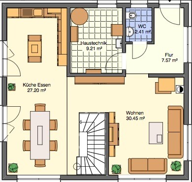
Ground floor

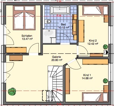
Upper floor

Thanks and best regards,
Martin
Our floor plan design is now complete, and we are satisfied with it. However, if anyone has any ideas or suggestions on how it could be improved, we would appreciate your input.
Ground floor
Upper floor
Thanks and best regards,
Martin
Good morning!
So, do you already have a plot of land in mind?
I notice that the entrance area is now positioned quite differently, which is a bit unusual 😕 since most plots don’t allow that much flexibility.
When planning, definitely consider the location of the house on the plot (for example, a south-facing patio).
This floor plan is definitely more functional. However, I would make the utility room significantly smaller and skip the gallery (a very naive question: what is that used for? My parents have a huge hallway in their old house due to construction, and the wasted space is just frustrating). But maybe it’s because we are building smaller, so every room size and square meter is carefully considered.

Here are some quick observations:
Bathroom upper floor:
- The space between the shower and bathtub is very narrow, while there is a large "empty cavity" behind them.
- The wall runs directly into the window.
Bedroom:
- Is the wardrobe shown too narrow? The other wardrobes in the children's room are all deeper. Especially if you have a wardrobe with doors, it will feel too tight.
Chimney upper floor:
- The passage between the chimney and the bedroom wall seems to be only 80cm (31.5 inches) wide. In my opinion, that is a bit too narrow.
- I’m not really convinced by its central position in the room.
- Might it be better placed on the gable end (lower side)?
Children’s room 1:
- I find it far too small, considering that you lose all the space for the gallery.
Children’s room 2:
- The window cannot be opened.
General:
Am I reading correctly that the knee wall is 1m (39 inches)?
That might be quite tight for the beds. In my opinion, it won’t be possible to get into the bathtub without hitting your head.
I spent several years as a teenager living in an attic apartment with a knee wall of 92cm (36 inches).
My parents had the bed about 25–30cm (10–12 inches) away from the wall.
Also, having the roof window right above the bed wouldn’t be my choice. When it rains, the noise hitting the window can be quite loud. So anyone who’s a light sleeper might as well move to the living room. Cleaning the window or opening it in snow is also tricky when the bed is right underneath. 😉
Thank you for the feedback.
The gallery is intended as a home workspace. The children’s rooms are deliberately planned to be smaller because the beds are planned to be moved to the attic later. I myself grew up in a timber-framed house and really liked that.
Making the utility room smaller will be difficult once there is a staircase on the upper floor.
We are aware that there are still a few unresolved weak points in the design.
The entrance is on the north side (left), right? I like the ground floor better than the first design, but I would remove the wall between the hallway and the stairs. Otherwise, it will become a dark stairwell.
Pantry without a window? Kitchen and living room are okay.
Child 1’s room is way too small. Consider using the gallery as Child 1’s bedroom and the current Child 1 room as the office.
The bathroom window is misplaced; why not move it to the left (north?) or to the middle of the lower wall?
Do you also have elevation views of this design?
gima84 schrieb:
The gallery is intended as a home workspace. The children's rooms are deliberately planned to be small because the plan is to move the beds later to the attic. I myself grew up in a half-timbered house and I thought it was great. For permanent use of the attic, the staircase is missing.
If possible, I would personally consider switching to a house with two full stories. This way, you would have more space on the upper floor, wouldn’t need a full staircase to the attic or heating in the attic, and so on. Insulation could then be done on the ceiling of the second floor. You wouldn’t have any issues with roof windows in the bathroom and bedroom.
With minor modifications, your floor plan could even become usable.
Similar topics