Hello everyone,
Since there are already some wonderful "Show Off" posts, I wanted to contribute another one to this forum. Specifically, I’m interested in the color contrasts between floor colors and wall colors (painted or tiled) in various rooms (excluding basements or attics).
This forum post could also inspire future homeowners facing the classic dilemma: "Light floors in the bathroom or rather dark tiles?" / "Dark wood look in the living room or light floors with a dark wall?"
Here is some information found online about how different color combinations affect the perception of rooms:
PS: What exactly are warm and dark tones? Isn’t that a contradiction?
I could go on almost endlessly with quotes from various websites. I don’t want to get into the effects of individual specific colors now (but feel free to do so if you like).
What I am really interested in, though, are your color combinations.
Many thanks to everyone who shares their artistic possibilities and ideas here.
annab377
Since there are already some wonderful "Show Off" posts, I wanted to contribute another one to this forum. Specifically, I’m interested in the color contrasts between floor colors and wall colors (painted or tiled) in various rooms (excluding basements or attics).
This forum post could also inspire future homeowners facing the classic dilemma: "Light floors in the bathroom or rather dark tiles?" / "Dark wood look in the living room or light floors with a dark wall?"
Here is some information found online about how different color combinations affect the perception of rooms:
Rooms facing north often feel cooler due to the lack of sunlight. Warm, intense wall colors are a good way to make the room feel cozier. In contrast, soft colors are perfect for rooms bathed in warm sunlight all day.
Warm and dark tones visually shorten the depth of a room, making the space appear closer. This creates a sense of inviting coziness and security even in large rooms.
PS: What exactly are warm and dark tones? Isn’t that a contradiction?
Light and cool tones appear less close to the viewer and visually add spaciousness and openness to rooms. These colors are a good choice for designing smaller rooms. You can also highlight bays and window recesses with lighter shades to make the space appear larger.
Light floors are excellent for creating a comfortable design in bathrooms. They harmonize well with the often light walls typically found in sanitary areas. Furthermore, this approach prevents the space from feeling cluttered and creates a perfect balance with reflective surfaces such as mirrors and glass, which are common in bathrooms.
Delicate glass, sturdy oak, or wicker furniture – in the dining room, the focus is centered on the seating area. Tables and chairs should be paired with an appealing floor. Light floors work perfectly to provide a cozy atmosphere in the dining area. The subtle color scheme ensures that the main focus remains where it should be: the seating area.
Light floor / light walls / light ceiling: Light colors on every surface create broad and friendly-feeling rooms. However, too much white can result in an impersonal atmosphere.
Light floor / dark walls / light ceiling: This emphasizes horizontal lines. Rooms gain depth, coziness, and personality.
Light floor / a dark feature wall / light ceiling: The space appears narrower visually. This setup can showcase furniture and create accents.
Dark floor / light walls / light ceiling: The room seems wider.
I could go on almost endlessly with quotes from various websites. I don’t want to get into the effects of individual specific colors now (but feel free to do so if you like).
What I am really interested in, though, are your color combinations.
Many thanks to everyone who shares their artistic possibilities and ideas here.
annab377
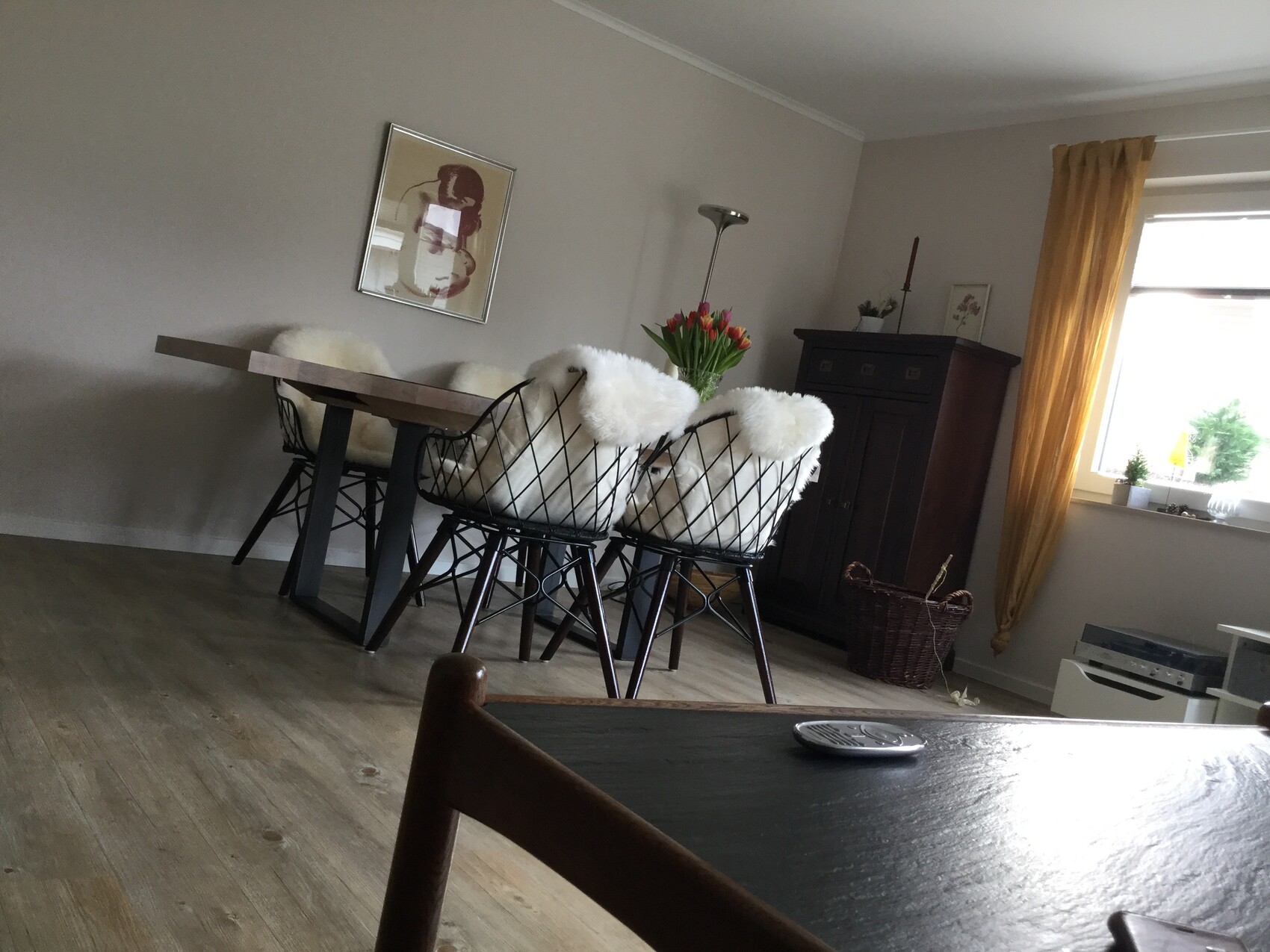
Floor in brown,
walls in light cappuccino, ceiling white, curtains in curry yellow-green, furniture in strong brown, partly black, and also pure white in between. This imitates nature: brown earth, green plants, dark trees, light horizon sky very bright. This is how people from Holstein have learned to see. This is how they live.
walls in light cappuccino, ceiling white, curtains in curry yellow-green, furniture in strong brown, partly black, and also pure white in between. This imitates nature: brown earth, green plants, dark trees, light horizon sky very bright. This is how people from Holstein have learned to see. This is how they live.