ᐅ Facade Paint in White Shades – How to Decide Without a RAL Reference?
Created on: 17 Sep 2022 20:27
F
fromthisplace
Dear forum,
We are currently deciding on the color for our facade and want a modern shade of white. We have already sampled interior doors and the patio roof in RAL 9016. We were considering using the same white shade for the exterior facade.
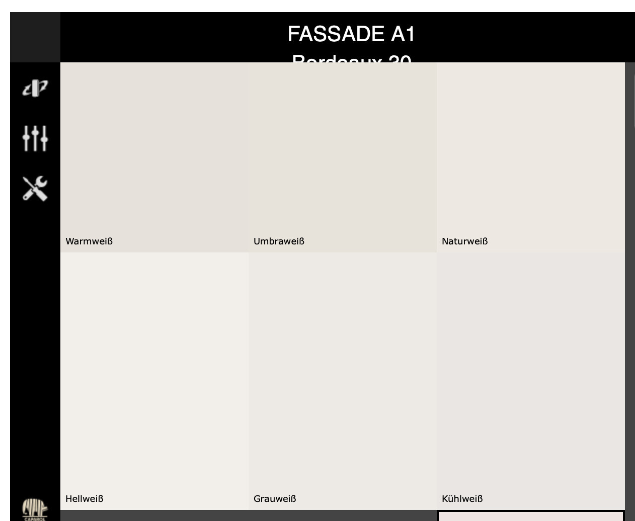
Now we have received the Carparol color fan from the general contractor. It shows the six attached white tones, with the values L (Lightness, 100 = white, 0 = black), C (Chroma, the higher, the more intense the color), and H (Hue, position on the color wheel). Unfortunately, there is no RAL equivalent.
The whites have the following values:
Naturweiß L: 93, C: 3, H: 95
Umbraweiß L: 92, C: 4, H: 95
Warmweiß L: 91, C: 2, H: 87
Kühlweiß L: 91, C: 1, H: 185
Grauweiß L: 93, C: 1, H: 116
Hellweiß L: 96, C: 2, H: 109
In a thread by @Pinkiponk, I read that a low C value is recommended. Does this also apply to white? How significant are the differences in L, C, and H values? Should we consider them when deciding, or just go by what feels right? Would you choose based on your subjective preference from the color fan, or what other criteria would you use?
Our biggest concern is how the color from the fan will actually look on the house facade. We have two samples offered, and more can be provided for an additional cost. Which two would you choose?
We have already asked Carparol which color is closest to RAL 9016.
Thanks in advance for your help. 🙂
We are currently deciding on the color for our facade and want a modern shade of white. We have already sampled interior doors and the patio roof in RAL 9016. We were considering using the same white shade for the exterior facade.
Now we have received the Carparol color fan from the general contractor. It shows the six attached white tones, with the values L (Lightness, 100 = white, 0 = black), C (Chroma, the higher, the more intense the color), and H (Hue, position on the color wheel). Unfortunately, there is no RAL equivalent.
The whites have the following values:
Naturweiß L: 93, C: 3, H: 95
Umbraweiß L: 92, C: 4, H: 95
Warmweiß L: 91, C: 2, H: 87
Kühlweiß L: 91, C: 1, H: 185
Grauweiß L: 93, C: 1, H: 116
Hellweiß L: 96, C: 2, H: 109
In a thread by @Pinkiponk, I read that a low C value is recommended. Does this also apply to white? How significant are the differences in L, C, and H values? Should we consider them when deciding, or just go by what feels right? Would you choose based on your subjective preference from the color fan, or what other criteria would you use?
Our biggest concern is how the color from the fan will actually look on the house facade. We have two samples offered, and more can be provided for an additional cost. Which two would you choose?
We have already asked Carparol which color is closest to RAL 9016.
Thanks in advance for your help. 🙂

fromthisplace schrieb:
@11ant! Nice to have you back. 🙂 Let’s not count our chickens before they hatch – just a few hours ago negotiations broke down again, so who knows how much longer this will last :-(
Chloe83 schrieb:
Dear @11ant already answered me on the same question a few days ago. Yes, exactly, https://www.hausbau-forum.de/threads/welche-farbe-fuer-fassade-ral-9016-oder-ral-9010.44090/#post-593566
fromthisplace schrieb:
I really can’t agree with the argument “it depends on the substrate anyway, so RAL doesn’t matter at all.” That would be a major misunderstanding. RAL is not “irrelevant”; it just can’t serve as a precise reference to the extent that color shades “vary” depending on different materials. Unfortunately, it’s a sad reality that the RAL system can’t match the accuracy that Pantone offers. There is no alternative for the builder (and for the average building materials manufacturer) because, first, Pantone doesn’t offer comparable pocket-sized guides, and secondly, there are no tables or methods to convert or translate shades between the two systems. No one has yet commissioned such a comprehensive work from Pantone. So, we don’t know how RAL 9016 would be defined in Pantone terms. For practical applications of “traffic white,” this doesn’t pose a problem because the surface of traffic signs is sufficiently similar to the glossy cardstock used for color fans.
fromthisplace schrieb:
Precisely because the substrate and individual conditions of the façade vary, I want to use a reasonably reliable reference point along the lines of: “Our bright white corresponds to RAL 9016, but be aware that it will look different on the house façade compared to the inside edges of the windows.” The problem is that the difference between two RAL colors can even reverse depending on the material. If you compare two RAL shades and find that on wood A is lighter than B, you might perceive the opposite on metal, with A appearing more bluish and B more yellowish. Some web designers have created charts that translate RAL colors into the more systematic CMYK color space, but unfortunately, these charts don’t agree on the exact approximations. Especially with white, black, and gray tones, opinions differ the most. A degree of uncertainty is therefore unavoidable. Take comfort (or add to your frustration) knowing that colors will always look different in the morning in October than in the evening in April.
https://www.instagram.com/11antgmxde/
https://www.linkedin.com/company/bauen-jetzt/
Chloe83 schrieb:
There must be many members here with white façades. Maybe they can share which shade of white they used. White! Standard!
fromthisplace schrieb:
One point is that the color tone or the finished façade should blend harmoniously with the surroundings and not look out of place. Believe me, your façade will eventually blend into the surroundings. Use the brightest white — it will naturally age to a darker shade.
P
Pinkiponk18 Sep 2022 10:10For me, among your color samples, "light white" is the only color I perceive as approximately "white." If I wanted a white facade, I would choose "light white."
I don’t have a definite answer to your question, but I can confirm again that colors, whether inside or outside, always appear darker in reality than they do on the samples.
Our exterior facade as well as the interior walls are considerably darker than selected and desired, but still acceptable. I don’t want to expect more than "acceptable," as that would only make me unhappy during the house construction/interior design. ;-)
It is as you say, and you get used to it. I chose comfort over despair, even though the color differences bother me. ;-)
I don’t have a definite answer to your question, but I can confirm again that colors, whether inside or outside, always appear darker in reality than they do on the samples.
Our exterior facade as well as the interior walls are considerably darker than selected and desired, but still acceptable. I don’t want to expect more than "acceptable," as that would only make me unhappy during the house construction/interior design. ;-)
11ant schrieb:
Take comfort (or deepen your despair) in the fact that the differences will always look different, morning in October compared to evening in April.
It is as you say, and you get used to it. I chose comfort over despair, even though the color differences bother me. ;-)
If RAL 9016 is your choice, I would go with Bright White. You will never achieve a perfect match because there are already tolerances in the production of identical components.
When you also use different substrates and coating systems, deviations are inevitable. For example, if you have a coarse plaster, it will appear somewhat grayer than a finer plaster with the same paint. This is simply because the grains in the coarse plaster cast slight shadows, giving the surface a grayish tint. The intensity, of course, depends on the lighting.
When you also use different substrates and coating systems, deviations are inevitable. For example, if you have a coarse plaster, it will appear somewhat grayer than a finer plaster with the same paint. This is simply because the grains in the coarse plaster cast slight shadows, giving the surface a grayish tint. The intensity, of course, depends on the lighting.

If you choose exterior paint color based on a color fan deck, and even worse, from a computer screen, and then end up getting the color you imagined, you’ve just been extremely lucky.
In my opinion, there is no 100% reliable method; the reasons have already been mentioned.
The best approach, in my view, is to have the plasterer paint sample patches side by side on the finished plaster of the house. Ideally, not just on one facade. Then take a few days to observe these samples under different times of day, weather, and lighting conditions. Decide while keeping in mind that sunlight in winter produces a different light and color tone than in summer.
Alternatively, use sample pieces on plasterboard panels. The advantage is that they are portable and can be held up against all sides of the facade, in sun or shade. This is how we did it.
We did not choose white but a beige earth tone as the color. In this case, it’s easier to be completely off, for example, if the color appears slightly pinkish in sunlight (which I have seen before).
On the other hand, you shouldn’t overdo it. Without a direct comparison, I am convinced that most people do not actually notice subtle differences in white tones on finished houses.
Similar topics