Hello everyone,
we are planning a custom-designed house and are very satisfied with this floor plan at first and second glance. Our wish was to have a large garage, and the house has now been adapted accordingly. We have a relatively narrow plot of land, measuring 18m (59 feet).
Planned changes still include:
We would be interested in your opinions.
Thanks in advance
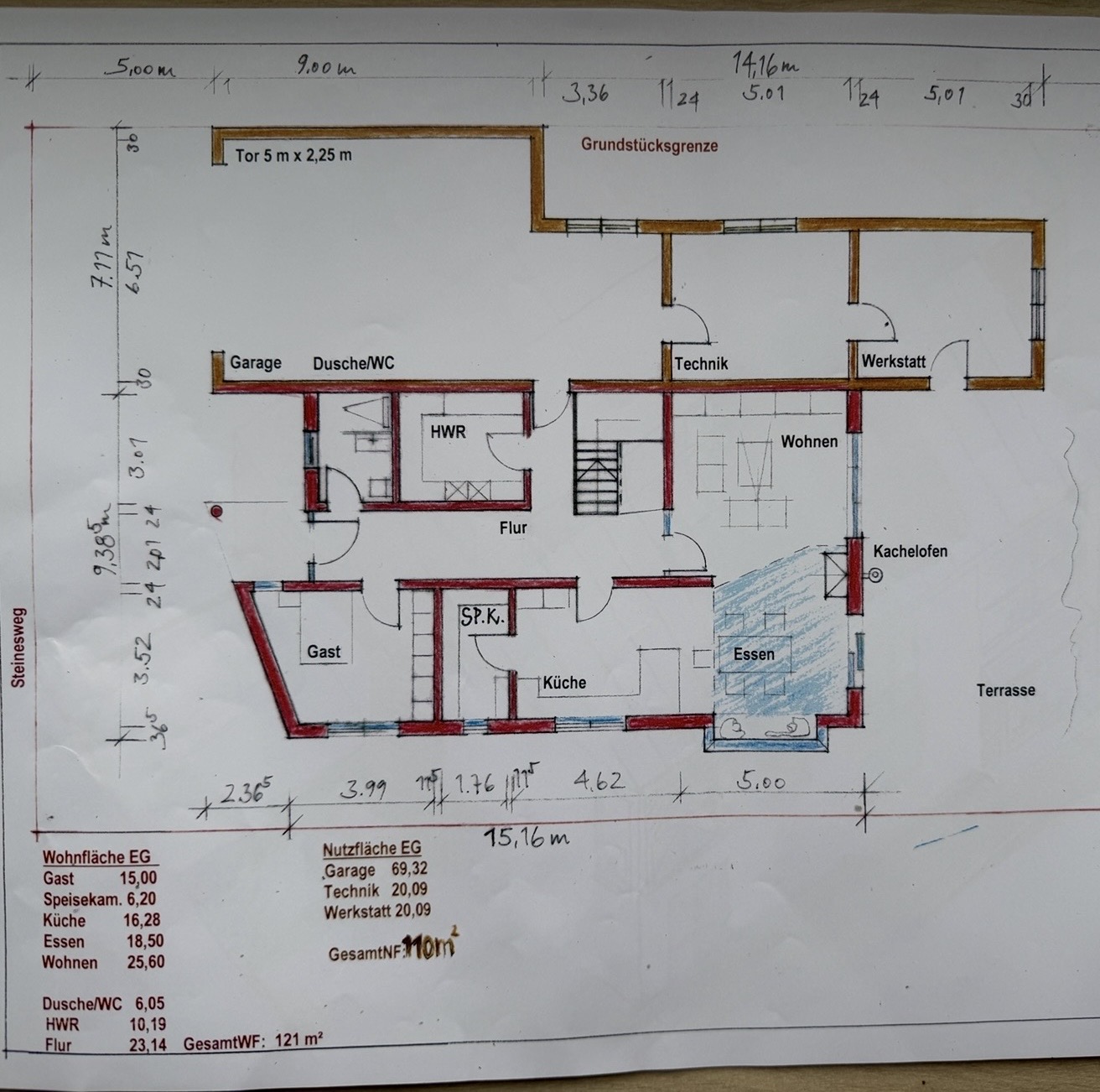
we are planning a custom-designed house and are very satisfied with this floor plan at first and second glance. Our wish was to have a large garage, and the house has now been adapted accordingly. We have a relatively narrow plot of land, measuring 18m (59 feet).
Planned changes still include:
- Utility room as a walkthrough from the garage
- Reducing the size of the technical room and thereby enlarging the living room
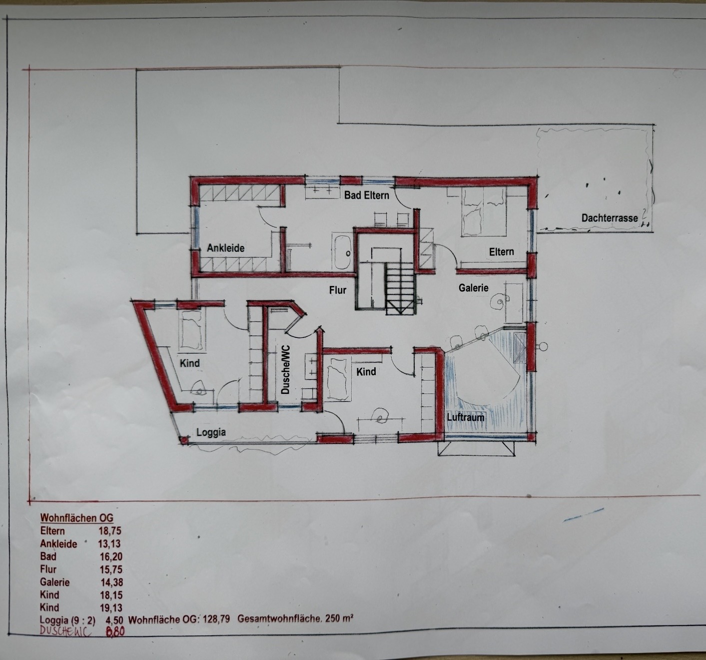
- Layout of the master bathroom/dressing room/bedroom is not yet finalized
- The front slant will cause problems when placing a bed
We would be interested in your opinions.
Thanks in advance

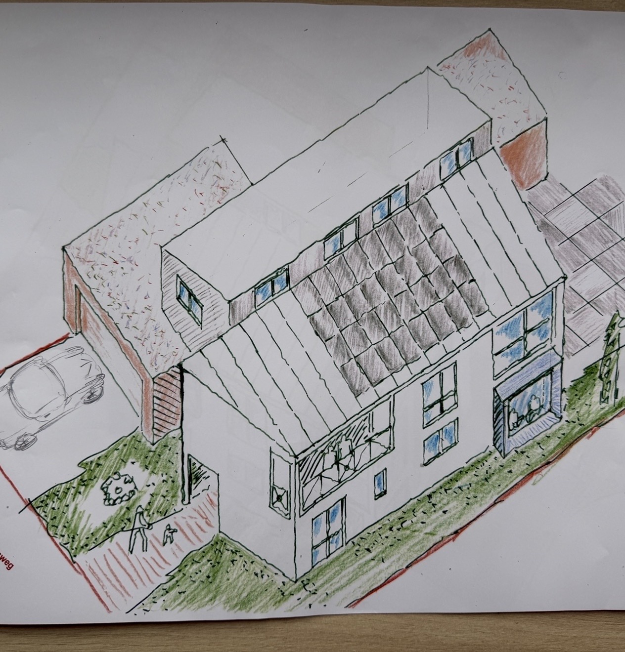
This is going to be one of those houses where outsiders wince at the price. "You spent that much?!"
I prefer the 2.0 floor plan over the first one, but it’s still really ugly. Sorry, but a gallery doesn’t save it when half of it faces the workshop. The gallery as a whole feels odd. If you’re going to have one, it should be spacious—not just a hallway with a single spot overlooking the area below through a railing. A balcony with a bathroom window is questionable, but I guess it’s only the kids… A disaster. The rooms feel scattered, and the hallways divide more than they connect. From the outside, the previous design made me think I wouldn’t want to live next door—maybe the roof shape is better now, who knows. It still looks extremely quirky.
Honestly, for me this is one of the ugliest house projects I’ve seen here in the last 12 months. But: you have to pay for it and if it’s your perfect 10/10, go for it. I just don’t see any objective beauty.
B
bluetoothtony4 Apr 2026 11:01Schmirgel schrieb:
This will be one of those houses where outsiders will be shocked by the price. “You spent that much on it?!” It’s quite possible it won’t be cheap. If you want a large garage on a relatively narrow plot, you have to juggle the floor plan accordingly.
The workshop separates the garage from the neighbor.
The wall will be faced with brick cladding anyway, so it will look good.
Have you seen the window in the bathroom? If it’s going to be a high horizontal window, no one will be able to look inside…
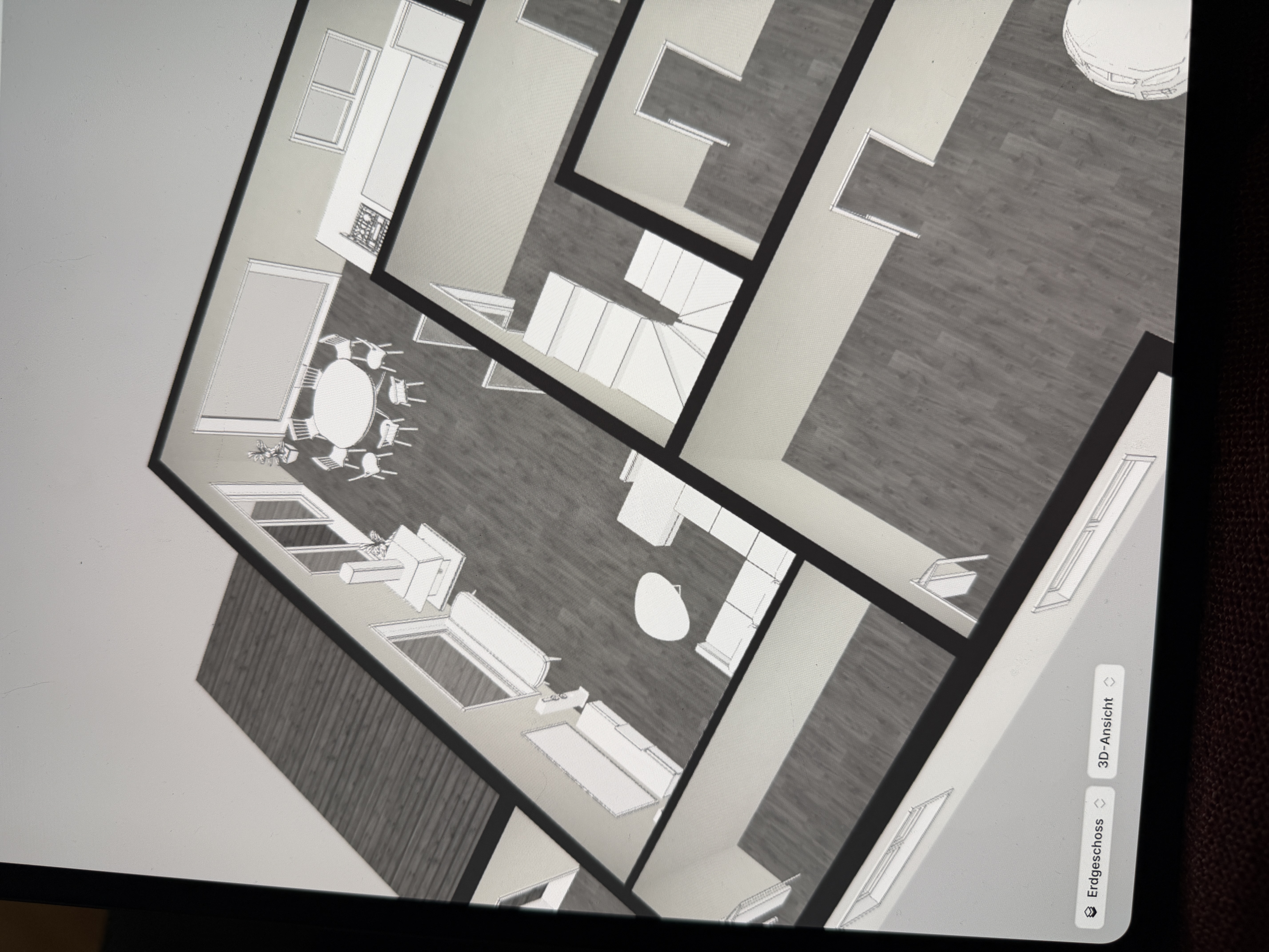
We think it’s pretty good. The room sizes are also large enough to accommodate everything you might want to add in the future.
The gallery is very spacious. If you think the wall near the desk is closed, that’s incorrect according to the plan.
The whole area is open with tall windows and should bring a lot of natural light into the entire space, making it visually very attractive as well.
B
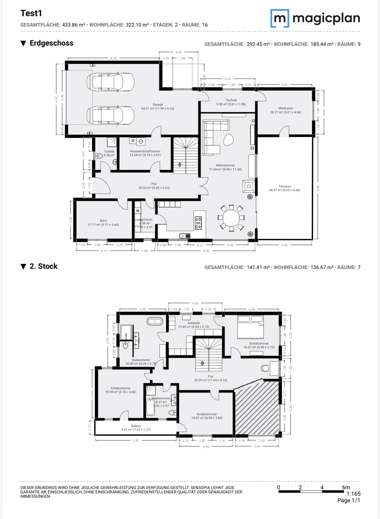
bluetoothtony4 Apr 2026 11:02We have now made some additional adjustments in 3D, and I don’t think the living room will get too little light.
B
bluetoothtony4 Apr 2026 11:25kbt09 schrieb:
Where is north? Or is the plan oriented to true north? That's right, that information is missing.
North is the garage entrance.
South is the terrace.
West side is therefore the kitchen/children’s room.
H
hanghaus20234 Apr 2026 11:26Somehow, neither I nor YOU have understood how the wall where the offset shed roof connects should be positioned (blue).

Is there also a cross-section?
Is there also a cross-section?
Similar topics