Dear house building community,
After much consideration, I have decided to share our preliminary design here. As a longtime passive reader, I would like to give back to the community with this small contribution and perhaps even inspire some readers with our floor plan.
For context: We have completed the preliminary design phase with the architect and are currently gathering quotes. The house will be a prefabricated home with slightly upscale features (KfW-40 standard, Q3 plaster, ventilation system, motorized blinds, etc.) and will cost around 3000 € per square meter (about 280 per square foot). I appreciate any feedback and look forward to many comments. Feel free to critically question the design. One note: we are satisfied with the planning and do not wish to make any changes.
Let’s get started!
Basic data:
Requirements:
I have kept it brief on purpose and do not want to reveal what I like or dislike about the design just yet. Instead, I’m going to relax now and grab some popcorn. If you want to know more, feel free to visit my website (Name + “.de”).
I’m looking forward to your opinions!
After much consideration, I have decided to share our preliminary design here. As a longtime passive reader, I would like to give back to the community with this small contribution and perhaps even inspire some readers with our floor plan.
For context: We have completed the preliminary design phase with the architect and are currently gathering quotes. The house will be a prefabricated home with slightly upscale features (KfW-40 standard, Q3 plaster, ventilation system, motorized blinds, etc.) and will cost around 3000 € per square meter (about 280 per square foot). I appreciate any feedback and look forward to many comments. Feel free to critically question the design. One note: we are satisfied with the planning and do not wish to make any changes.
Let’s get started!
Basic data:
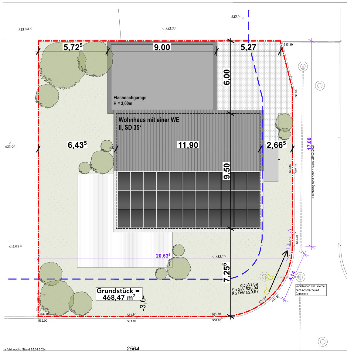
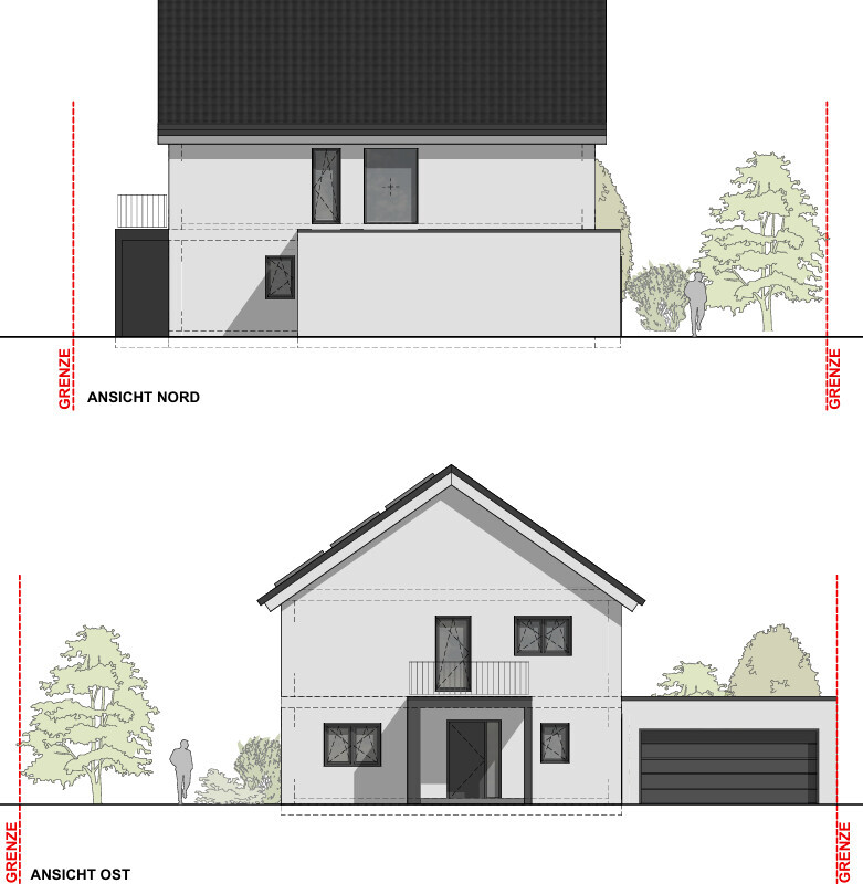
- Plot: approx. 470 m² (about 5050 sq ft) in a new development area with a slight south-facing slope (1 m (3 feet) over plot length, 0.5 m (1.5 feet) over house width)
- Neighboring plot to the north: unattractive, vacant three-story building
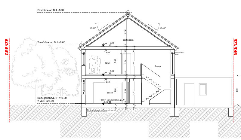
- Maximum budget for the construction project excluding land and possibly garden/terrace: 700,000 €
Requirements:
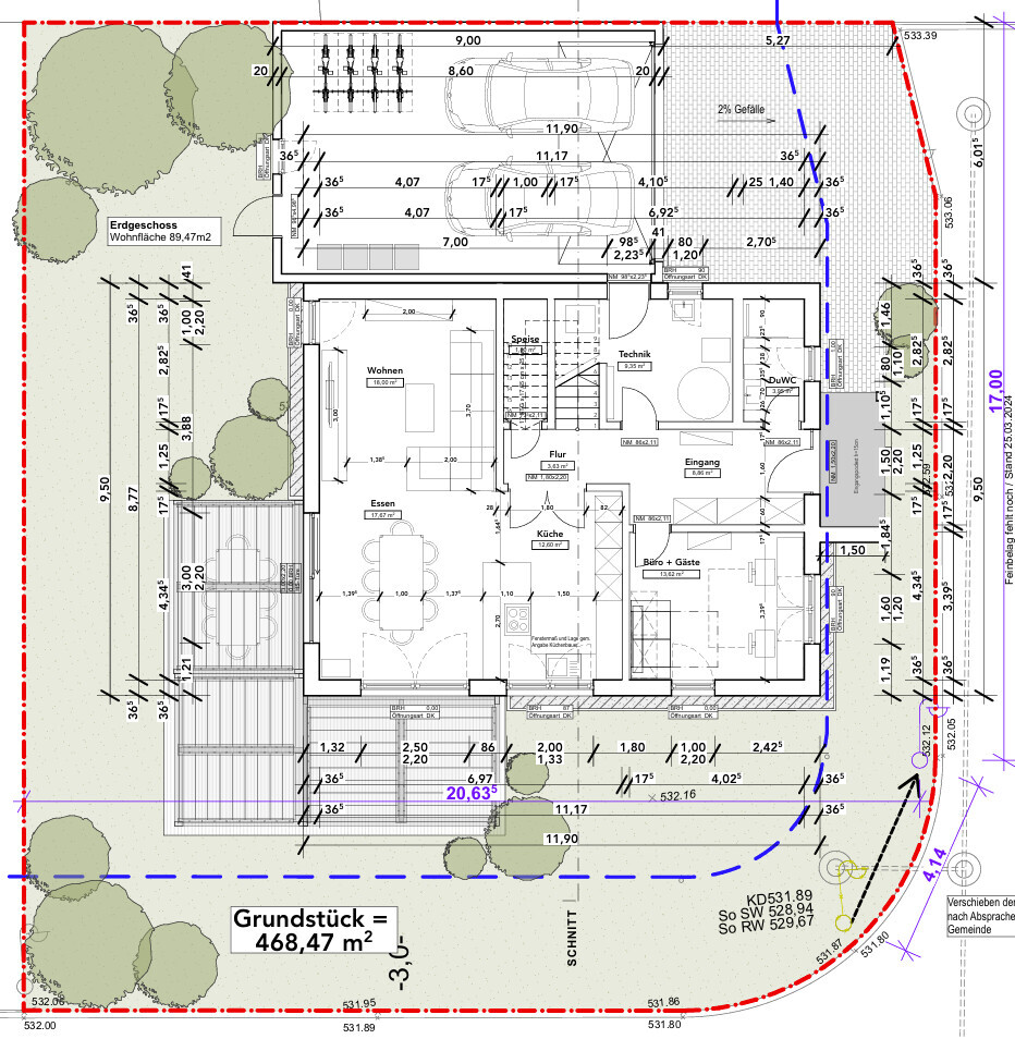
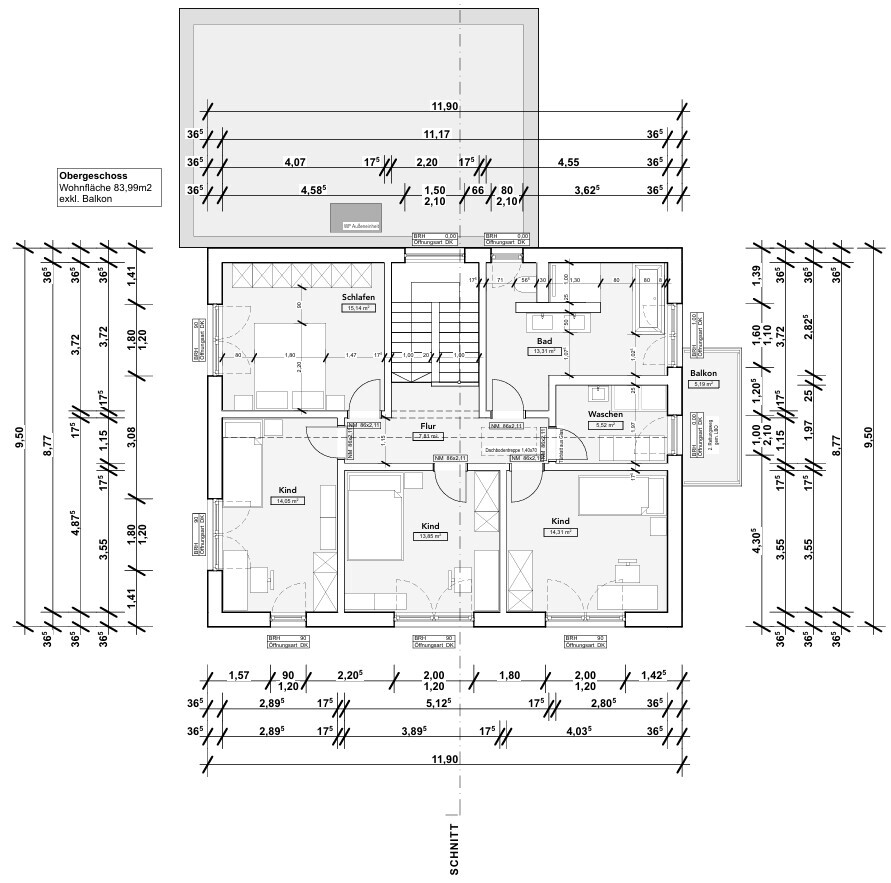
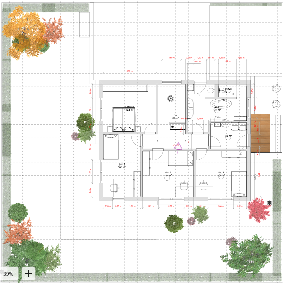
- 3 children’s bedrooms (each 12–14 m² (130–150 sq ft))
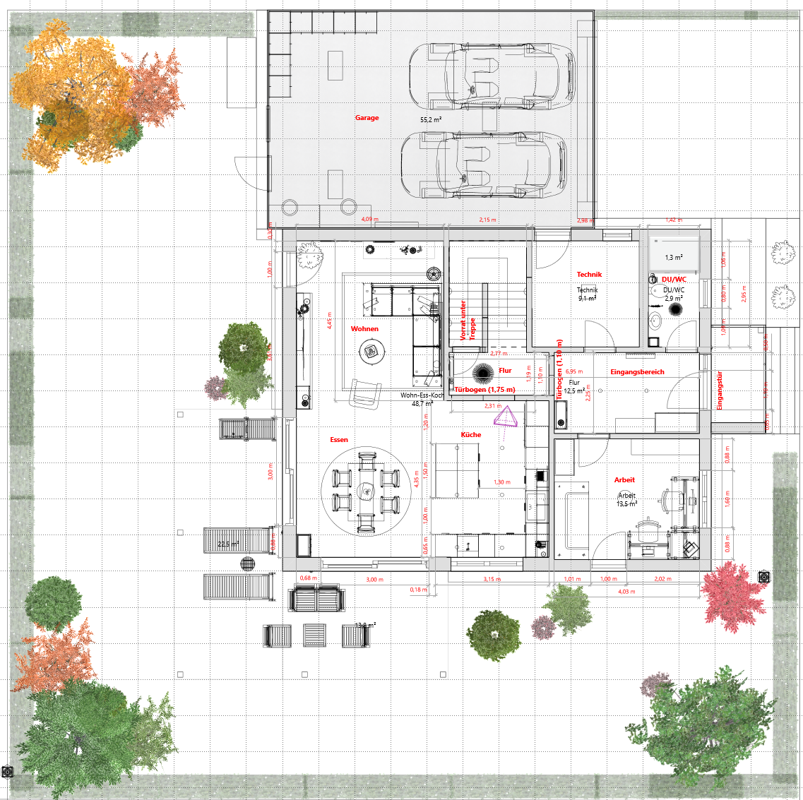
- Laundry or utility/laundry room
- Study room with space for double desk and guest bed
- Shower in guest bathroom
- Straight-run staircase
- Living-dining-kitchen area in an L-shape
- Space for hallway furniture
- Double garage
- 2 full stories
- Built on a slab foundation
I have kept it brief on purpose and do not want to reveal what I like or dislike about the design just yet. Instead, I’m going to relax now and grab some popcorn. If you want to know more, feel free to visit my website (Name + “.de”).
I’m looking forward to your opinions!
Thank you for sharing your workflow!
I already assumed that you use a basic structure in one of the major AI image generators. For clarification: when you say you use the "woodcut-style 3D import" from LiveHome3D, what exactly do you mean? Is it the built-in 3D view of the floor plan there?
I had planned to try something similar and have often seen SweetHome3D recommended. Have you tested that as well and then actively decided to go with LiveHome3D? If so, I might try out that one directly.

-Malte- schrieb:
The built-in 3D view of the floor plan there?Exactly. You can do that via the export function or simply take a screenshot.I can’t comment on SweetHome3D. However, LiveHome3D is really a nice piece of software at a fair price (all the DLCs are completely unnecessary).
So, the shell of the house is finally complete, and while I’ve been actively posting updates and pictures on my blog, it’s about time I gave a sign of life here in the forum again. Honestly, after the initial aesthetic and functional culture shock, I couldn’t even find my own previous post. Praise be to Google for keeping the old links working and helping me find my way back to this thread.
Our original house design now dates back almost a year and a half, and as is typical with such projects, the plan has evolved quite a bit. I had to take some criticism for certain decisions, and others ended up as classic compromises between my partner and me. To keep it brief: The kitchen layout was adjusted, as we had discussed here before. Upstairs, we optimized the bathroom so that the bathtub is now at the T-junction instead of the washbasin, and the door to the home office on the ground floor has shifted slightly east to better optimize the interior space.
Although there are already tons of pictures on my blog, I want to address a few specific points here that illustrate what I really like about the floor plan now that I’ve experienced the house physically, and where I still have some doubts.
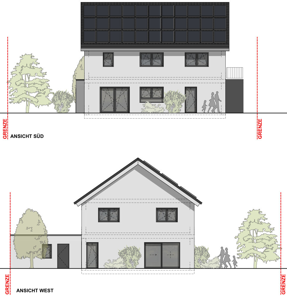
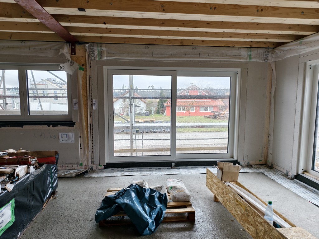
Let’s start with the balcony. I realized early on that it doesn’t offer much functional value as a living space, but since we more or less got it as a free addition and also wanted the entrance canopy for structural reasons, that’s fine by me. The real benefit here is more physical: The balcony door lets in a lot of natural light into the upper hallway as hoped, which greatly improves the lighting situation there — definitely a win.
When it comes to the guest bathroom and utility room, I’m ambivalent. Intuitively, I would have preferred these areas to be strictly separated. If you’re in a hurry or don’t want to track garden dirt through the house, our current solution is certainly pragmatic, but if I were building just for myself, it would have been designed differently. I feel similarly about the passage to the garage. It’s a nice feature for sure, but without that door, the utility room could be about half a square meter smaller, and the guest bathroom could have been swapped more effectively with the utility room. Whether the passage will actually prove useful in daily life depends a lot on how we end up using the garage. For now, I remain skeptical.
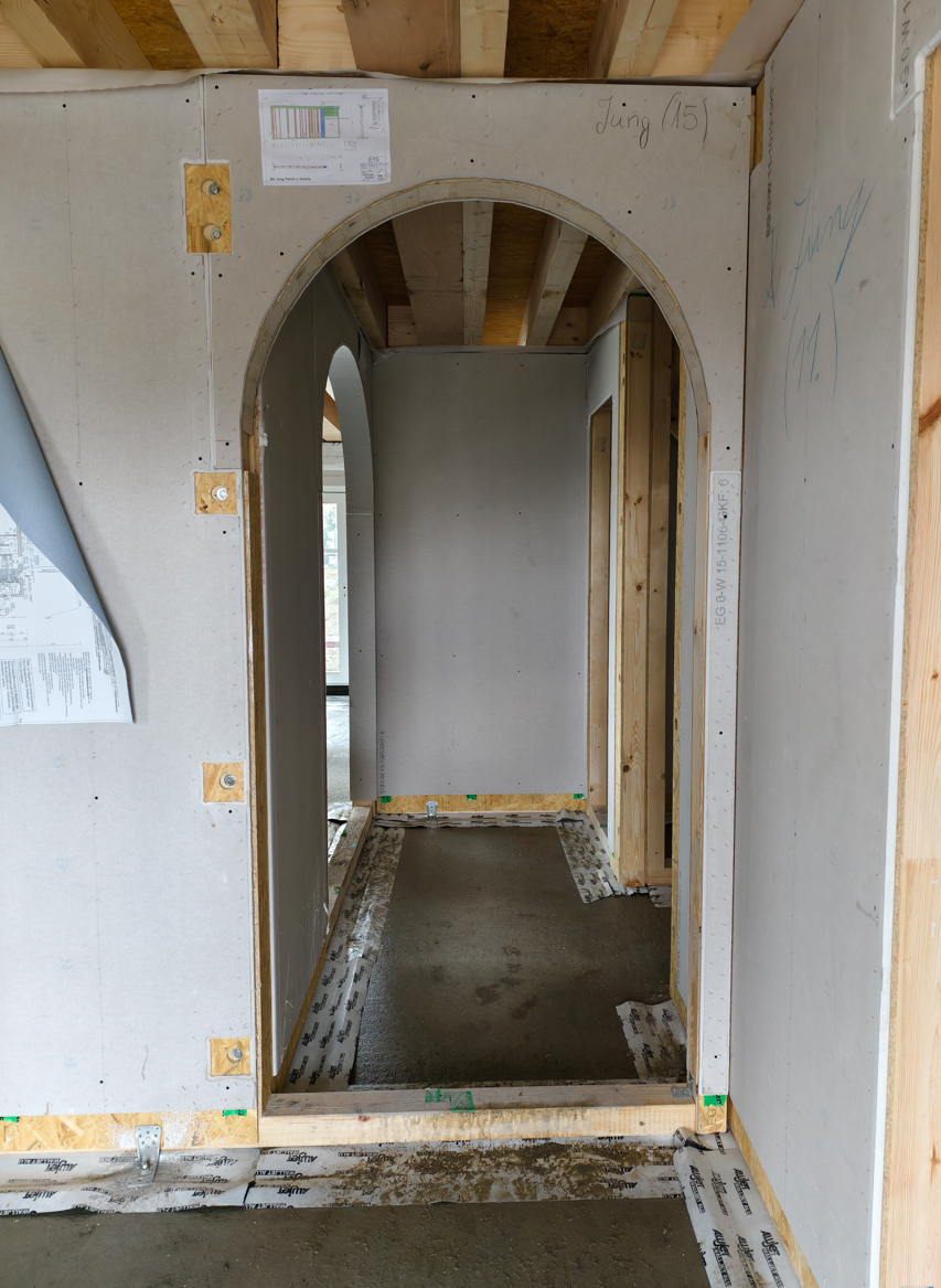
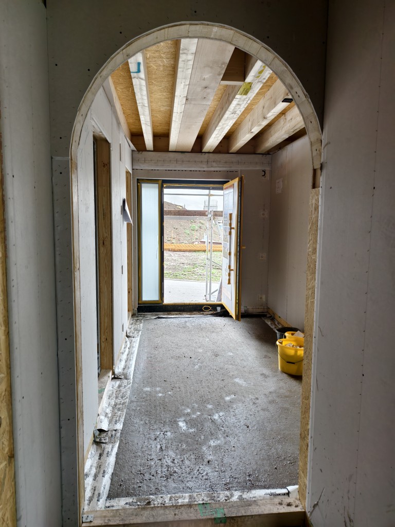
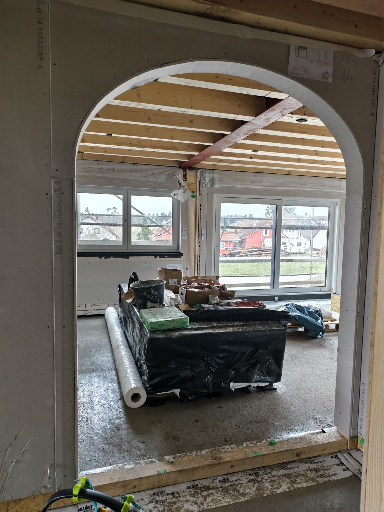
Now to the point I was most concerned about: the entrance area. I still hear the voices of ypg and Arauki in my head, warning that the hallway would narrow and become a dark dead-end where no one wants to go. Now that I’m standing in the shell, I have to say: That’s nonsense! And here’s why that theory was wrong. The door arches visually frame the rear area. The interplay of lighter and darker zones — that is, light and shadow — is what makes a space interesting and gives it depth. That’s exactly why no one wants to install a hundred sterile spotlights in the ceiling anymore. When you enter, you can already anticipate the passage to the living-dining-kitchen area; the floor plan makes you curious to see more. The originally planned fixed glazing on the right is missing, but the light is still more than sufficient. I think the arches significantly enhance the floor plan here, and too little thought is given to the actual spatial effect during all the theoretical 2D planning — I don’t exclude myself from that.
In the picture, the fixed glazing behind the stairs is still closed.
Even the notorious T-shaped bathroom layout, which has often been a somewhat divisive topic in this forum, has turned out to be a wonderful solution for us. You just have to accept that the bathroom needs to be about two square meters larger for it to work, ideally with natural light from two sides. In return, the zoning is now perfect. I also really like our slightly wider hallway. Being tall, I finally feel like I can move around properly when putting on my jacket without having to bend awkwardly.
Lastly, a few words about the living area. There have been occasional criticisms that it might be too dark. I find the result fantastic. Where the couch is placed, there is no direct, glaring light, but no matter where you look, the room is pleasantly bright. This creates a perfect cozy atmosphere with indirect lighting instead of feeling like you’re being grilled on the sofa.
I’ll try to post updates here from time to time. I would really appreciate any feedback.
Our original house design now dates back almost a year and a half, and as is typical with such projects, the plan has evolved quite a bit. I had to take some criticism for certain decisions, and others ended up as classic compromises between my partner and me. To keep it brief: The kitchen layout was adjusted, as we had discussed here before. Upstairs, we optimized the bathroom so that the bathtub is now at the T-junction instead of the washbasin, and the door to the home office on the ground floor has shifted slightly east to better optimize the interior space.
Although there are already tons of pictures on my blog, I want to address a few specific points here that illustrate what I really like about the floor plan now that I’ve experienced the house physically, and where I still have some doubts.
Let’s start with the balcony. I realized early on that it doesn’t offer much functional value as a living space, but since we more or less got it as a free addition and also wanted the entrance canopy for structural reasons, that’s fine by me. The real benefit here is more physical: The balcony door lets in a lot of natural light into the upper hallway as hoped, which greatly improves the lighting situation there — definitely a win.
When it comes to the guest bathroom and utility room, I’m ambivalent. Intuitively, I would have preferred these areas to be strictly separated. If you’re in a hurry or don’t want to track garden dirt through the house, our current solution is certainly pragmatic, but if I were building just for myself, it would have been designed differently. I feel similarly about the passage to the garage. It’s a nice feature for sure, but without that door, the utility room could be about half a square meter smaller, and the guest bathroom could have been swapped more effectively with the utility room. Whether the passage will actually prove useful in daily life depends a lot on how we end up using the garage. For now, I remain skeptical.
Now to the point I was most concerned about: the entrance area. I still hear the voices of ypg and Arauki in my head, warning that the hallway would narrow and become a dark dead-end where no one wants to go. Now that I’m standing in the shell, I have to say: That’s nonsense! And here’s why that theory was wrong. The door arches visually frame the rear area. The interplay of lighter and darker zones — that is, light and shadow — is what makes a space interesting and gives it depth. That’s exactly why no one wants to install a hundred sterile spotlights in the ceiling anymore. When you enter, you can already anticipate the passage to the living-dining-kitchen area; the floor plan makes you curious to see more. The originally planned fixed glazing on the right is missing, but the light is still more than sufficient. I think the arches significantly enhance the floor plan here, and too little thought is given to the actual spatial effect during all the theoretical 2D planning — I don’t exclude myself from that.
In the picture, the fixed glazing behind the stairs is still closed.
Even the notorious T-shaped bathroom layout, which has often been a somewhat divisive topic in this forum, has turned out to be a wonderful solution for us. You just have to accept that the bathroom needs to be about two square meters larger for it to work, ideally with natural light from two sides. In return, the zoning is now perfect. I also really like our slightly wider hallway. Being tall, I finally feel like I can move around properly when putting on my jacket without having to bend awkwardly.
Lastly, a few words about the living area. There have been occasional criticisms that it might be too dark. I find the result fantastic. Where the couch is placed, there is no direct, glaring light, but no matter where you look, the room is pleasantly bright. This creates a perfect cozy atmosphere with indirect lighting instead of feeling like you’re being grilled on the sofa.
I’ll try to post updates here from time to time. I would really appreciate any feedback.
@roteweste ... very well summarized.
Utility room, I fully agree with you there. I think the garage door was overrated. 😉
Guest bathroom, practically the same situation—I had the bathroom in the “small apartment” (44m² (474 sq ft)) next to me separated off during renovation. It has proven to be 100% practical.
The rest of the ground floor ... I like it, and living in it will show whether all decisions were good or if some areas would have turned out differently with practical experience.
Upper floor – bathroom ... yes, a T-shaped bathroom needs a bit more space and definitely two window sides. Then it can work well. I also like the current positions of the bathtub and washbasin.
What I would check on the upper floor is the bed in the master bedroom. I really don’t like it next to the door. I would swap it with the wardrobe and see if additional storage can be created on the right side of the room.
In the children’s rooms, what is the actual window sill height implemented there?
Otherwise, fingers crossed!
kbt09 schrieb:
What I would check on the upper floor is the bed in the master bedroom. I really don’t like it right next to the door. I would swap it with the wardrobe and see if it’s possible to create additional storage space on the right side of the room. On both sides of the wall, we have soundproof panels. We’ll see if that’s enough; otherwise, we’ll have to modify our wardrobe, which is 3.5m (11.5 ft) wide.
kbt09 schrieb:
What is the window sill height in the children’s rooms? The sill height is standard: 1.20m (47 inches). It was important to us to have privacy in the bedrooms. Since there is already a height difference of about 1–2m (3–6.5 ft) to the neighbors to the south due to the slope and the street, this works well for us. To the west (left in the picture), the neighbor is building a bungalow. Good luck for us. :-)
Similar topics