ᐅ Floor Plan Review for a Single-Family Home of Approximately 200 sqm
Created on: 10 Aug 2022 13:23
S
Stadtvilla2023
Hello everyone,
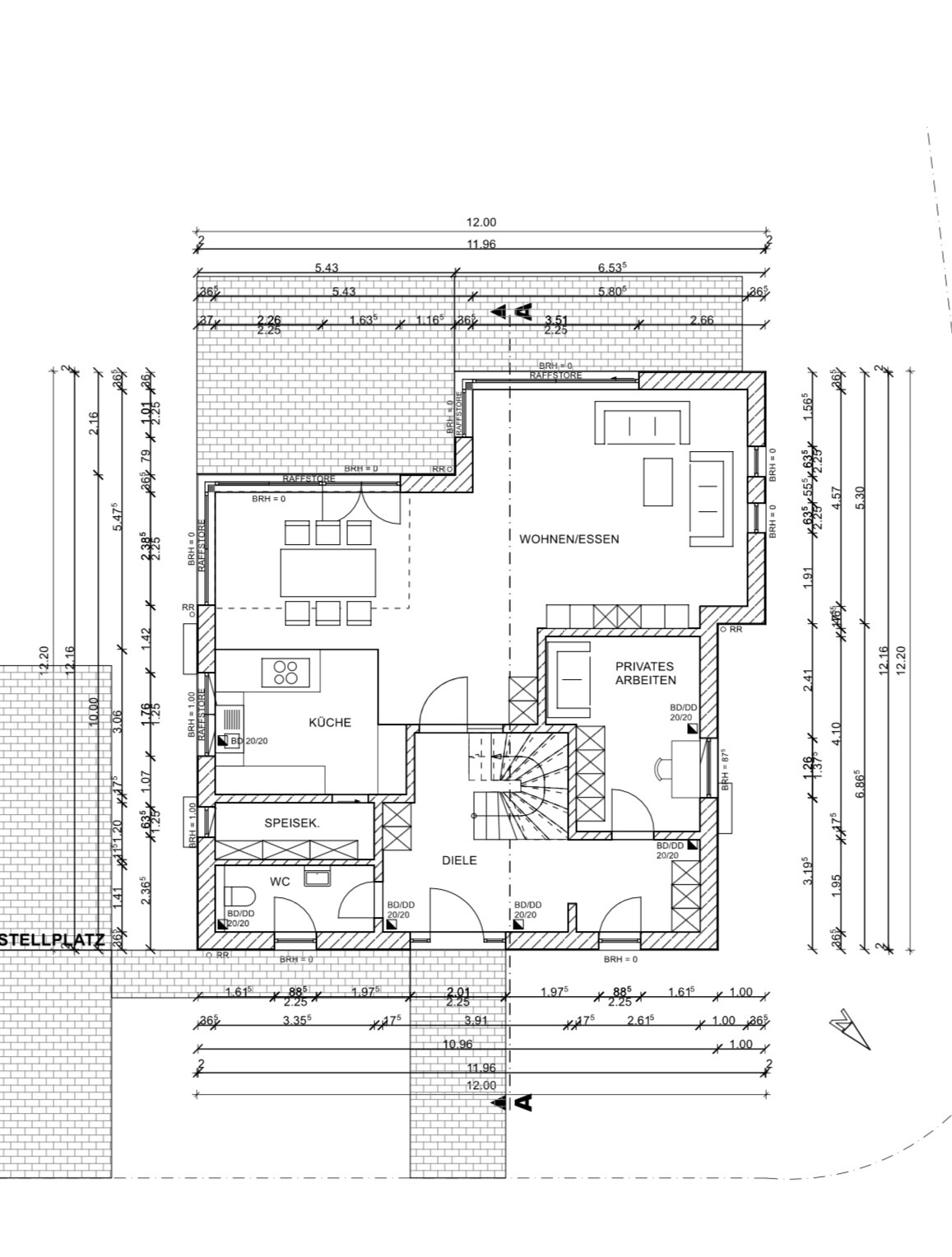
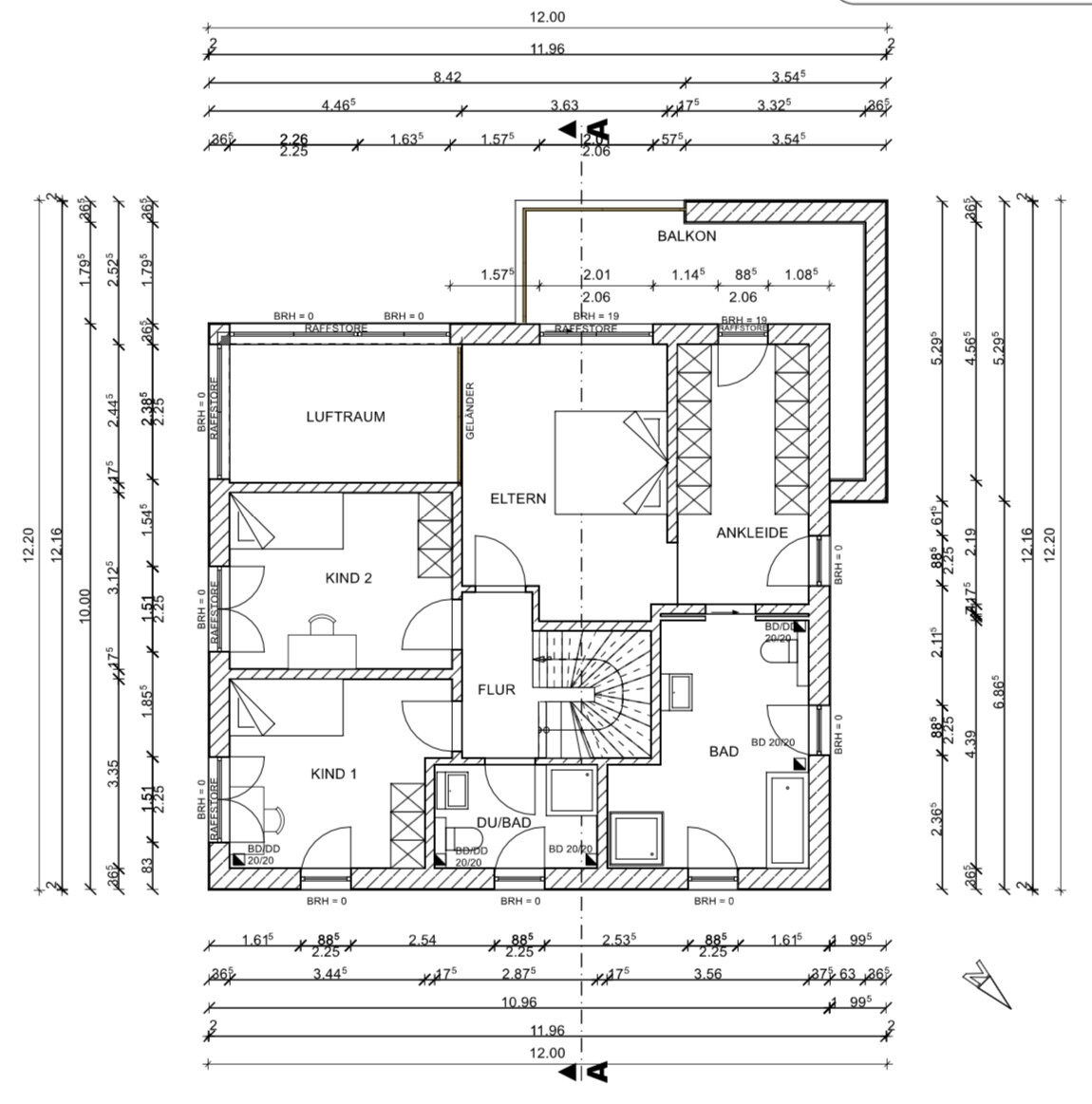
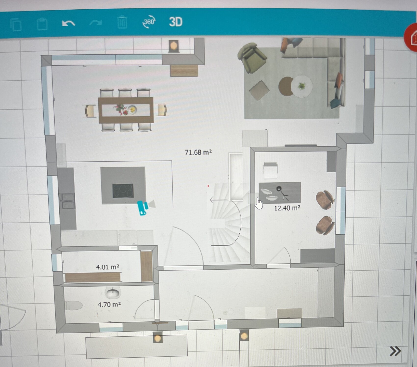
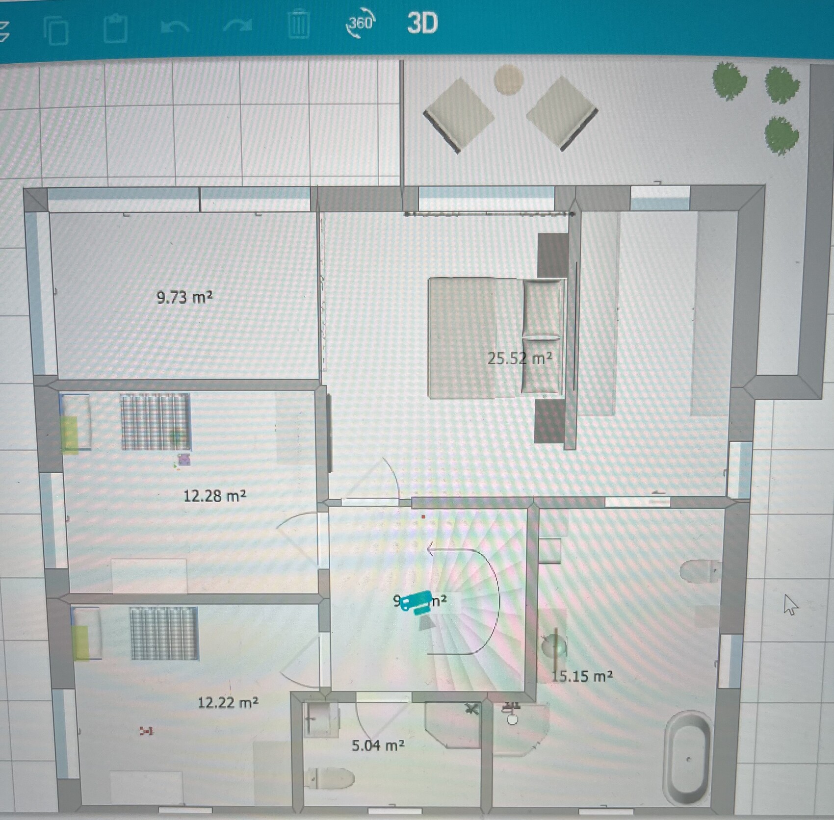
I’m only moderately satisfied with our floor plan because the relatively square staircase causes the surrounding rooms to become quite awkwardly shaped. I’ve accurately transferred the floor plan into a program and created an alternative. Essentially, the alternative floor plan is more open, and with the staircase being more elongated, the rooms are less compartmentalized. I don’t want to burden the architect with many more changes that might not be implemented. Therefore, I ask for your understanding that I cannot provide the architect’s drawings for this alternative. We could definitely consider the concept of a staircase integrated into the living area. I know this might not be an option for many. I would really appreciate your opinions on this or perhaps suggestions for changes.
Development plan / restrictions
No development plan / no planning permission
Plot size: 620m² (0.15 acres)
Slope
Site coverage ratio
Floor space index
Building envelope, building line and boundary
Edge development
Number of parking spaces
Number of storeys:
Roof type: hipped roof
Architectural style: urban villa
Orientation: south/west
Maximum heights / limits
Other requirements
Owners’ requirements
Style, roof type, building type: single-family home urban villa, hipped roof, plastered façade
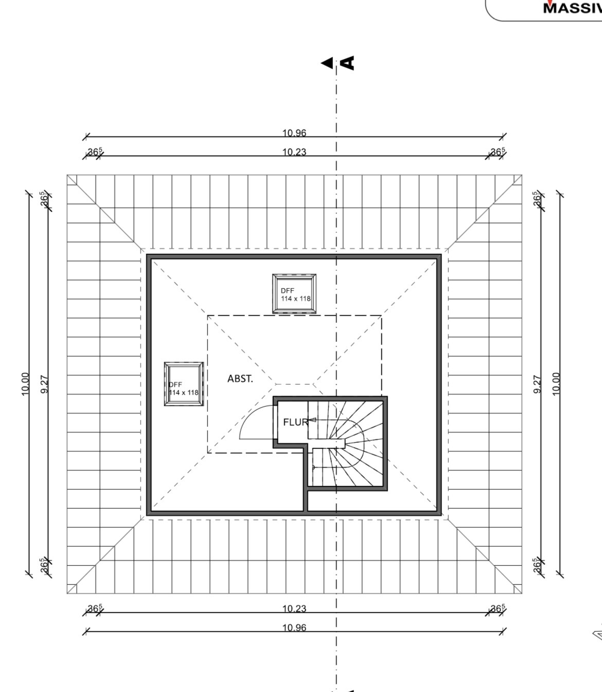
Basement, floors: 2 floors with finished attic and basement
Number of occupants, ages: 2 adults, 2 children
Space requirements on ground floor and upper floor
Office: family use or home office? 1x home office
Guest bedrooms per year: 2 guests
Open or closed architectural style: undecided, leaning towards closed
Conservative or modern construction: mix
Open kitchen, kitchen island: open
Number of dining seats: 6
Fireplace: yes
Music / stereo wall
Balcony, roof terrace: balcony
Garage, carport: garage, unclear whether attached or detached
Utility garden, greenhouse
Other wishes / special features / daily routines, also reasons why some options are preferred or excluded:
House design
Who designed the plan:
- Architect: standard design adjusted by us
- Do-it-yourself
What do you particularly like? Why?: large living area with big window fronts, spacious master bedroom with bathroom, pantry
What do you dislike? Why?: staircase – no highlight, space issues causing overly fragmented rooms, elongated guest WC and pantry
Cost estimate according to architect/planner: 620,000
Preferred heating system: air-source heat pump
If you have to give up something, which details / features
- Can give up: fireplace
- Cannot give up: kitchen island, number of rooms, open space above the living area
Why does the design look as it does now? For example:
We adapted the standard design to meet our needs. It was especially important that the rooms upstairs be as large as possible, and the hallway area small. That’s why we had to choose a smaller staircase. Since our plot is a corner lot and quite tightly built around, we planned an open space in the corner. This space is basically oriented toward the center of the gardens of the housing block.
What is the most important / fundamental question about the floor plan in 130 characters?
Basically, I would like to know what you think of the alternative I created. Do you perhaps have other ideas? We have already submitted the building application, as timing is an issue in Cologne. We will probably have to submit a change later because the window in the office should be larger and the window in the pantry removed. In principle, it would also be possible to modify additional windows. On the street side, we would like to maintain symmetry.
Thank you very much to anyone who can assist us here.
Corinna
I’m only moderately satisfied with our floor plan because the relatively square staircase causes the surrounding rooms to become quite awkwardly shaped. I’ve accurately transferred the floor plan into a program and created an alternative. Essentially, the alternative floor plan is more open, and with the staircase being more elongated, the rooms are less compartmentalized. I don’t want to burden the architect with many more changes that might not be implemented. Therefore, I ask for your understanding that I cannot provide the architect’s drawings for this alternative. We could definitely consider the concept of a staircase integrated into the living area. I know this might not be an option for many. I would really appreciate your opinions on this or perhaps suggestions for changes.
Development plan / restrictions
No development plan / no planning permission
Plot size: 620m² (0.15 acres)
Slope
Site coverage ratio
Floor space index
Building envelope, building line and boundary
Edge development
Number of parking spaces
Number of storeys:
Roof type: hipped roof
Architectural style: urban villa
Orientation: south/west
Maximum heights / limits
Other requirements
Owners’ requirements
Style, roof type, building type: single-family home urban villa, hipped roof, plastered façade
Basement, floors: 2 floors with finished attic and basement
Number of occupants, ages: 2 adults, 2 children
Space requirements on ground floor and upper floor
Office: family use or home office? 1x home office
Guest bedrooms per year: 2 guests
Open or closed architectural style: undecided, leaning towards closed
Conservative or modern construction: mix
Open kitchen, kitchen island: open
Number of dining seats: 6
Fireplace: yes
Music / stereo wall
Balcony, roof terrace: balcony
Garage, carport: garage, unclear whether attached or detached
Utility garden, greenhouse
Other wishes / special features / daily routines, also reasons why some options are preferred or excluded:
House design
Who designed the plan:
- Architect: standard design adjusted by us
- Do-it-yourself
What do you particularly like? Why?: large living area with big window fronts, spacious master bedroom with bathroom, pantry
What do you dislike? Why?: staircase – no highlight, space issues causing overly fragmented rooms, elongated guest WC and pantry
Cost estimate according to architect/planner: 620,000
Preferred heating system: air-source heat pump
If you have to give up something, which details / features
- Can give up: fireplace
- Cannot give up: kitchen island, number of rooms, open space above the living area
Why does the design look as it does now? For example:
We adapted the standard design to meet our needs. It was especially important that the rooms upstairs be as large as possible, and the hallway area small. That’s why we had to choose a smaller staircase. Since our plot is a corner lot and quite tightly built around, we planned an open space in the corner. This space is basically oriented toward the center of the gardens of the housing block.
What is the most important / fundamental question about the floor plan in 130 characters?
Basically, I would like to know what you think of the alternative I created. Do you perhaps have other ideas? We have already submitted the building application, as timing is an issue in Cologne. We will probably have to submit a change later because the window in the office should be larger and the window in the pantry removed. In principle, it would also be possible to modify additional windows. On the street side, we would like to maintain symmetry.
Thank you very much to anyone who can assist us here.
Corinna
Würfel* schrieb:
I find it pointless because you can’t look upward from the dining table.In my opinion, the purpose is not to look up while eating or talking at the table, but to create a more open feeling. Personally, I think it’s quite awkward to plan an open void above the dining table when it isn’t even aligned with the seating arrangement. Half of the people sit right next to the ceiling edge, while the others face the opening.
Aside from that, this lost space would probably be more useful for the kids’ rooms.
Unfortunately, here there is also a wall on the upper floor (the kids’ room wall) cutting into the void, which reduces both its size and visual effect. It’s basically just a shaft upwards, without a gallery or mezzanine.

Würfel* schrieb:
I find it pointless because you can’t look upwards from the dining table. On the other hand, there is the statement from @Myrna_Loy #22. How it actually appears is probably not that easy to judge and also depends on building materials, etc.
Würfel* schrieb:
I have a similar open space “around the corner” myself, and that feels completely different from having it just on one side. I agree with that. Such an open void is truly a luxury, and if you build one, you probably don’t want to make compromises. In this case, the children’s living quality is sacrificed while the adults continue to enjoy luxury. This is not meant negatively at all. After all, many children would be happy just to have a room of their own. I just wonder if the parents forget during the planning stage that the little ones will soon want more than just to explore the 2sqm (21.5 sq ft) around them—they will want to invite friends, need a desk with a computer, their own clothes, maybe a hobby, and so on. Is the attic really the right answer then?
I also want to mention that such an open void isn’t just nice for looking out, but also for looking in. That’s no problem on spacious plots; but here, it was pointed out that the buildings are close together. So not only does the family look right into the marital bed, but the neighbor can also see in. The missing gallery also turns this luxury, as Yvonne already pointed out, into somewhat of a wannabe project.
Overall, I find the wish understandable and acceptable, but in this case, the design doesn’t quite convince me. Maybe they could experiment a bit more with different staircases, etc.
K a t j a schrieb:
Maybe try experimenting a bit more with different staircase options, etc. Your approach in #28 already looks good.
Was that with a basement? If so, I would probably go with the straight staircase option in #28 (my one turn is also basically straight 😉), separate the living area a bit more, rotate the staircase 180 degrees so that it opens up to the new atrium. The basement would then be accessible from the hallway.
Move the staircase more to the left on the plan to better utilize the space.
There’s a lot more potential in the kitchen area; I’m not a fan of Katja’s layout there, but there’s enough room to get creative.
I previously posted a photo of my open ceiling space. https://www.hausbau-forum.de/threads/einfamilienhaus-fast-finaler-grundriss-verbesserungsvorschlaege.32596/post-353302
I still think it looks amazing, and the effect is biggest when sitting at the dining table. Although ours is only partially underneath. We have a rug under the table and stacked wood by the fireplace, which also helps with the acoustics.
But I agree with others – the view and privacy should fit well when you have such large glass surfaces.
M
Myrna_Loy12 Aug 2022 17:10Würfel* schrieb:
I’ve posted a photo of my open ceiling space before. https://www.hausbau-forum.de/threads/einfamilienhaus-fast-finaler-grundriss-verbesserungsvorschlaege.32596/post-353302
I still really like it, and the biggest impact is definitely felt when sitting at the dining table. Although ours is only partially underneath it. We have a rug under the table and stacked wood by the fireplace, which also helps with the acoustics.
But I agree with others – the view inside and outside should be right when you have such large glass surfaces.That fits well. And it basically reflects what we aim for by positioning the open ceiling space. Your dining room light is also hung from the standard-height ceiling. But in this design, you are essentially sitting in a narrow tower, which is emphasized by a light fixture similar to the one you have as a focal point.Similar topics