My two bathrooms are "basically" already planned.
However, while walking through the construction site, some fresh ideas came up.
At the moment, I still have quite a bit of freedom to redesign, although walls, doors, and some small details are naturally already fixed.
Here is the ground floor bathroom (for personal use) as I have planned it:
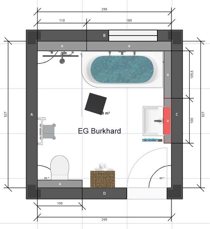
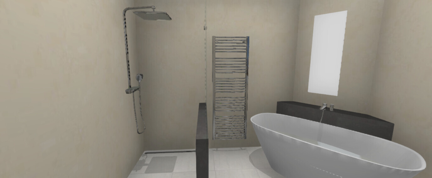
The position of the shower is already fixed, or rather the full-height pre-wall element, since wastewater and the mechanical ventilation system for indoor air have to run from above through it. The shower is to be enclosed on three sides by about 2m (6.5 feet) high glass panels, approximately 130-140cm (51-55 inches) deep, without a door or curtain.
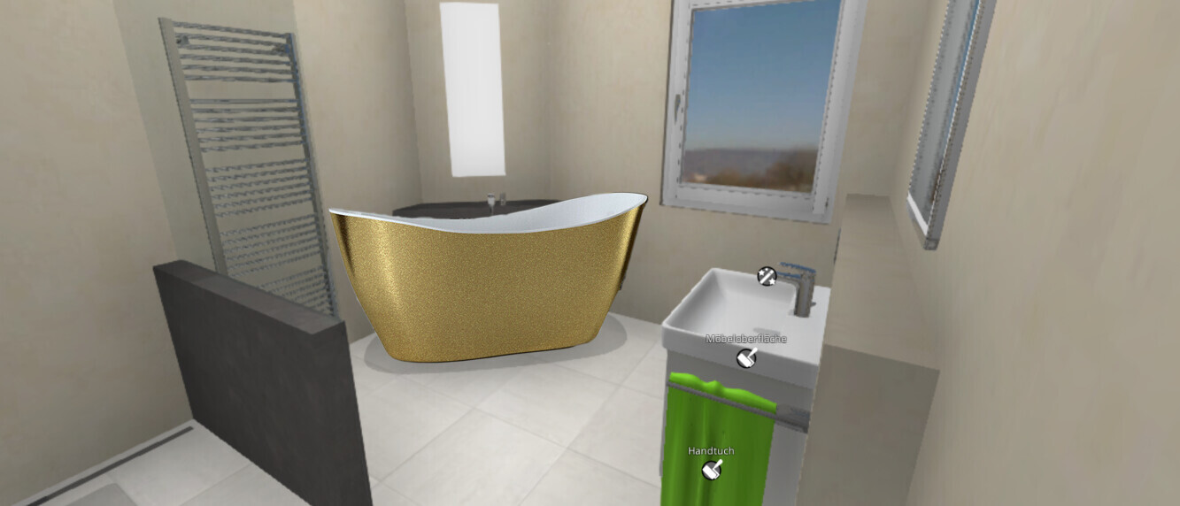
My wish for a freestanding bathtub hasn’t yet been graphically implemented in a way I find visually appealing. But then the idea came up to place the washbasin on a T-shaped element next to the toilet and position the bathtub diagonally in the corner on the right. Problem: It could get a bit tight next to the toilet, or you might be partially blocking the doorway while standing at the washbasin. Does anyone have a better idea? My desired bathtub (haven’t tried sitting in it yet) would be a real eye-catcher like, for example, this one
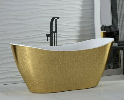
One reason: I would probably enjoy the look every time I enter the bathroom. And it would surely create a wow effect for guests (I don’t have a separate guest toilet). And if others enjoy it, so do I 😎
But I’m still a bit nervous about committing to one like this. Just for your information: A bathtub is essential for me (also for medical reasons).
@ypg Hardly possible to step on my toes with such things :p
However, while walking through the construction site, some fresh ideas came up.
At the moment, I still have quite a bit of freedom to redesign, although walls, doors, and some small details are naturally already fixed.
Here is the ground floor bathroom (for personal use) as I have planned it:
The position of the shower is already fixed, or rather the full-height pre-wall element, since wastewater and the mechanical ventilation system for indoor air have to run from above through it. The shower is to be enclosed on three sides by about 2m (6.5 feet) high glass panels, approximately 130-140cm (51-55 inches) deep, without a door or curtain.
My wish for a freestanding bathtub hasn’t yet been graphically implemented in a way I find visually appealing. But then the idea came up to place the washbasin on a T-shaped element next to the toilet and position the bathtub diagonally in the corner on the right. Problem: It could get a bit tight next to the toilet, or you might be partially blocking the doorway while standing at the washbasin. Does anyone have a better idea? My desired bathtub (haven’t tried sitting in it yet) would be a real eye-catcher like, for example, this one
One reason: I would probably enjoy the look every time I enter the bathroom. And it would surely create a wow effect for guests (I don’t have a separate guest toilet). And if others enjoy it, so do I 😎
But I’m still a bit nervous about committing to one like this. Just for your information: A bathtub is essential for me (also for medical reasons).
@ypg Hardly possible to step on my toes with such things :p
K
knalltüte3 Jan 2021 19:10I used the weekend to thoroughly and intensely discuss my kitchen and bathroom planning, or rather to have a "heated" debate about it. I realized that many of my habits are better remembered by my family than by myself 😉. Learned something new...
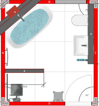
Therefore, I’m sharing here what will likely be my final bathroom plan; the kitchen plan will follow shortly.
The arguments against a "designer glass enclosure" were clearly the difficult and frequent cleaning required. I’m not the one who would do that. So, I looked at a low-maintenance bathroom (shower) at my daughter’s place. These are walk-in showers with light gray 60cm x 60cm (24 inches x 24 inches) tiles and a linear drain. Not cleaning for two weeks doesn’t show. Hopefully, a cleaning lady visiting every two weeks will be sufficient.
Only a single glass panel from about 85cm (33 inches) high up to 210cm (83 inches) high, mounted on the half-height wall, allows an open view through the room and lets daylight into the shower. At the same time, this provides necessary storage space for shampoo, etc. This area will probably have a frosted or film-coated section, depending on how visible the bathroom is from outside.
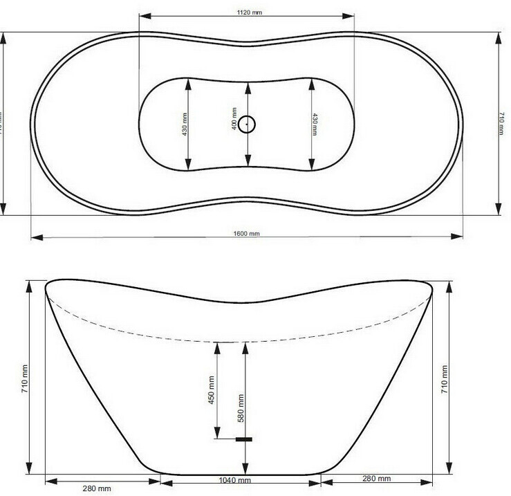
The golden bathtub was mostly well received. But logically, other furnishings will need to be rather simple or follow the "golden" style.
I have “photoshopped” the tub into the plan. The perspective isn’t quite right. Behind the tub is a (necessary) sloped casing. I’m planning to use that space for needed storage in the form of a recessed shelf. Next to the vanity unit will be the only other storage option, but it will be sufficient (about as much as in my current rental apartment). The floor and tiles in the shower will be light gray, approximately 60cm x 60cm (24 inches x 24 inches). Everything else roughly as shown.
I’m happy to hear your opinions, but the bathroom will go to the plumber pretty much as planned, so no major changes will be possible afterward. I don’t want that either, I need to finalize this. Photos of the finished bathroom will likely only be available in late summer.
Therefore, I’m sharing here what will likely be my final bathroom plan; the kitchen plan will follow shortly.
The arguments against a "designer glass enclosure" were clearly the difficult and frequent cleaning required. I’m not the one who would do that. So, I looked at a low-maintenance bathroom (shower) at my daughter’s place. These are walk-in showers with light gray 60cm x 60cm (24 inches x 24 inches) tiles and a linear drain. Not cleaning for two weeks doesn’t show. Hopefully, a cleaning lady visiting every two weeks will be sufficient.
Only a single glass panel from about 85cm (33 inches) high up to 210cm (83 inches) high, mounted on the half-height wall, allows an open view through the room and lets daylight into the shower. At the same time, this provides necessary storage space for shampoo, etc. This area will probably have a frosted or film-coated section, depending on how visible the bathroom is from outside.
The golden bathtub was mostly well received. But logically, other furnishings will need to be rather simple or follow the "golden" style.
I have “photoshopped” the tub into the plan. The perspective isn’t quite right. Behind the tub is a (necessary) sloped casing. I’m planning to use that space for needed storage in the form of a recessed shelf. Next to the vanity unit will be the only other storage option, but it will be sufficient (about as much as in my current rental apartment). The floor and tiles in the shower will be light gray, approximately 60cm x 60cm (24 inches x 24 inches). Everything else roughly as shown.
I’m happy to hear your opinions, but the bathroom will go to the plumber pretty much as planned, so no major changes will be possible afterward. I don’t want that either, I need to finalize this. Photos of the finished bathroom will likely only be available in late summer.
I actually find a 90 cm (35 inch) high tiled wall with a glass panel on top more difficult to clean than a continuous tiled or glass wall.
Therefore, I would plan your proposed 130 cm (51 inch) wall as a 100 cm (39 inch) drywall with a niche (height rather from 110 cm (43 inch) upward) and then add about 50 cm (20 inch) of glass panel beside it. This could later be extended around the corner if you find there is still quite a bit of splashing.
I would place the shower head on the narrow side of the shower, on the left when looking at the plan. This should reduce splashing. One or two recessed spotlights could provide lighting; preferably they should be on a separate switch. That’s what I have in my small bathroom—spotlights in the shower that I can switch on separately.
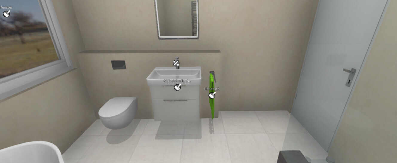
For the drywall on the right side, I would plan about 100 cm (39 inch) of space for the toilet and a 100 cm (39 inch) wide vanity unit (there are good and affordable options available, for example at Ikea, Godmorgon series).
Therefore, I would plan your proposed 130 cm (51 inch) wall as a 100 cm (39 inch) drywall with a niche (height rather from 110 cm (43 inch) upward) and then add about 50 cm (20 inch) of glass panel beside it. This could later be extended around the corner if you find there is still quite a bit of splashing.
I would place the shower head on the narrow side of the shower, on the left when looking at the plan. This should reduce splashing. One or two recessed spotlights could provide lighting; preferably they should be on a separate switch. That’s what I have in my small bathroom—spotlights in the shower that I can switch on separately.
For the drywall on the right side, I would plan about 100 cm (39 inch) of space for the toilet and a 100 cm (39 inch) wide vanity unit (there are good and affordable options available, for example at Ikea, Godmorgon series).
B
Bertram1003 Jan 2021 19:54Just a purely subjective opinion: I would use a striking color instead of the gray accents. That would look really cool. The gray feels a bit like an idea that was intended but never fully realized.
On the other hand, it’s just a rendering, and with actual material choices, it will probably look much better.
On the other hand, it’s just a rendering, and with actual material choices, it will probably look much better.
K
knalltüte3 Jan 2021 20:16kbt09 schrieb:
I actually find a 90 cm (35 inch) high tiled wall with a glass panel on top more difficult to clean than a continuous tiled or glass wall.
Therefore, I would plan your proposed 130 cm (51 inch) wall as a 100 cm (39 inch) drywall section with a niche (height rather starting from 110 cm (43 inch)), and then add about 50 cm (20 inch) of glass panel next to it. If you notice that splashing is still an issue, you could extend it around the corner.
I would place the showerhead on the left side wall of the shower. That should reduce splashing. For lighting, one or two spotlights would work well, ideally with separate switches. That's how I have it in my small bathroom—spotlights inside the shower with their own switch.
For the drywall partition on the right side, I would plan about 100 cm (39 inch) of space for the toilet and 100 cm (39 inch) for a washbasin (there are good and affordable options, for example at IKEA, Godmorgon series).Those are good detailed suggestions—thank you. Unfortunately, the bathroom planner 1) does not allow for that level of detail, and 2) I have not yet planned with such precision. For now, I just need to establish the rough layout so that the plumber can start installing the pipes. I will definitely take your advice into consideration.
However, the shower must be positioned along the utility room wall; otherwise, I would need a pre-wall element that takes up space (since the common wall cannot be channeled). I think 130 cm (51 inch) should be sufficient to keep the floor in front from getting too wet, and if it does… the tiles are light gray, durable, and slip-resistant 😉
K
knalltüte3 Jan 2021 20:19Bertram100 schrieb:
Just my personal opinion: I would use a cool color for the gray accents. That would look really stylish. The gray kind of says: they wanted to, but didn’t dare.
On the other hand, it’s “just” a rendering and will probably look much better with the actual material choices. Well, for the "color" I simply chose light gray, or something like slate for the partition wall. It will also be a matte light gray. Whether one or two more "fancy" details (like the built-in shelf above the tub or the illuminated mirror) will be added still has to be decided quite late. By then, the tub will already be in place, so there will still be time to reassess the overall impression.
B
Bertram1003 Jan 2021 20:28Now I can describe a bit better what makes the gray area look inelegant to me: the contrast to the light area is too strong. The light color is almost a non-color, and gray actually is too. Big contrasts need to be carefully considered and usually benefit from having enough space around them.
In my opinion, gray is also not elegant enough to pair with gold. Matte black would really work instead. In geometric shapes.
In my opinion, gray is also not elegant enough to pair with gold. Matte black would really work instead. In geometric shapes.
Similar topics