ᐅ Floor plan and 3D images of a 160m² urban villa. Please provide your feedback :)
Created on: 8 Jun 2019 13:44
K
Keenan86
Hello dear forum community,
My wife and I are planning to start our building project in a few months. It will be an urban villa with approximately 160 m² (1,722 sq ft) of living space. We have already purchased the plot of land (540 m² (5,813 sq ft)) and are currently in the planning phase. We would like to build with a general contractor and are actually quite satisfied with the one we have chosen so far.
However, we are not entirely sure about the floor plan and whether it really works well. This is our first (and hopefully last) building project. We would appreciate feedback from more experienced people who can offer us some tips. Thanks in advance!
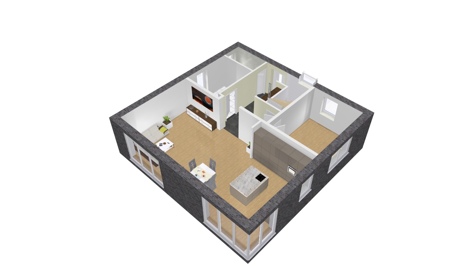
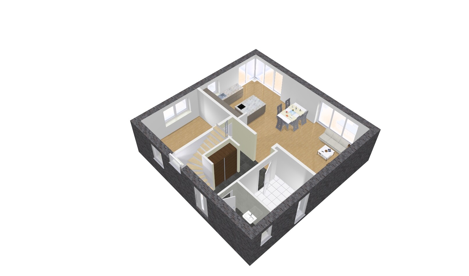
A few comments from me:
- A staircase directly at the front door... you see that often, but personally, I think it’s very impractical. You end up carrying all the dirt from the hallway upstairs.
- I’m also not a fan of bedrooms with very different sizes; one of them is quite small at 13m² (140ft²).
- The bathroom upstairs seems too large to me, or rather, you have too much unused space. It’s almost 2.5m (8 feet) from the sink to the bathtub... you can’t really put anything there.
Hello everyone and happy Pentecost!
Thank you very much for all the really helpful feedback. So I wasn’t completely wrong in thinking that the floor plan isn’t ideal. Personally, I’m not a big fan of the square shape. However, we were told that you either have significantly more length than width (or vice versa), and if not, it’s better to go with a square shape because of the ridge line.
@11ant what exactly do you mean by "For northeast exposure, bedroom and living room, the floor plan could sacrifice some depth and rather allow for more width, for example"? Unfortunately, I don’t have a detailed plan of our plot yet. But you can imagine the plot as a square.
I also think the kitchen could be recessed to create more space for the dining area. We will do that, and the room on the lower floor will probably be “sacrificed.” We will also take another look at the children’s room and bathroom upstairs and possibly make the bathroom a bit smaller to free up space for a small storage room. Thanks again for the tips, and if anyone has more, please feel free to share.

Keenan86 schrieb:
What exactly do you mean by "With the northeast child’s room, bedroom, and living room, the floor plan could afford to lose some depth without pain and instead gain more width, for example"?Oh, nonsense, I’m such a blonde—I actually meant the other side, the right side. The northeast room is the bedroom; I was referring to Child 1’s room in the northwest. These rooms have about four and a half meters (15 feet) depth, due to the depth of the walk-in closet plus a door width, which otherwise wouldn’t be necessary. If you took away the extra depth that Child 1’s room has compared to Child 2’s, you could afford more width for the house while keeping the same overall footprint.Keenan86 schrieb:
However, we were told that you should either have significantly more length than width (or vice versa), and if not, then it’s better to choose a square shape because of the roof ridge.That’s not entirely wrong, but it’s a greatly simplified explanation aimed at laypeople. Even a house with a footprint of 9.80 meters by 10.70 meters (32 feet 2 inches by 35 feet 1 inch) could be built without a ridge, despite the 90-centimeter (35-inch) difference in edge lengths: for example, by using a roof pitch of 30 degrees in depth and 28 degrees in width—just as a calculation example. The difference would hardly be noticeable to the naked eye.Keenan86 schrieb:
You can imagine the plot as a square.Even if you significantly misjudge it visually, this would still clearly allow for well over 10.25 meters (33 feet 8 inches) of possible house width. I therefore recommend not deliberately aiming for either a square or a non-square shape, but rather to experiment with optimized room dimensions and see what exterior dimensions and proportions result. That makes all this kind of tinkering unnecessary, which I clearly advise against:Keenan86 schrieb:
I also think the kitchen can be set back to make more space for the dining area. We will do that, and the room downstairs will probably be “sacrificed.”A room that can be “sacrificed” without hesitation would be a clear sign that the wrong basic floor plan was chosen.https://www.instagram.com/11antgmxde/
https://www.linkedin.com/company/bauen-jetzt/
H
hampshire10 Jun 2019 00:57Keenan86 schrieb:
I wasn’t far off with my suspicion that the floor plan isn’t ideal. Personally, I’m not a big fan of the square shape at all. You are right—don’t let anyone convince you to go with a square if you’re not really keen on it. It’s your house.
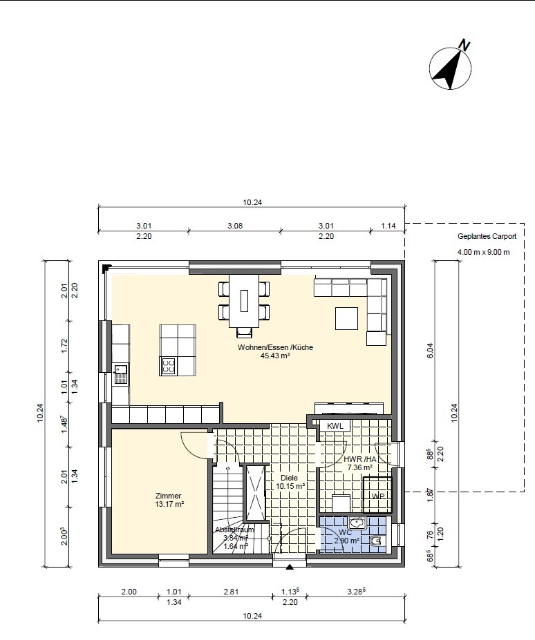
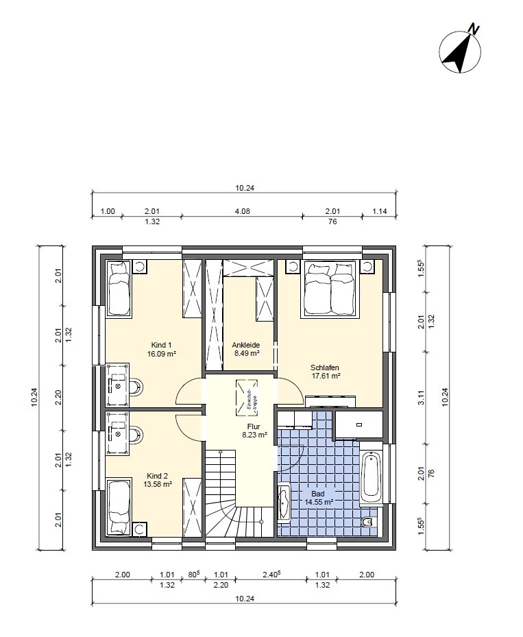
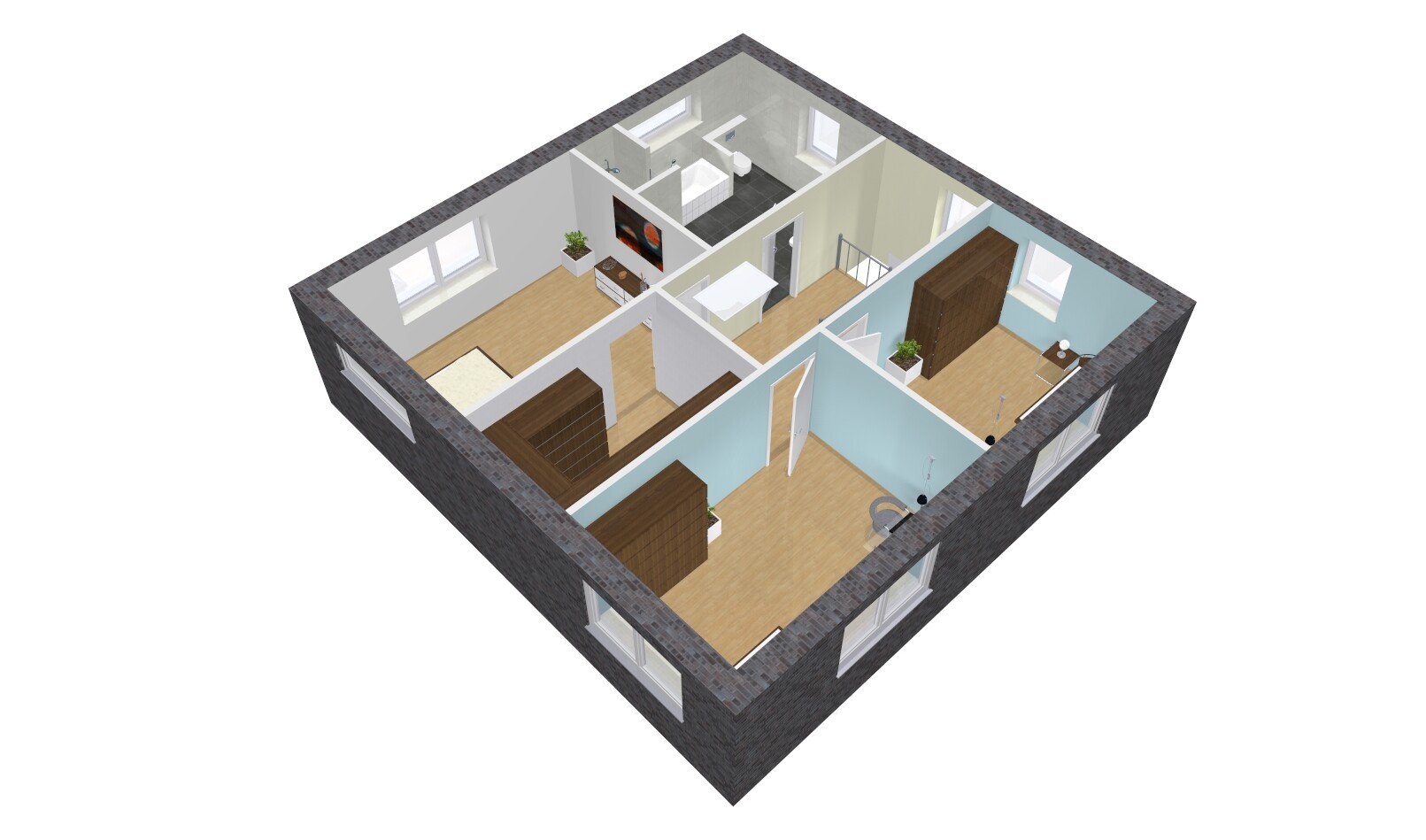
I’ve added numbers to the floor plans and will share my thoughts on the points:
1. Routing the staircase around the cloakroom is a great idea.
2. Skipping the seemingly obligatory shower in the guest toilet is also a good choice.
3. This design doesn’t just waste space; it also creates an expensive sense of discomfort by including a central open area.
4. The furniture looks very small here. Back facing the garden? Many do this for the TV. I always find that surprising. I’d rather make a home theater in the “room” marked here.
5. The dining table seems placed between the windows simply because the windows are fixed where they are. This shows the house wasn’t really designed from the inside out. None of the dining seats have an attractive view, and the passage to the kitchen island is too narrow.
6. The planner inserted a kitchen island just because it’s currently popular. But it doesn’t really fit here, and having the cooktop on the edge is questionable.
Summary: The kitchen-dining-living space is large but potentially uncomfortable and inefficient.
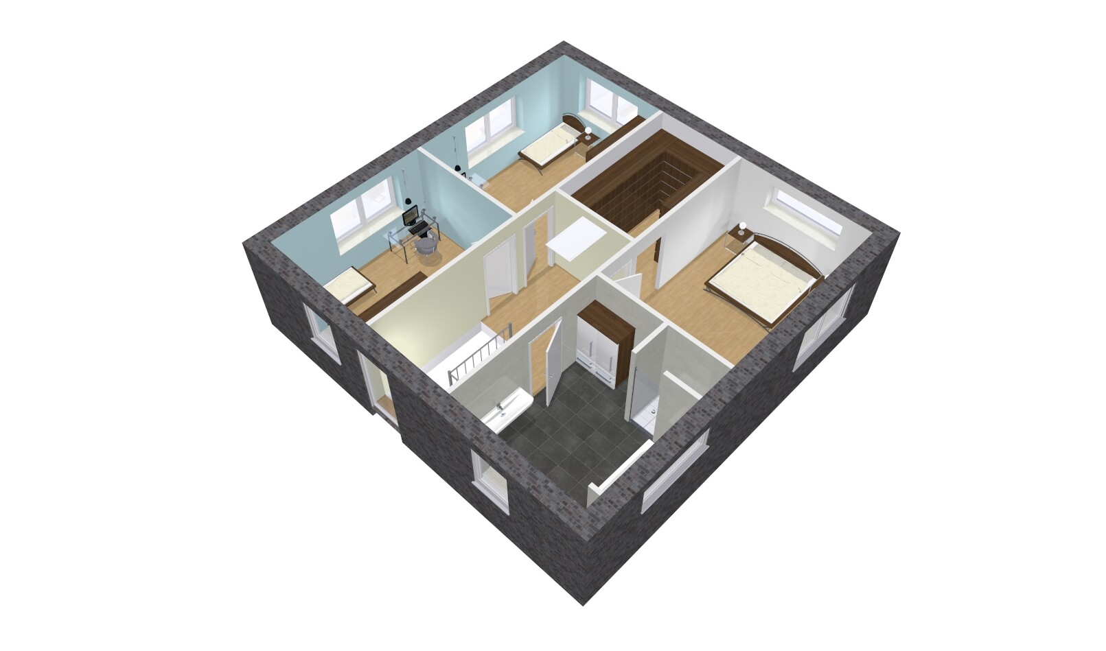
7. When building yourself, you can size children’s bedrooms more evenly. Such drastic size differences risk being hard to accept. I strongly advise against this, especially since the smaller room will be quite cramped for a teenager.
8. Slim wardrobes for slim people?
9. The bathroom is drawn carelessly. It seems too large compared to the other rooms, especially since the walk-in closet and children’s bedrooms are “small.”
10. The generous space at the foot of the bed in the master bedroom could compensate for the inequality of the children’s rooms.
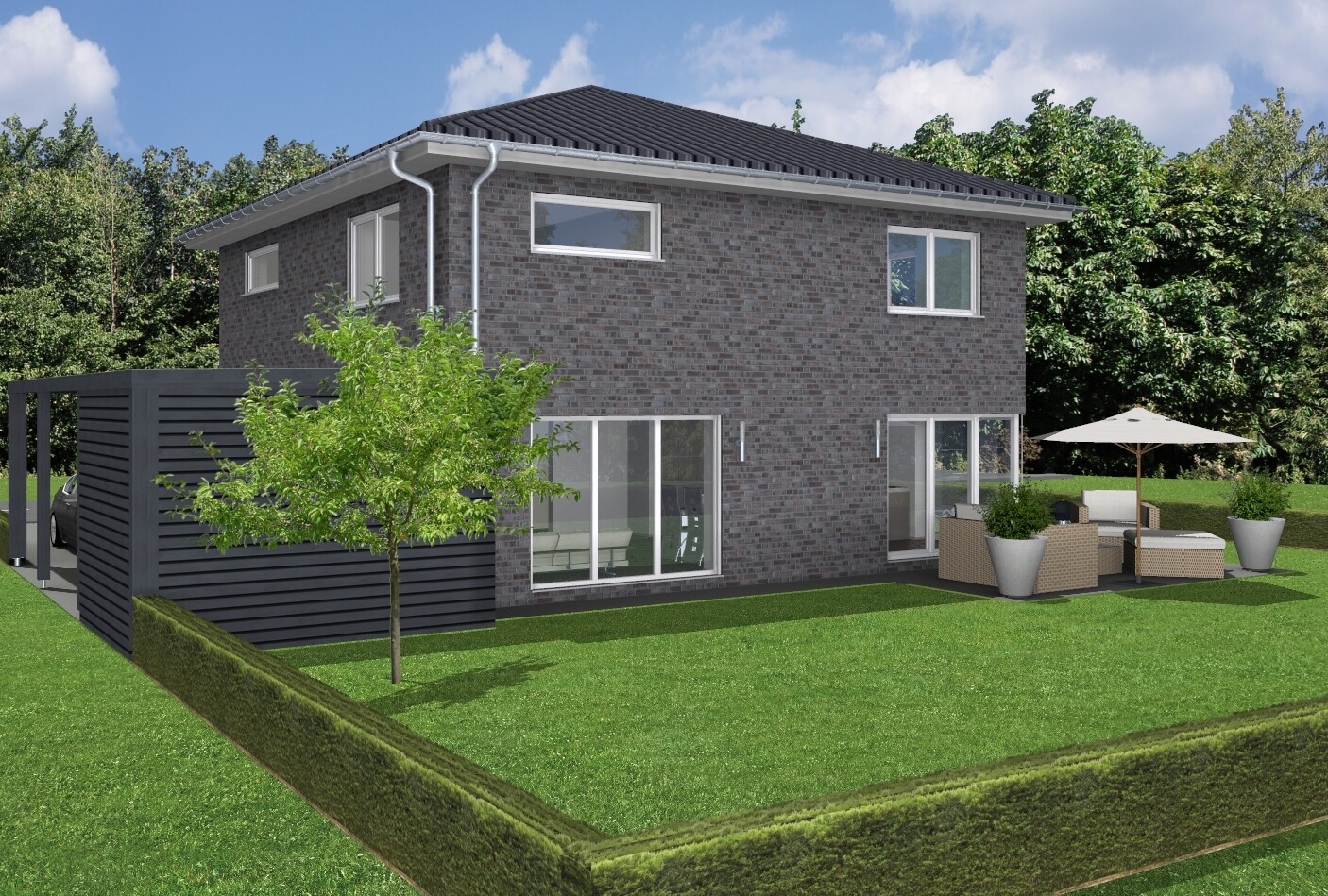
11. The windows—you have to live with what’s attractive on the outside when you’re inside.
Summary: The rooms feel carelessly and thoughtlessly thrown into the upper floor by the planner.
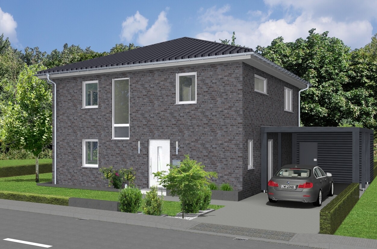
I would look for a new architect or designer. If a professional drew this, they have no interest in the life of the buyer in the house. Nice exterior views with a fitting car to identify with—and then imposing a square floor plan on someone who actually doesn’t want one... Next, please.
hampshire schrieb:
You are right, and don’t let anyone talk you into a square layout if you don’t really want it. It will be your house.
I’ve added numbers to the floor plans and am sharing my thoughts on each point:
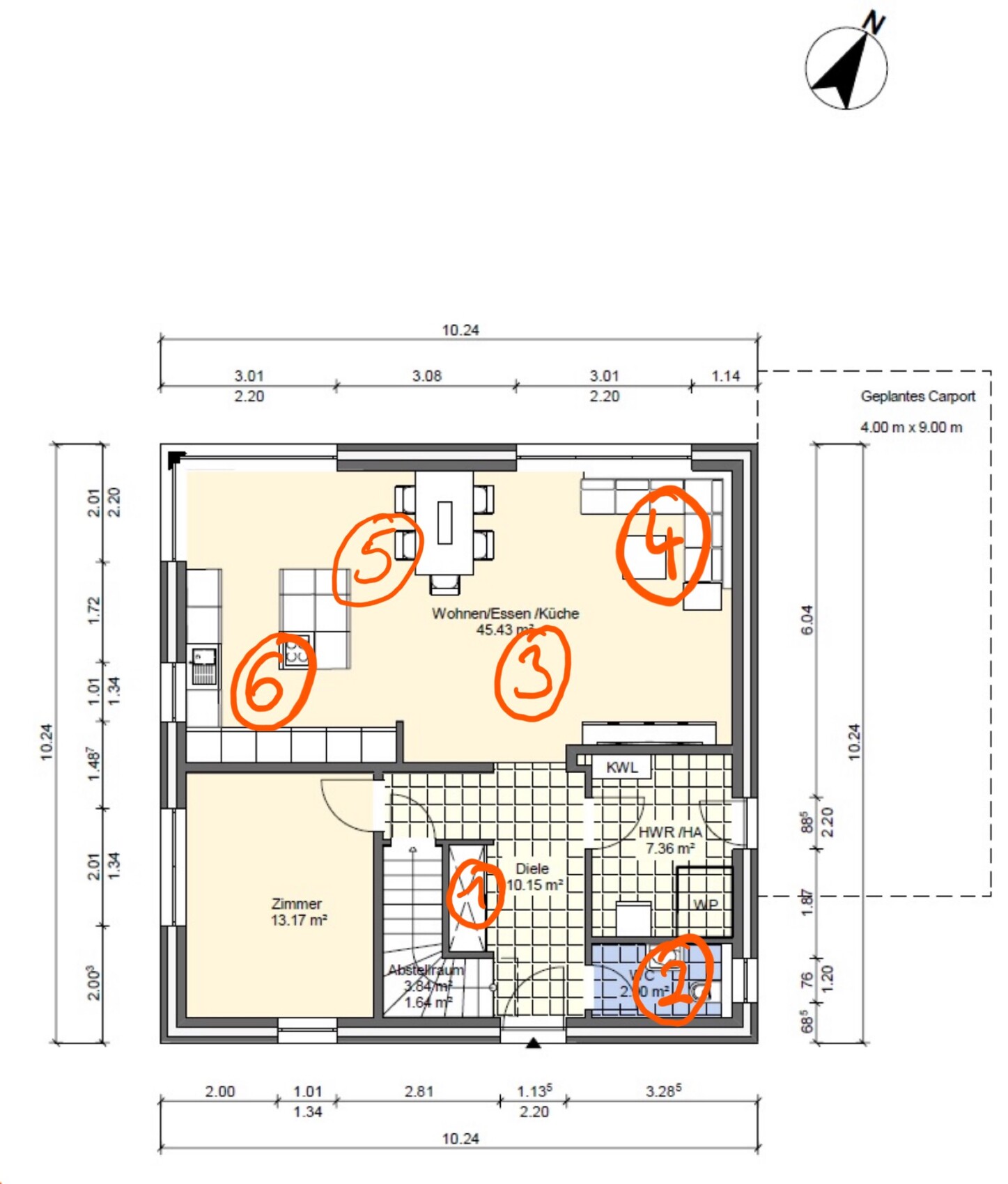
1. Having the staircase run around the cloakroom is great.
2. Skipping the seemingly obligatory shower in the guest toilet is also a good idea.
3. This design not only wastes space but also creates expensive discomfort with a central open area.
4. These pieces of furniture look very small. Facing the garden? Many do this because of the TV. I always find that surprising. Better to make a home theater in the room labeled “room.”
5. The dining table looks like it’s just placed between the windows because of the window arrangement. It shows that the house apparently wasn’t designed from the inside out. None of the dining places have an appealing atmosphere, and the walkway to the kitchen island is too narrow.
6. The planner inserted a kitchen island just because people currently like having one. But it doesn’t really fit, and having the cooktop at the edge—well, not ideal.
Conclusion: The combined kitchen-dining-living area is large but potentially uncomfortable and inefficient.
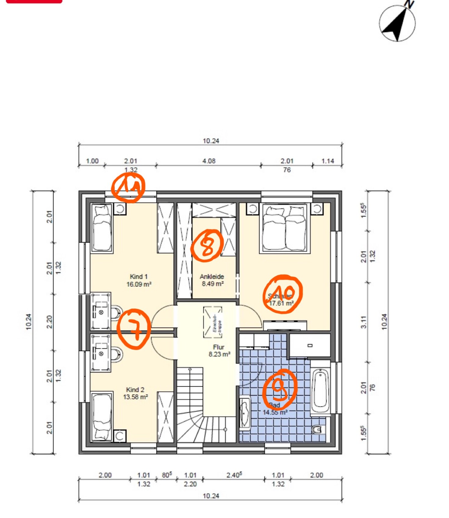
7. When building yourself, you can make the children’s rooms similar in size. These drastic size differences risk being hard to justify. I strongly advise against it, especially since the smaller room will be really cramped for a teenager.
8. Slim closets for slim people?
9. The bathroom is drawn without care. It seems too large compared to other rooms, especially the walk-in closet and the “small” children’s room.
10. The generous space at the foot of the bed in the master bedroom could compensate for the imbalance between the children’s rooms.
11. The windows—inside you have to make do with what looks stylish from the outside.
Conclusion: The rooms on the upper floor feel carelessly and thoughtlessly tossed together by the planner.
I would look for a new architect or designer. If a professional drew this, they are not interested in the buyer’s daily life in the house. Fancy exterior views and a car drawn in for identification—and then foist a square floor plan on someone who actually isn’t into that... Next, please. Nice and useful criticism, but it’s not always easy to change architects.
I had two bad ones from the start, then got tired of it, put a lot of time in myself, and my colleague gave it the final polish (she was once an architect, old-school training ?). The current floor plan is exactly what we want now.
That said, if the plan is lousy but in the end it fits perfectly, and the architect did little beforehand, then somehow there’s still something positive about that.
Similar topics