ßÉģ Detailed planning for a single-family house, 180 sqm, flat roof, with basement and double garage
Created on: 17 Dec 2017 18:53
I
ivenh0
Development Plan / Restrictions
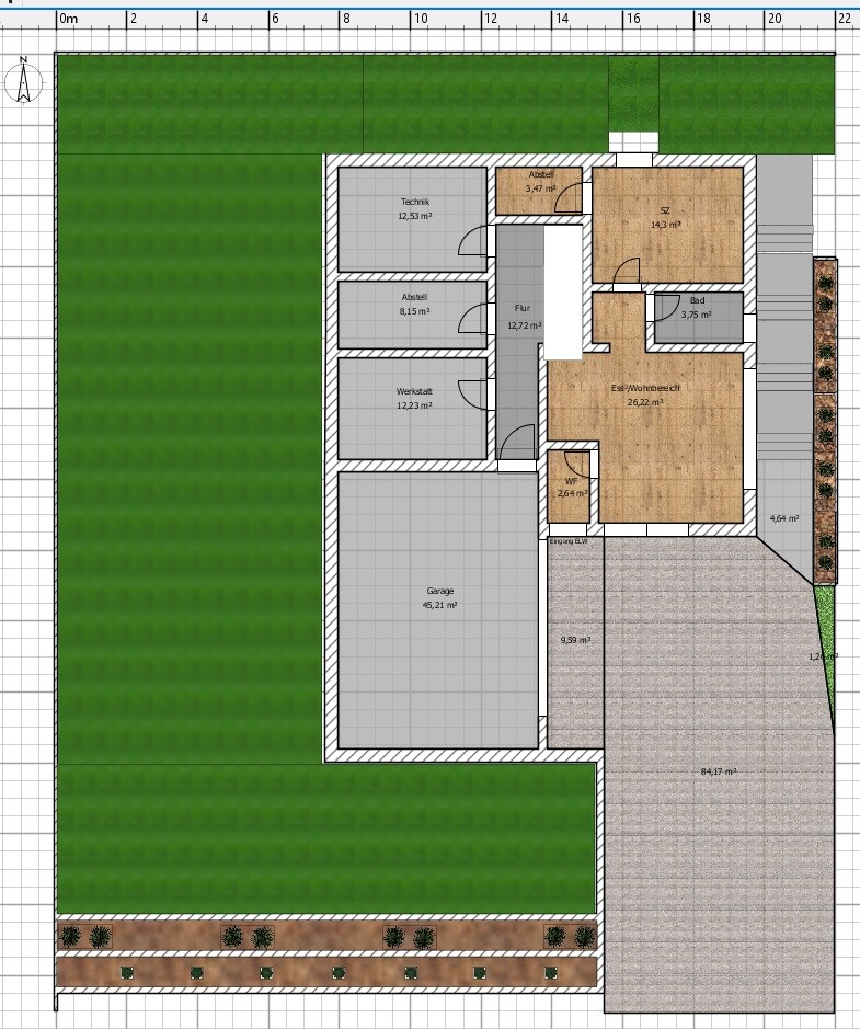
Plot Size: 594 m┬▓ (6389 sq ft)
Slope: South-facing slope
Floor Area Ratio: 0.4
Building Envelope, Building Line and Boundary: 12 x 22 m (39 x 72 ft)
Setback: 2.5 m (8 ft)
Number of Parking Spaces: 2 per residential unit
Roof Type: Flat roof
Architectural Style: Modern
Orientation: South
Maximum Height / Limits: Single-family house + 6.5 m (21 ft)
Client Requirements
Style, Roof Type, Building Type: Modern, flat roof
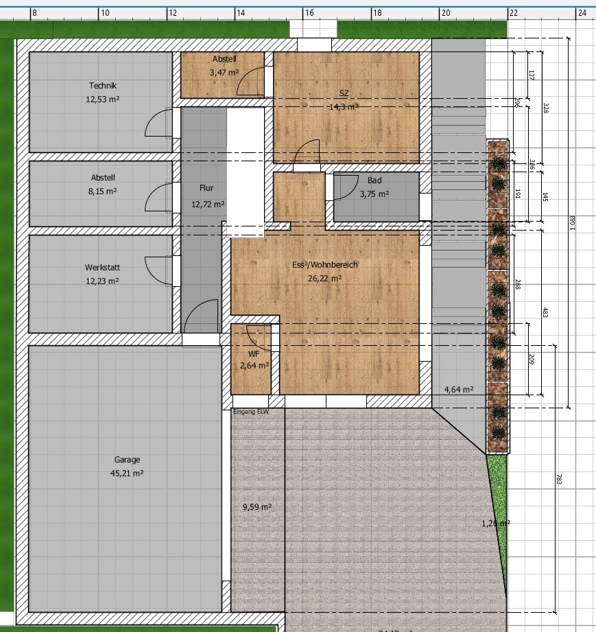
Basement, Floors: Basement with separate apartment + 2 floors
Number of Residents, Ages: 2 (male 26, female 26) + 2 planned children
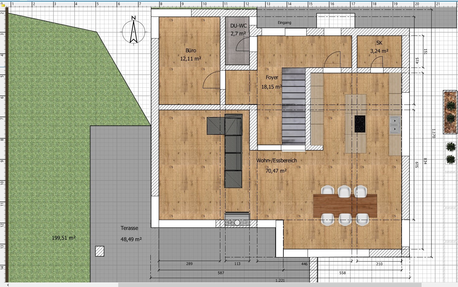
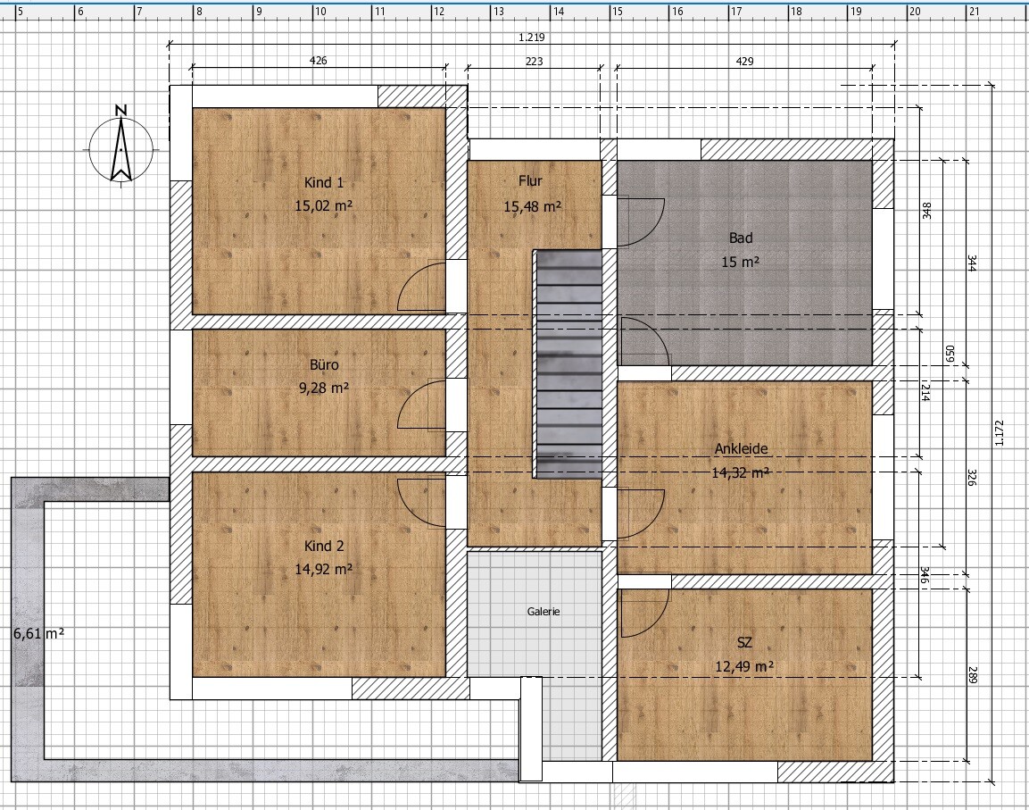
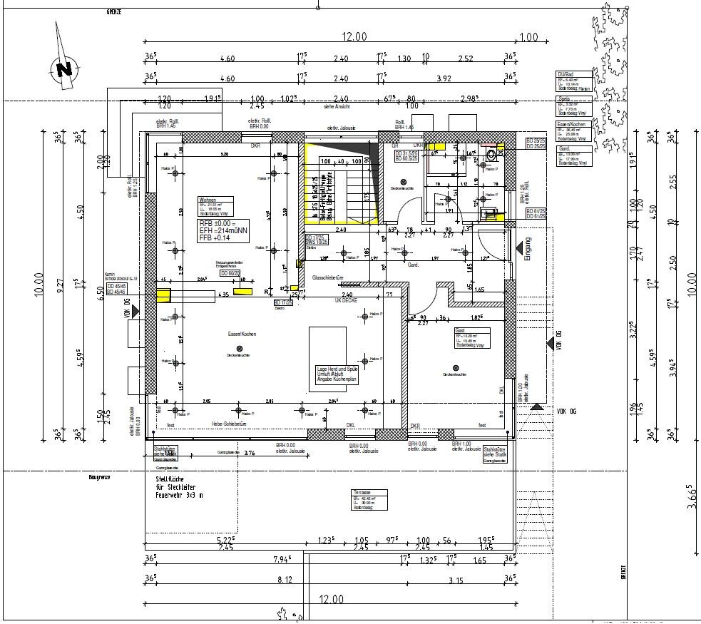
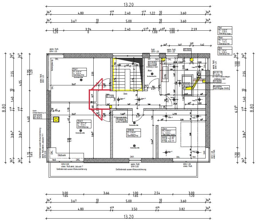
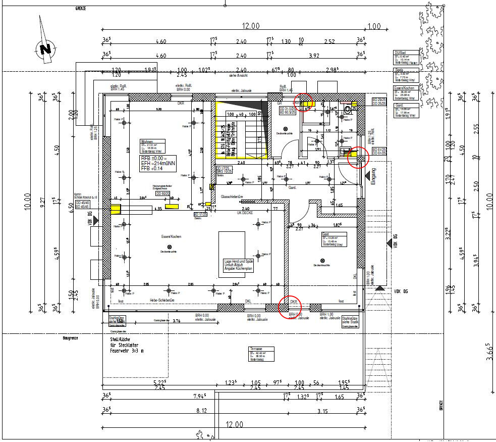
Room Requirements on Ground Floor and Upper Floor: Ground floor (office, living/dining/kitchen, shower-toilet, storage) Upper floor (2 childrenŌĆÖs rooms, office, bedroom, bathroom, dressing room)
Office Use: Family or Home Office? Wife is a teacher, I work from home once a week
Number of Overnight Guests per Year: 2-5
Open or Closed Layout: Open
Conservative or Modern Construction: Modern
Open Kitchen, Kitchen Island: Open kitchen with island
Number of Dining Seats: 6-10
Fireplace: Yes
Music / Stereo Wall: ŌĆō
Balcony, Roof Terrace: ŌĆō
Garage, Carport: Double garage
Utility Garden, Greenhouse: ŌĆō
Additional wishes / special features / daily routine, also explanations why something should or should not be included
House Design
Who Designed it: Architect from a construction company
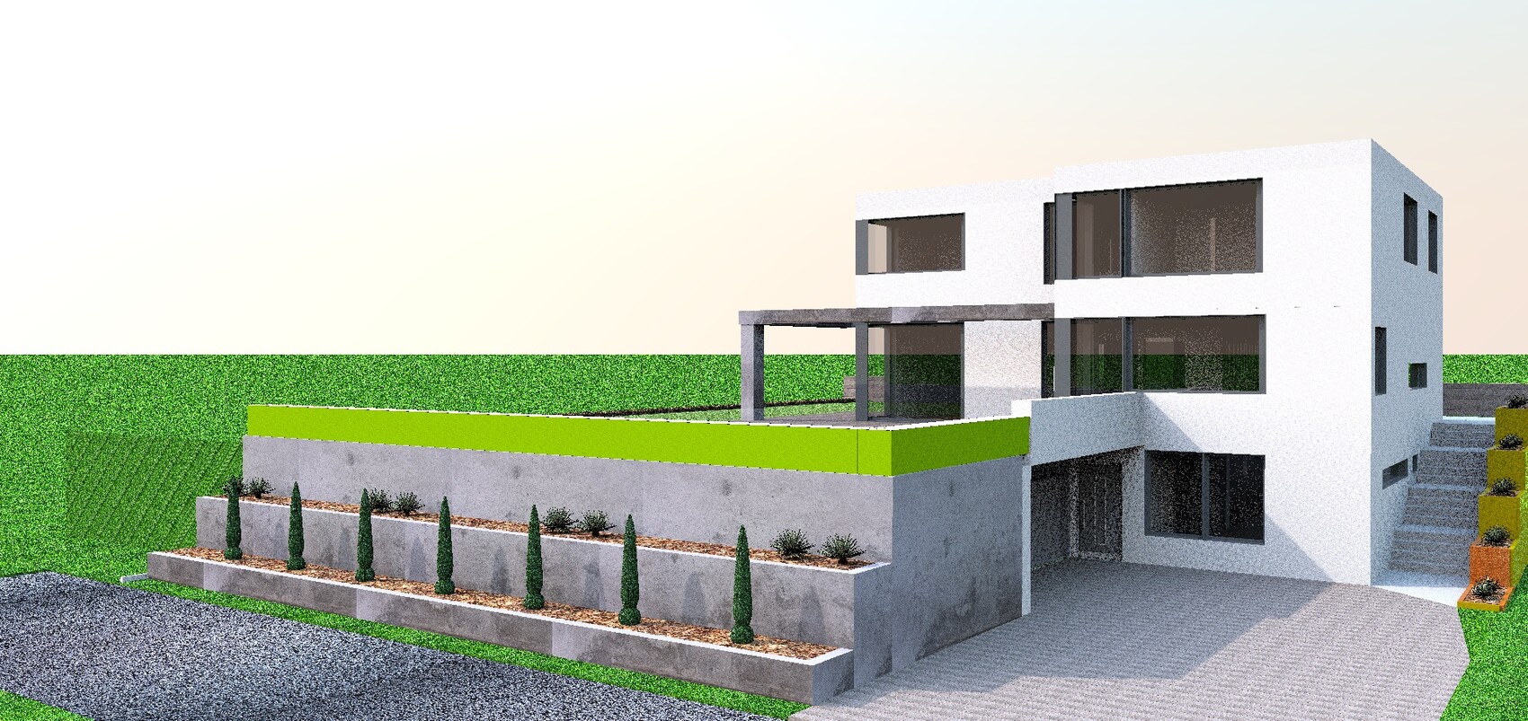
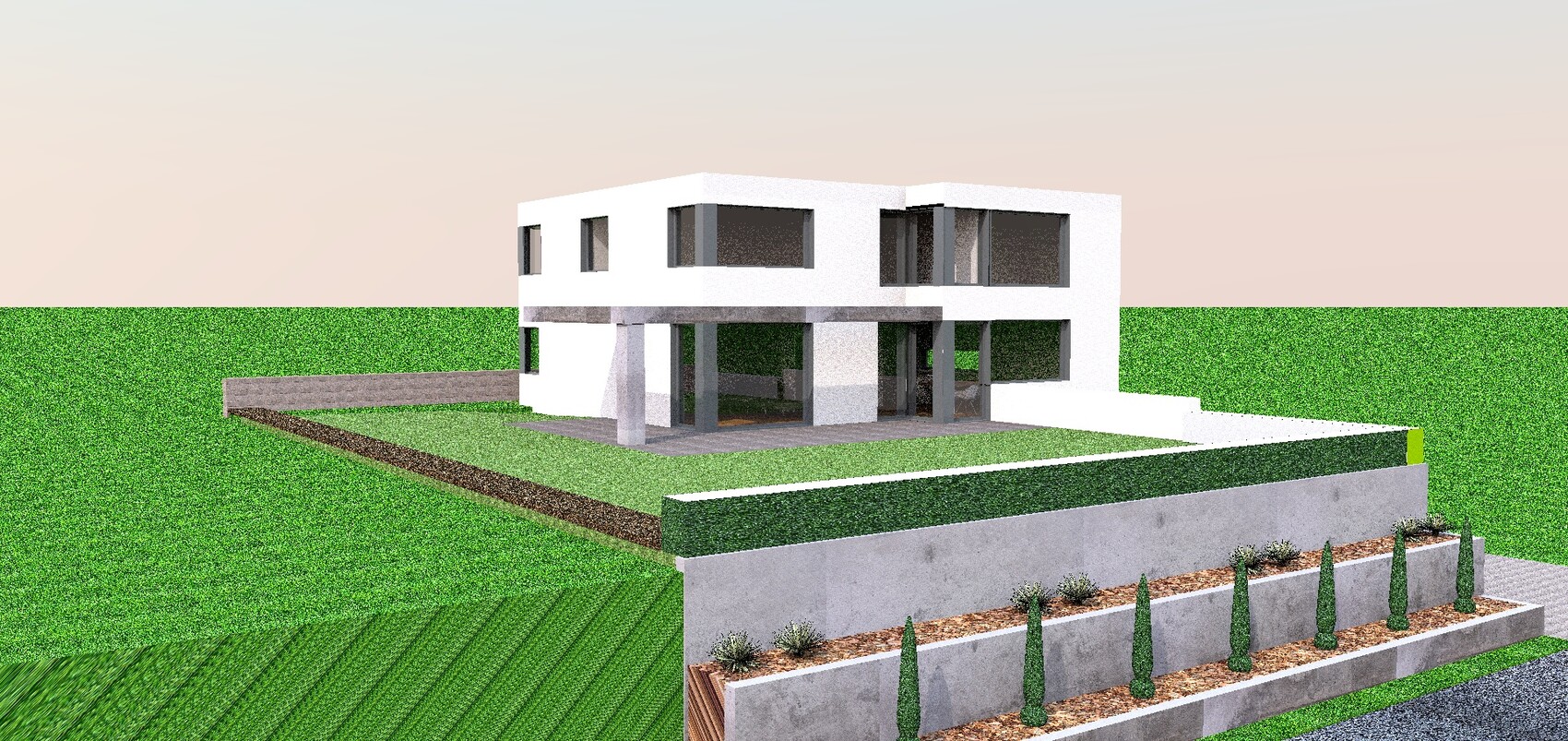
What Do You Like Most? Why? Side driveway to garage, direct access from garage to house, separate apartment concept, open ground floor design, upper floor is perfect in our opinion, gallery
What Do You Like Least? Why? Living/dining area is somewhat too large (wife worries it may be hard to arrange cozily), bedroom window position in the separate apartment is tricky, (north entrance ŌåÆ long access route for guests)
Preferred Heating System: Air-to-water heat pump + photovoltaic system + battery storage
If You Have to Cut Back, On Which Details / Extensions
- Can be cut: Office on upper floor, a few square meters in living/dining area
- Cannot be cut: Remaining room program
Why Has the Design Turned Out As It Is Now?
The room program was provided by us. Furthermore, many requirements and the plot itself influenced the design.
Why Was the Drawing Created in Sweet Home 3D?
The architectŌĆÖs design is drawn to scale but not dimensioned, so I transferred it to SH3D.
What Is the Most Important / Fundamental Question About the Floor Plan, Summarized in 130 Characters?
What do you think of the floor plan? Any ideas on how to make the large living/dining area feel cozier?
Plot Size: 594 m┬▓ (6389 sq ft)
Slope: South-facing slope
Floor Area Ratio: 0.4
Building Envelope, Building Line and Boundary: 12 x 22 m (39 x 72 ft)
Setback: 2.5 m (8 ft)
Number of Parking Spaces: 2 per residential unit
Roof Type: Flat roof
Architectural Style: Modern
Orientation: South
Maximum Height / Limits: Single-family house + 6.5 m (21 ft)
Client Requirements
Style, Roof Type, Building Type: Modern, flat roof
Basement, Floors: Basement with separate apartment + 2 floors
Number of Residents, Ages: 2 (male 26, female 26) + 2 planned children
Room Requirements on Ground Floor and Upper Floor: Ground floor (office, living/dining/kitchen, shower-toilet, storage) Upper floor (2 childrenŌĆÖs rooms, office, bedroom, bathroom, dressing room)
Office Use: Family or Home Office? Wife is a teacher, I work from home once a week
Number of Overnight Guests per Year: 2-5
Open or Closed Layout: Open
Conservative or Modern Construction: Modern
Open Kitchen, Kitchen Island: Open kitchen with island
Number of Dining Seats: 6-10
Fireplace: Yes
Music / Stereo Wall: ŌĆō
Balcony, Roof Terrace: ŌĆō
Garage, Carport: Double garage
Utility Garden, Greenhouse: ŌĆō
Additional wishes / special features / daily routine, also explanations why something should or should not be included
House Design
Who Designed it: Architect from a construction company
What Do You Like Most? Why? Side driveway to garage, direct access from garage to house, separate apartment concept, open ground floor design, upper floor is perfect in our opinion, gallery
What Do You Like Least? Why? Living/dining area is somewhat too large (wife worries it may be hard to arrange cozily), bedroom window position in the separate apartment is tricky, (north entrance ŌåÆ long access route for guests)
Preferred Heating System: Air-to-water heat pump + photovoltaic system + battery storage
If You Have to Cut Back, On Which Details / Extensions
- Can be cut: Office on upper floor, a few square meters in living/dining area
- Cannot be cut: Remaining room program
Why Has the Design Turned Out As It Is Now?
The room program was provided by us. Furthermore, many requirements and the plot itself influenced the design.
Why Was the Drawing Created in Sweet Home 3D?
The architectŌĆÖs design is drawn to scale but not dimensioned, so I transferred it to SH3D.
What Is the Most Important / Fundamental Question About the Floor Plan, Summarized in 130 Characters?
What do you think of the floor plan? Any ideas on how to make the large living/dining area feel cozier?
Thank you for the additional feedback.
We have now submitted the plans accordingly. The point about the children's rooms is a good one. However, both rooms are sufficiently sized, and I donŌĆÖt find it particularly problematic if one is larger than the other.
(I can well imagine that one of the children will move to the basement during puberty and then enjoy having their own bathroom there).
We still have enough time to make adjustments later during the detailed planning stage if necessary.

ivenh0 schrieb:
The point about the kidsŌĆÖ rooms is a good one. However, both are sufficiently sized, and I donŌĆÖt mind if one is larger than the other. I wasnŌĆÖt referring to size or size differences, but rather to not having the open doors pushed flat against the wall as if for clearance reasons, but leaving space behind them to place wardrobes there as well. This simply increases the number of possible furniture arrangements, which can sometimes be more valuable than the nominal square meters.
https://www.instagram.com/11antgmxde/
https://www.linkedin.com/company/bauen-jetzt/
Where can small adjustments still improve things? Whether it's lighting, walls, doors, windows, ...
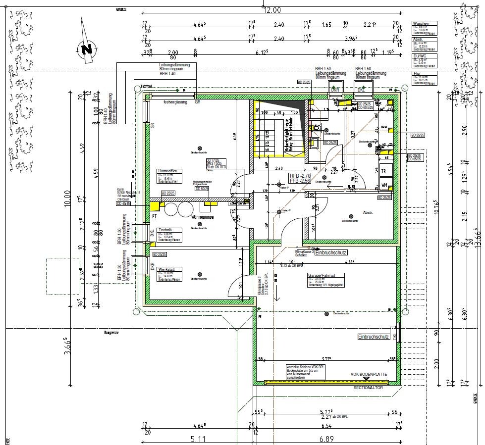
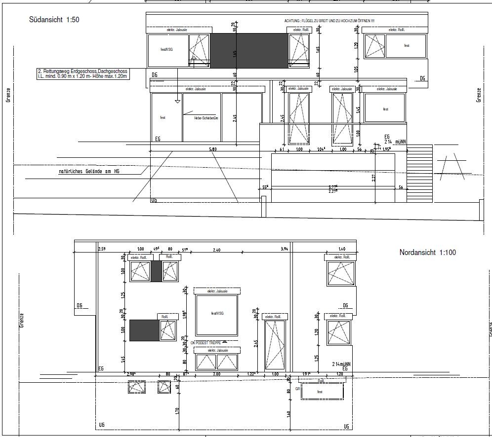
A note upfront regarding the window arrangement on the north side. We know it doesnŌĆÖt look good from the outside, but we deliberately chose it because we really like how it appears from the inside -> great window on the ground floor/first floor landing, light in the basement corridor.
Looking forward to your feedback.
Best regards

Nice design, although I have to admit that the second child would really be at a disadvantage compared to the first. If there are indeed two children, I would suggest a more balanced approach.
What I notice about the windows (inside!) is that they are often placed very close to the edgesŌĆöliterally right on the edge. IŌĆÖm not a fan of ŌĆ£slamming them against the wallŌĆØ or ŌĆ£squeezing them into the corner.ŌĆØ Placing windows directly next to the room wall is something I would recommend reviewing again in the 3D simulation. Personally, I wouldnŌĆÖt like it that way.
What I notice about the windows (inside!) is that they are often placed very close to the edgesŌĆöliterally right on the edge. IŌĆÖm not a fan of ŌĆ£slamming them against the wallŌĆØ or ŌĆ£squeezing them into the corner.ŌĆØ Placing windows directly next to the room wall is something I would recommend reviewing again in the 3D simulation. Personally, I wouldnŌĆÖt like it that way.
kaho674 schrieb:
Windows placed directly against the room wall ŌĆō I would take another look at this in your 3D simulation. Yes, it does have a bit of a cubicle feel, especially when itŌĆÖs only attached on one side, giving it a somewhat asymmetrical appearance. From an experienced, aesthetic perspective, this is a serious mistake ŌĆō but from a laypersonŌĆÖs point of view, it actually creates that "distinctly Bauhaus" look.
https://www.instagram.com/11antgmxde/
https://www.linkedin.com/company/bauen-jetzt/
kaho674 schrieb:
Nice layout, although I have to admit that the second child really gets the short end of the stick compared to child one. If there are really two children, I would also recommend a fairer distribution.
What I notice about the windows (inside!) ŌĆö they are often placed right on the edge, literally. IŌĆÖm not a fan of "slamming against the edge" or "squeezing into the corner." Windows directly up against the room walls ŌĆö I would suggest checking that again in your 3D simulation. I wouldnŌĆÖt like it that way.
The window in the pantry makes sense as is, since a continuous shelf can be installed along the narrow left side of the room. The bathroom window is unfortunate! We will move it. Thanks for the tip. Do you have any suggestions for the office door? Sliding it to the right is not ideal, because then the window would either have to be narrowed or the wall between the window and door would be eliminated, which we donŌĆÖt like aesthetically.
Any ideas?
Similar topics